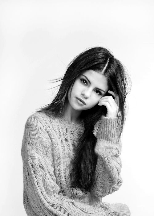
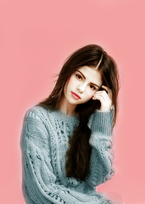
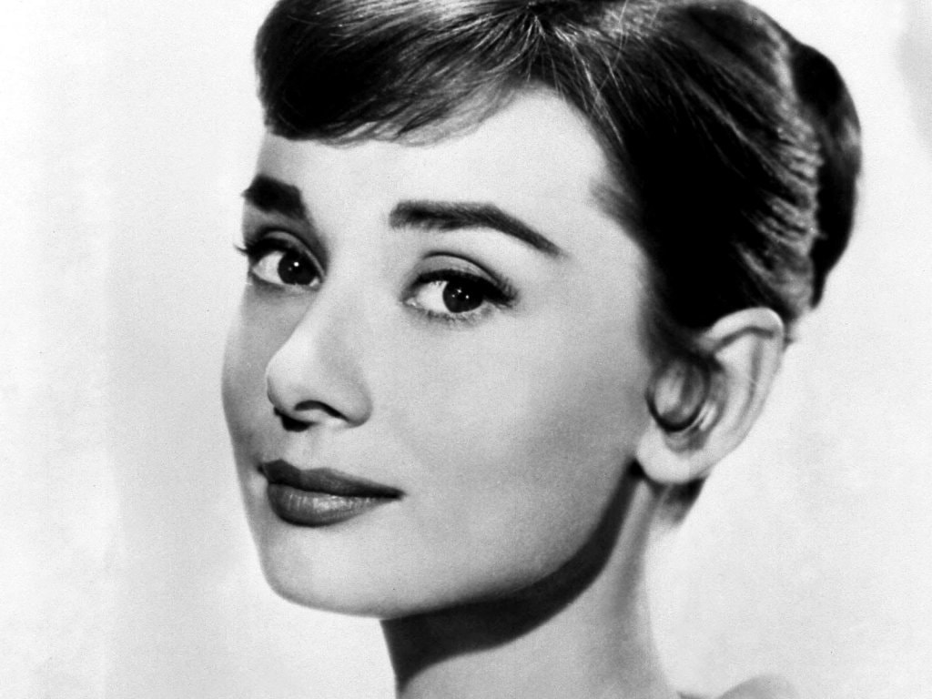
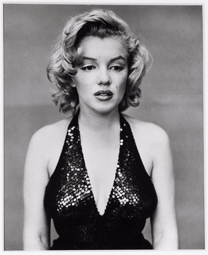
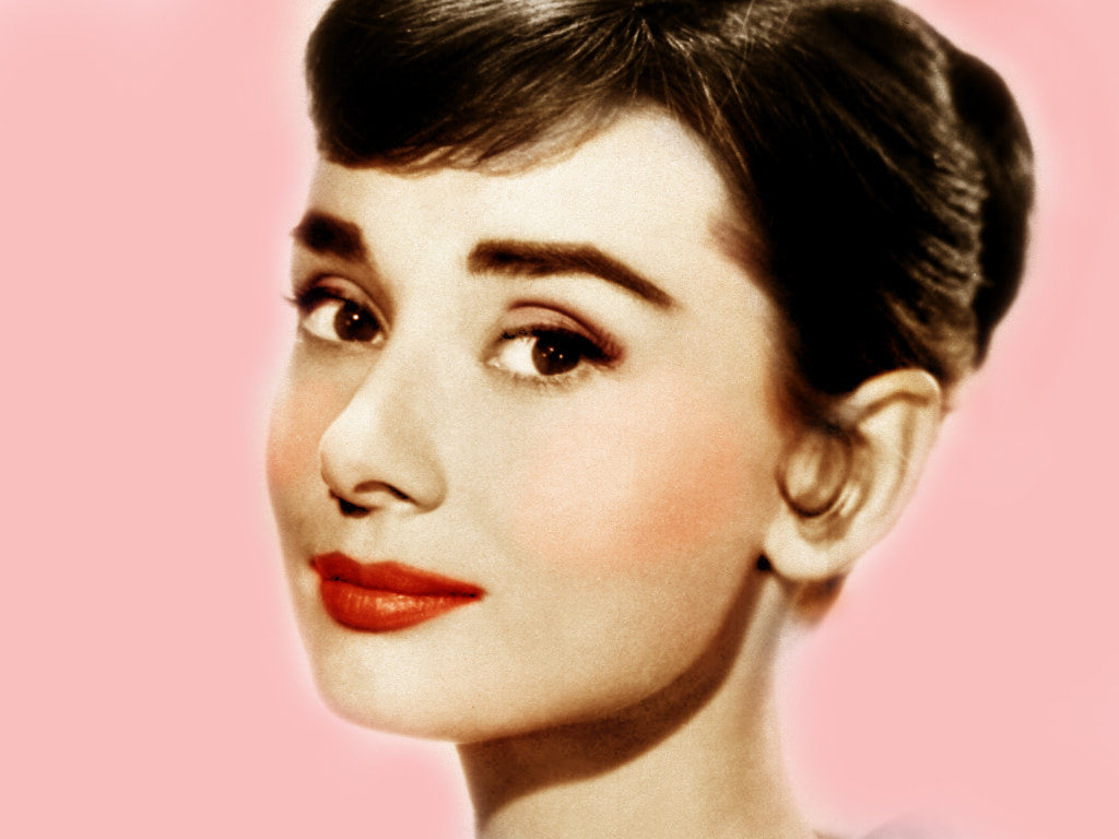
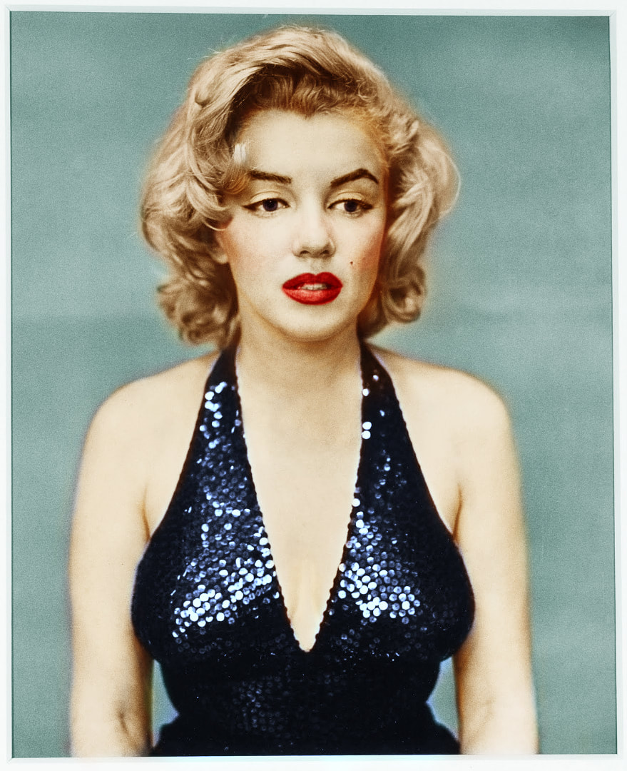
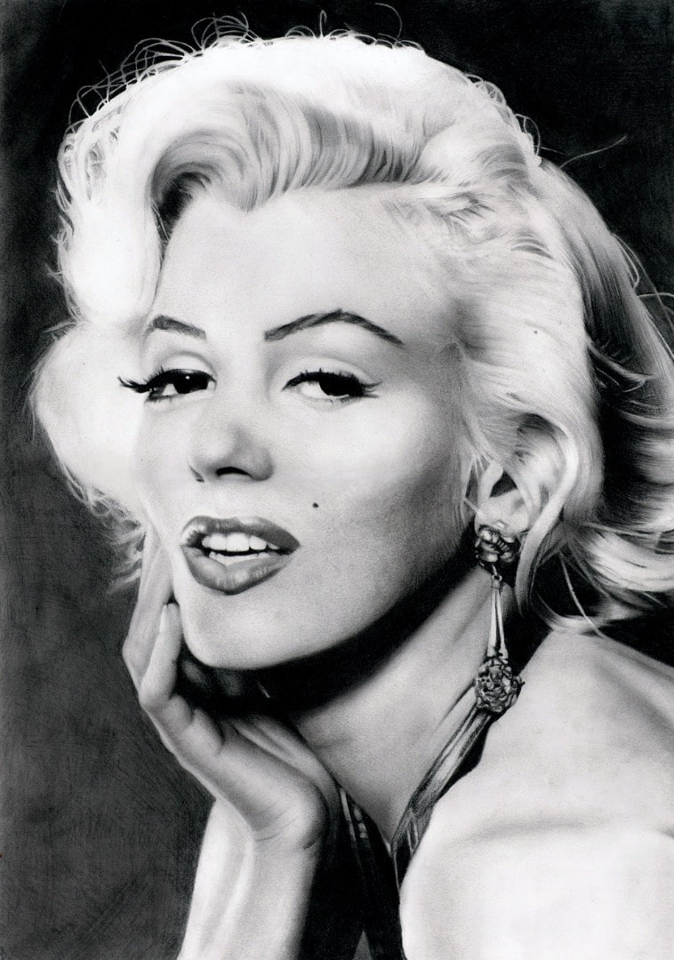
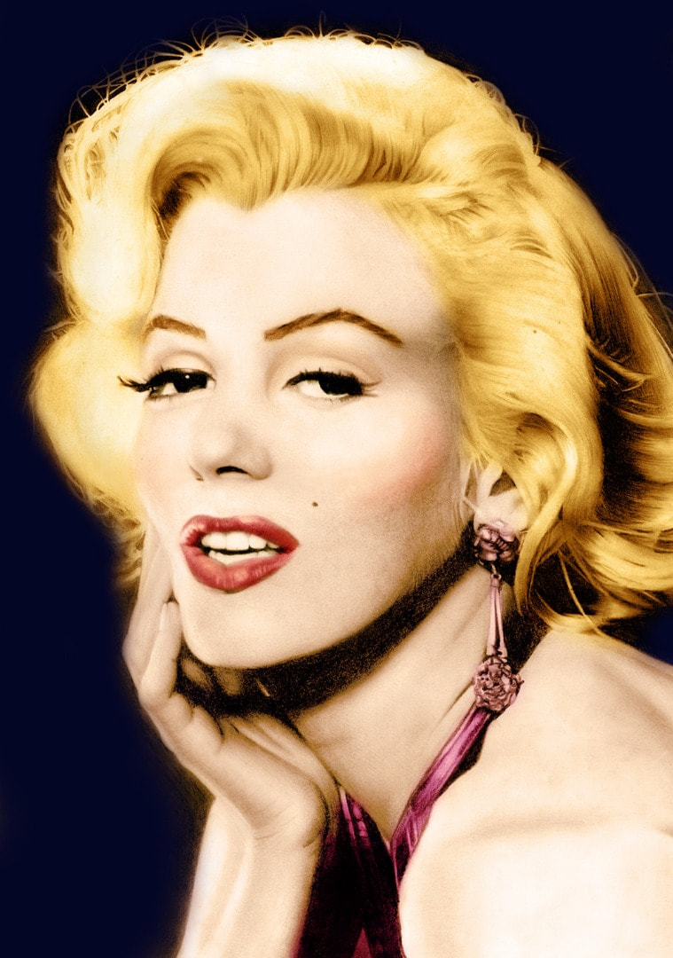
1. coloring b&w photos using photoshop
|
|
|
|
|
|
|
|
1.import chosen photo to photoshop
2.Make sure the image mode is in RGB color and not B&W
3.Create new fill or adjustment layer
(the button that's half black half white at the bottom of the layer panel )
and choose "black & white"
4.Adjust this new layer
5.Select one feature that you want to colour (ex: lips, hair,eyes) using quick selection or magic wand
6.Soften the edges by using pen tool
7.Create new fill or adjustment layer and choose "solid color"
8.Colour accordingly, change the layer mode to soft light/multiply if necessary. Otherwise, just keep it normal
9.Adjust the opacity to make it natural
10.Repeat step 5 for each feature that you want to colour
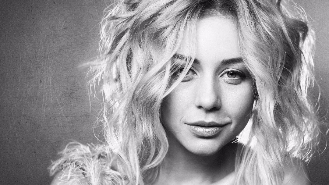
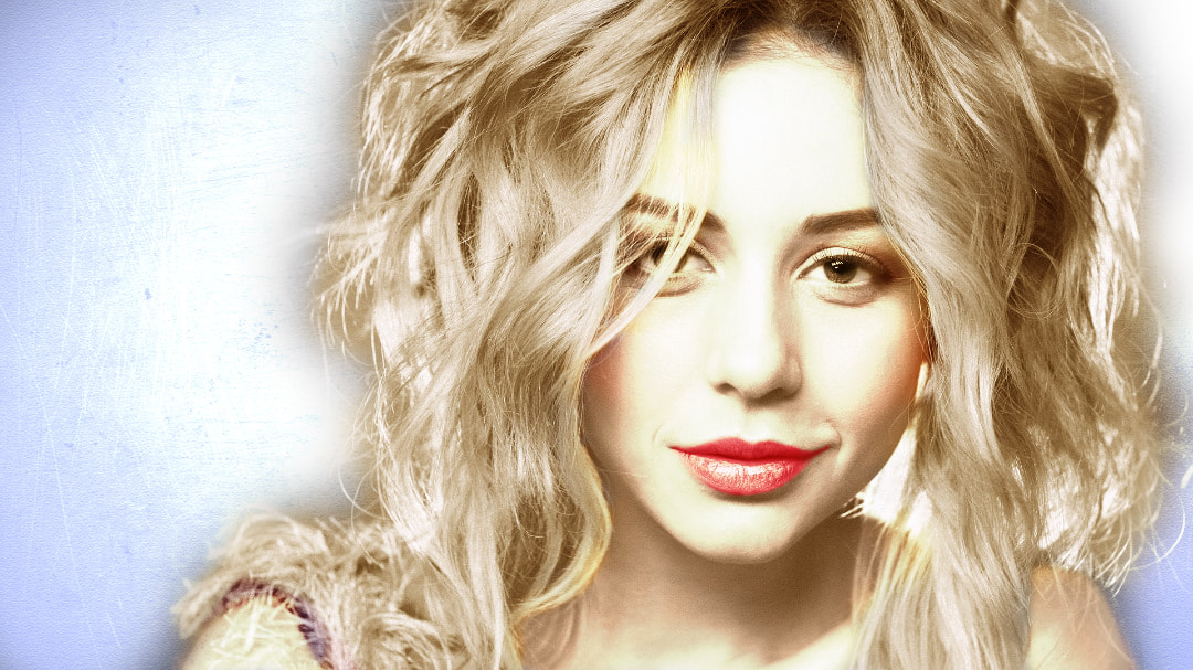
2. color correcting
before
steps:
|
after
Adobe photoshop tools used:
|
3. content aware scaling
before
|
after
|
steps:
- import photo
- select area you want to protect using selection tool or quick mask
- click save selection as channel
- click edit> content aware
- click protect "alpha 1/ object you want to stay unchanged"
- stretch image until satisfied
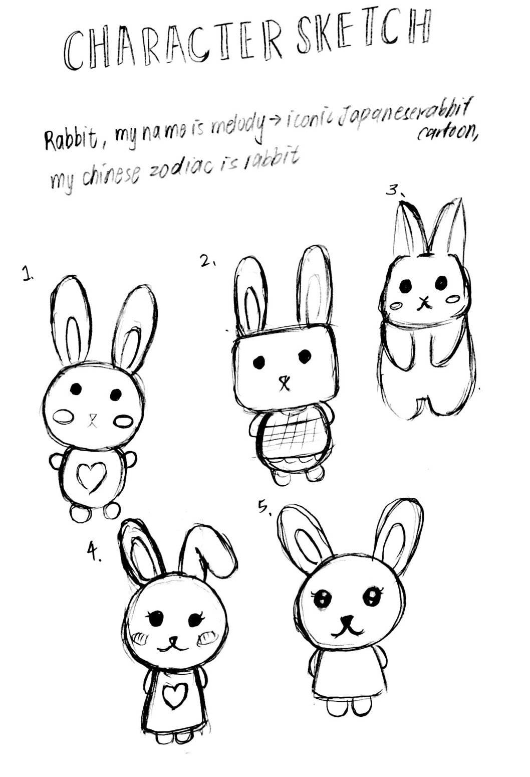
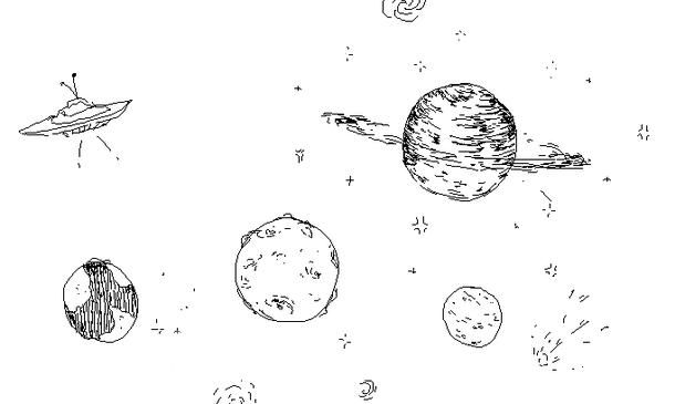
4. character postcard design
|
|
|
artist reference research
1.Yuko Yamaguchi
source: Wikipedia, the free encyclopedia
Yuko Yamaguchi (山口 裕子 Yamaguchi Yūko, born October 24) is a Japanese character designer and illustrator, who is well known as the third character designer of Hello Kitty.
Biography[edit]
Yamaguchi was born in Kōchi, Kōchi, Japan. She attended Joshibi University of Art and Designwhere she studied industrial design. Yamaguchi joined Sanrio in 1978. In 1980 she became the third Hello Kitty designer. She has been the main Hello Kitty designer for much of the character’s history
Aside from Hello Kitty, Yamaguchi has been designing Jewelpet since 2008.She also did the illustration for TV Asahi’s official mascot, Go-Chan.
reason: because the design is very simple and easy to remember even for kids, thus become famous and well-known.
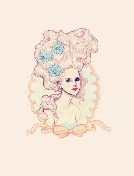
2. Pamela Majocha
Pamela Majocha says she wants to make art thatʼs pretty — not provocative. The Ryerson Fashion Communications graduate illustrates settings that fit each unique individual that you see in them.
Nicole Siena: Do you know if illustrating is what you want to do for the rest of your life, or are you still evolving as a person?
Pamela Majocha: Itʼs so frustrating. Now, Iʼm more interested in home décor. But how long will I be interested in that? Itʼs a little frightening, but you just have to take opportunities as they come, instead of denying them. I want what I do to be something I can do tirelessly. I donʼt want it to cause me any stress, because sometimes drawing something really pretty will stress me out to no end.
NS: Are you a perfectionist?
PM: Yes. But the world doesnʼt award perfectionists; it awards people who get stuff done. Itʼs so hard to walk away from a picture and say youʼre done.
NS: What inspires the drawings?
PM: Usually stuff like movie sets and home décor. It always starts with a setting. Iʼm always trying to make a person fit into that setting, even if the setting itself doesnʼt end up in
the illustration.
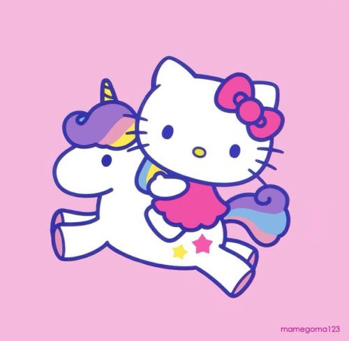
reason: soft and gentle color use and illustration style.
3.Yukiji
ㄇㄚˊ幾(まちこ) ©YUKIJI Machiko rabbit Taiwanese25yrs. Illustrator︀︁︂︃︄︅︆︇︈︉︊︋︌︍︎️ LINE STAMP designer.
reason: very adorable personally my favorite, because its so simple
yet adorable with soft colors.
1.Yuko Yamaguchi
source: Wikipedia, the free encyclopedia
Yuko Yamaguchi (山口 裕子 Yamaguchi Yūko, born October 24) is a Japanese character designer and illustrator, who is well known as the third character designer of Hello Kitty.
Biography[edit]
Yamaguchi was born in Kōchi, Kōchi, Japan. She attended Joshibi University of Art and Designwhere she studied industrial design. Yamaguchi joined Sanrio in 1978. In 1980 she became the third Hello Kitty designer. She has been the main Hello Kitty designer for much of the character’s history
Aside from Hello Kitty, Yamaguchi has been designing Jewelpet since 2008.She also did the illustration for TV Asahi’s official mascot, Go-Chan.
reason: because the design is very simple and easy to remember even for kids, thus become famous and well-known.
2. Pamela Majocha
Pamela Majocha says she wants to make art thatʼs pretty — not provocative. The Ryerson Fashion Communications graduate illustrates settings that fit each unique individual that you see in them.
Nicole Siena: Do you know if illustrating is what you want to do for the rest of your life, or are you still evolving as a person?
Pamela Majocha: Itʼs so frustrating. Now, Iʼm more interested in home décor. But how long will I be interested in that? Itʼs a little frightening, but you just have to take opportunities as they come, instead of denying them. I want what I do to be something I can do tirelessly. I donʼt want it to cause me any stress, because sometimes drawing something really pretty will stress me out to no end.
NS: Are you a perfectionist?
PM: Yes. But the world doesnʼt award perfectionists; it awards people who get stuff done. Itʼs so hard to walk away from a picture and say youʼre done.
NS: What inspires the drawings?
PM: Usually stuff like movie sets and home décor. It always starts with a setting. Iʼm always trying to make a person fit into that setting, even if the setting itself doesnʼt end up in
the illustration.
reason: soft and gentle color use and illustration style.
3.Yukiji
ㄇㄚˊ幾(まちこ) ©YUKIJI Machiko rabbit Taiwanese25yrs. Illustrator︀︁︂︃︄︅︆︇︈︉︊︋︌︍︎️ LINE STAMP designer.
reason: very adorable personally my favorite, because its so simple
yet adorable with soft colors.
sketches
|
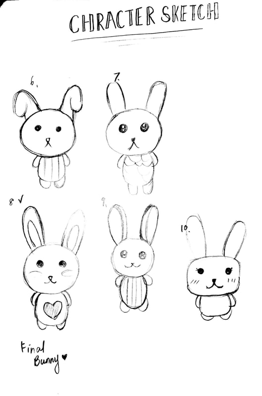
|
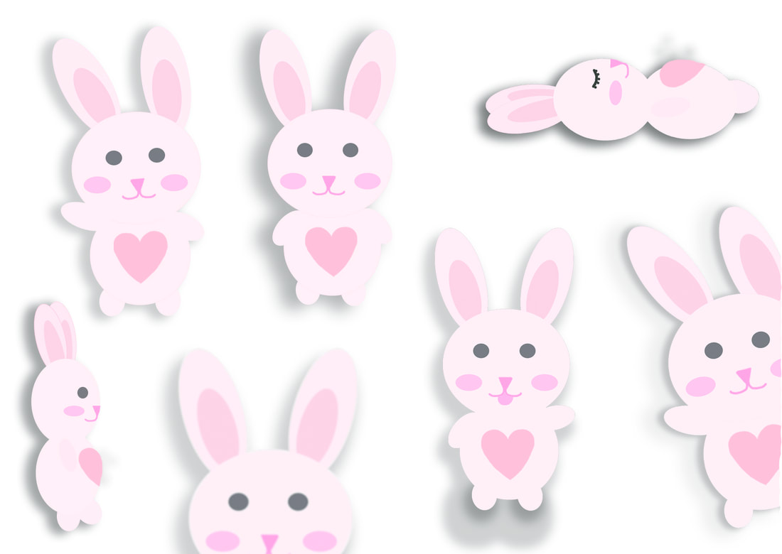
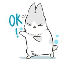
character design smiling bunny using adobe illustrator
|
final postcards
Postcard 3
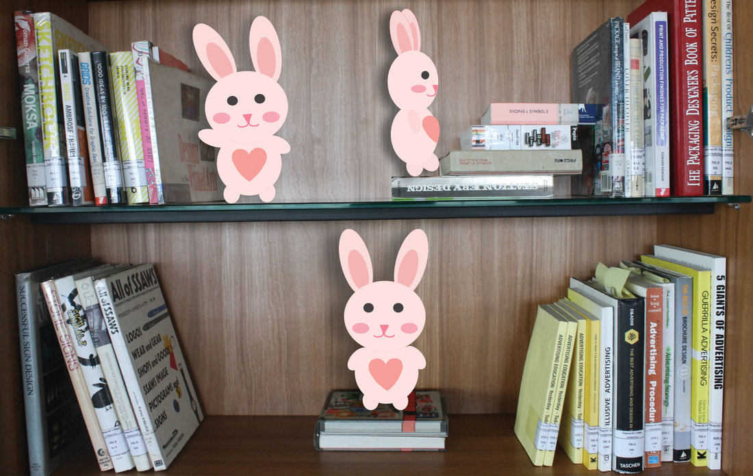
Character: happy bunny Smiling expression showing it is a positive character radiating joyful vibe. Pink color also showing loving, caring and adorable personality of bunny. A big heart showing its kindhearted and passionate characteristic postcard suze A6
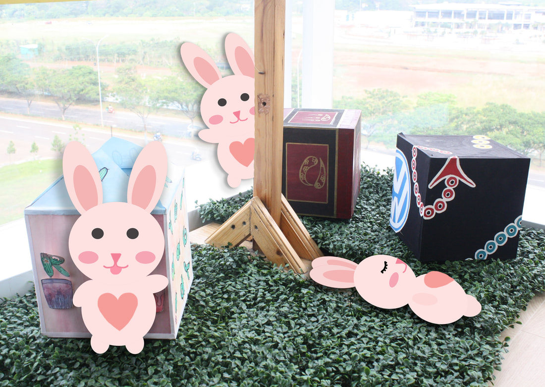
character paste on to the background in adobe photoshop, adding outer shadow to create 3d effect 
bunny postcard1
Character: happy bunny Smiling expression showing it is a positive character radiating joyful vibe. Pink color also showing loving, caring and adorable personality of bunny. A big heart showing its kindhearted and passionate characteristic |
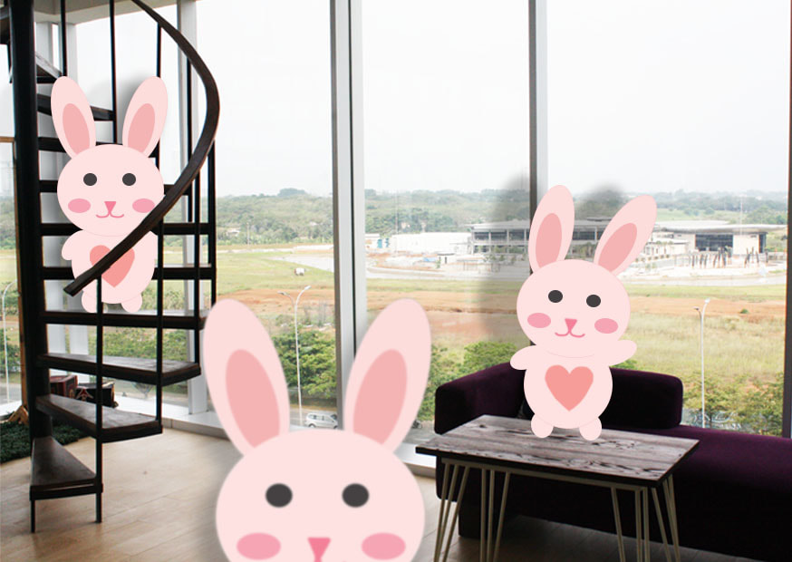
bunny postcard2
Character: happy bunny Smiling expression showing it is a positive character radiating joyful vibe. Pink color also showing loving, caring and adorable personality of bunny. A big heart showing its kindhearted and passionate characteristic 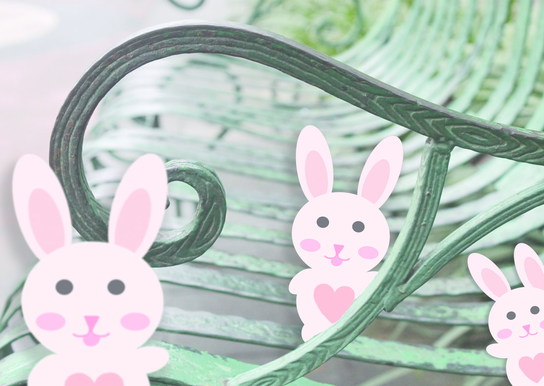
postcard4
Research on tips to create great character and application to the character i created: 1.CLARITY : no matter how complex, it has to look simple and eye catching- simple circles shape forming cute bunny 2.EXPRESSION : audience needs what they’re feeling sometimes without ever speaking- smiling and cheerful facial expression 3.BALANCE : as much as we exaggerate the design, the design has to be proportional 4.CONTRAST : in order to keep design interesting, u can make them asymmetrical, mechanical arm 5.APPEAL : attractive drawing style and colora 6.PROPORTION : structure and detaisl 7.CAPABILITY OF MOVEMENT : your character has to be able to seem like it can move (gesture and pose) 8.EXAGGERATION : push your design, make it expressive |
final desktop picture
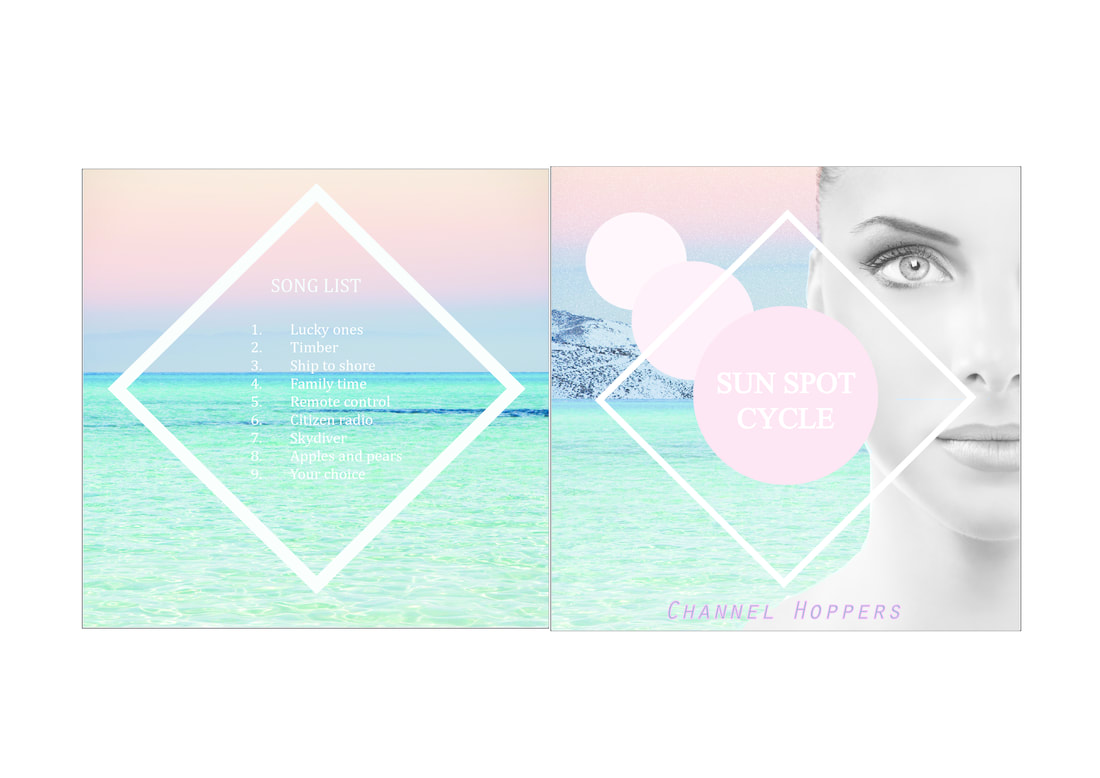
5. cd & album cover design
|
|
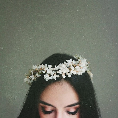
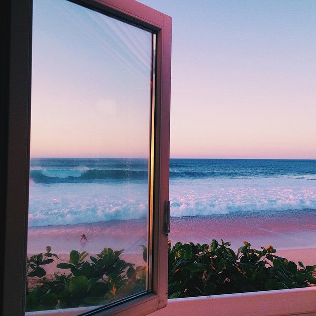
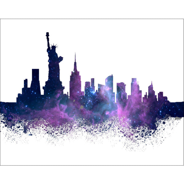
6. self portrait : photomontage
|
|
|
|
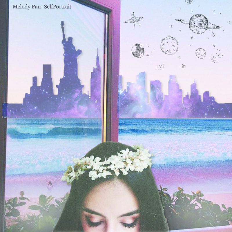
why
- Background: therapeutic sea as i love the ocean and i have always been drawn to its beauty. I wish to live in a beach house in the future. City skyline colored with watercolor showing i love both traveling and watercolor art. sky in the color of rose quartz and serenity pantone 2016 which is my favorite color. with doodle of space showing my mind of fantasy and real life colliding and combining into a new world of my own,
- foreground: girl with flower rcrown symbolizing me band my mind of dream and imagination.
7. double exposure exercise
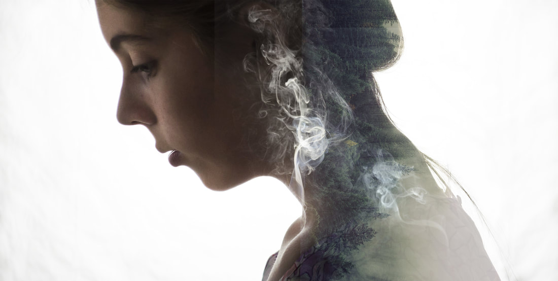
STEPS:
- import chosen photos
- decide background
- edit background using dodge(lighten) and burn tool(darken)
- place wanted image like mountain and ash on it
- adjust to screen so that it will be tranparent
- adjust position and blending options to get desired look
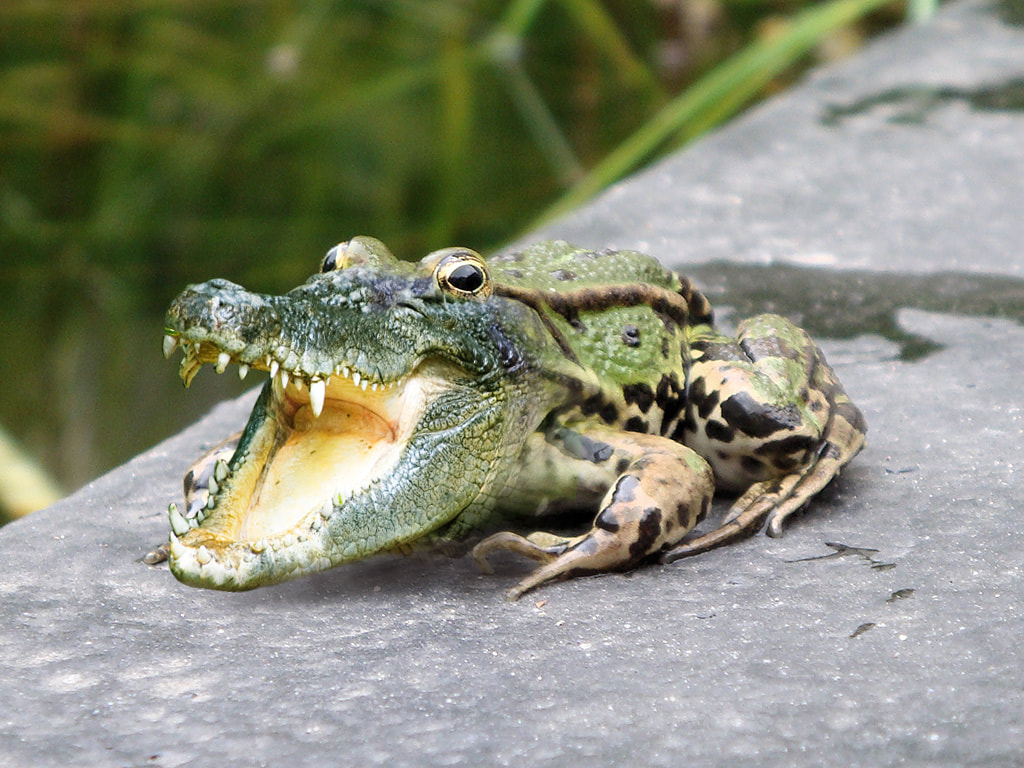
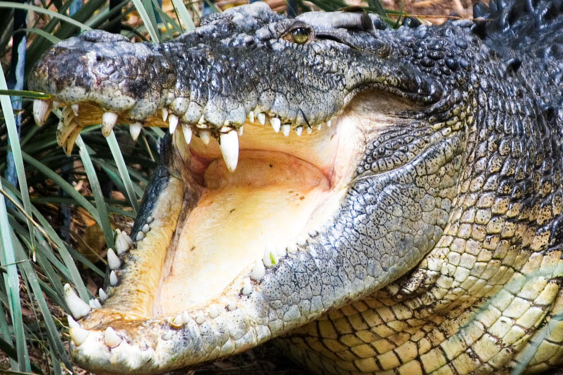
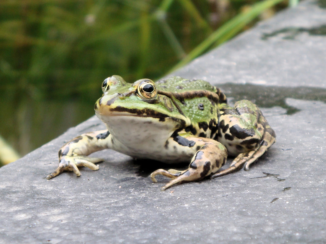
8. Photomontage exercise crog
crocodile + frog= croc
|
|
- Open both image on photoshop
- On the croc file, clean the background using your preferred tool.
- click on the tool below the color box (edit in quick mask mode) to make the edges smoother and get the teeth in details
- command shift i if you did it in the masked areas not selected areas
- place the crocodile in the frog document as a smart object
- adjust until desired position
- Use clone stamp to add the missing parts, change the sample option to "current & below" blend it smoothly
- Add new adjustment layer and adjust the croc's color,hue, and saturation
- make sure to click nested to it only applies to the layer under
- add shadow in a new layer by using soft black brush with a low opacity
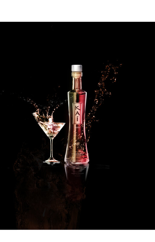
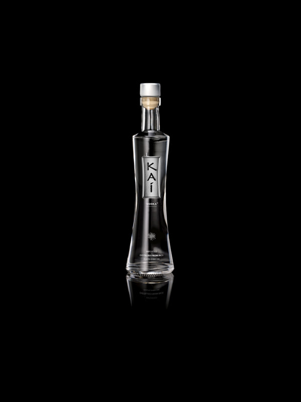
9. photomontage alcohol advertisement
|
|
|
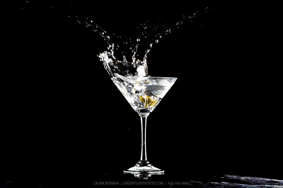
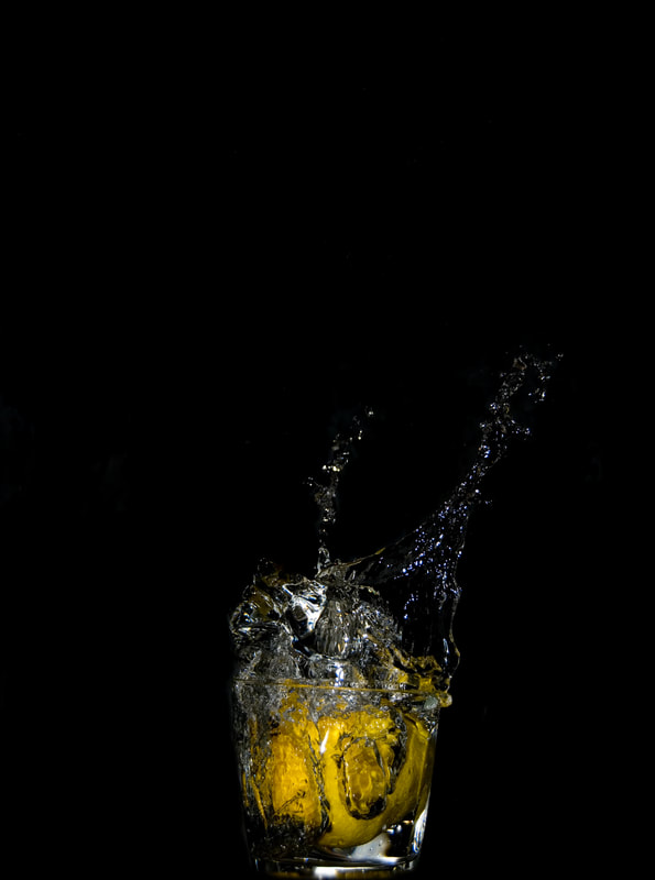
steps
1.open the image of the vodka bottle, martini glass. and splash
2.open the vodka bottle file and add a new layer
3.use brush and color the bottle, simply change the mode to "color" instead of normal
4.add glass and water
4.continue doing the same thing to the water
1.open the image of the vodka bottle, martini glass. and splash
2.open the vodka bottle file and add a new layer
3.use brush and color the bottle, simply change the mode to "color" instead of normal
4.add glass and water
4.continue doing the same thing to the water
10.cinematography
| tumblr_oupv38yafu1vj2zzko1_r3_250.gif |
| tumblr_oupv38yafu1vj2zzko2_r1_400.gif |
Cinema Graph of beer filling up and coffee beans falling down
tool: photoshop
STEPS:
1. importing and Clipping:
After recording the video imported it into Photoshop by going to File > Import > Video Frames to Layers and selecting the file.
2.Set your Timeline to repeat loop/Forever, so that your GIF will loop infinitely.
3. decide on which scene you want to start and the ending scene
4. copy paste an image of the scene to create stable surroundings
5.let the area of movement to be see through, By Editing Your MaskIn the Layer panel, select the mask layer and click on the “Add Layer Mask” icon at the bottom of the panel (it looks like a rectangle with a hole in the middle).Make sure this new white mask layer is selected, and not the image layer.
With the Brush Tool, you are going to begin painting over the areas you want to see movement. It helps if you are looking at one of the later frames in your video, since you will be able to see the different layer beneath your mask.
6. Render !
7. Export > save for web > setting: GIF, Perceptual, Noise, adjust size(from 1080-> 480), select loop n forever
8. save
11.class exercise
|
|
smart object
steps:
- import photos
- adjust color balance and hue
- add text
- convert text to smart bject
- copy the font and turn horizontal and flip vertical to make it upside down
- to achieve fading effect use gradient tool -vertical
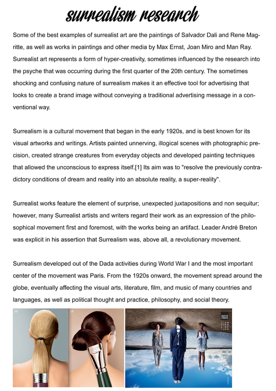
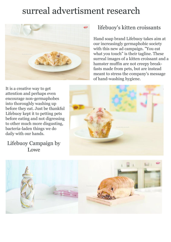
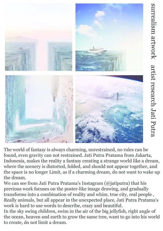
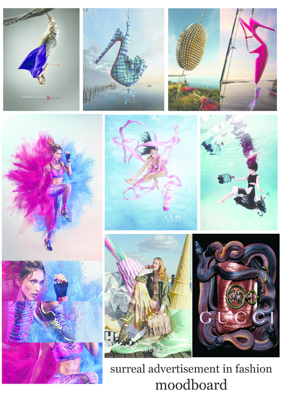
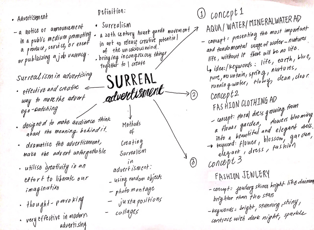
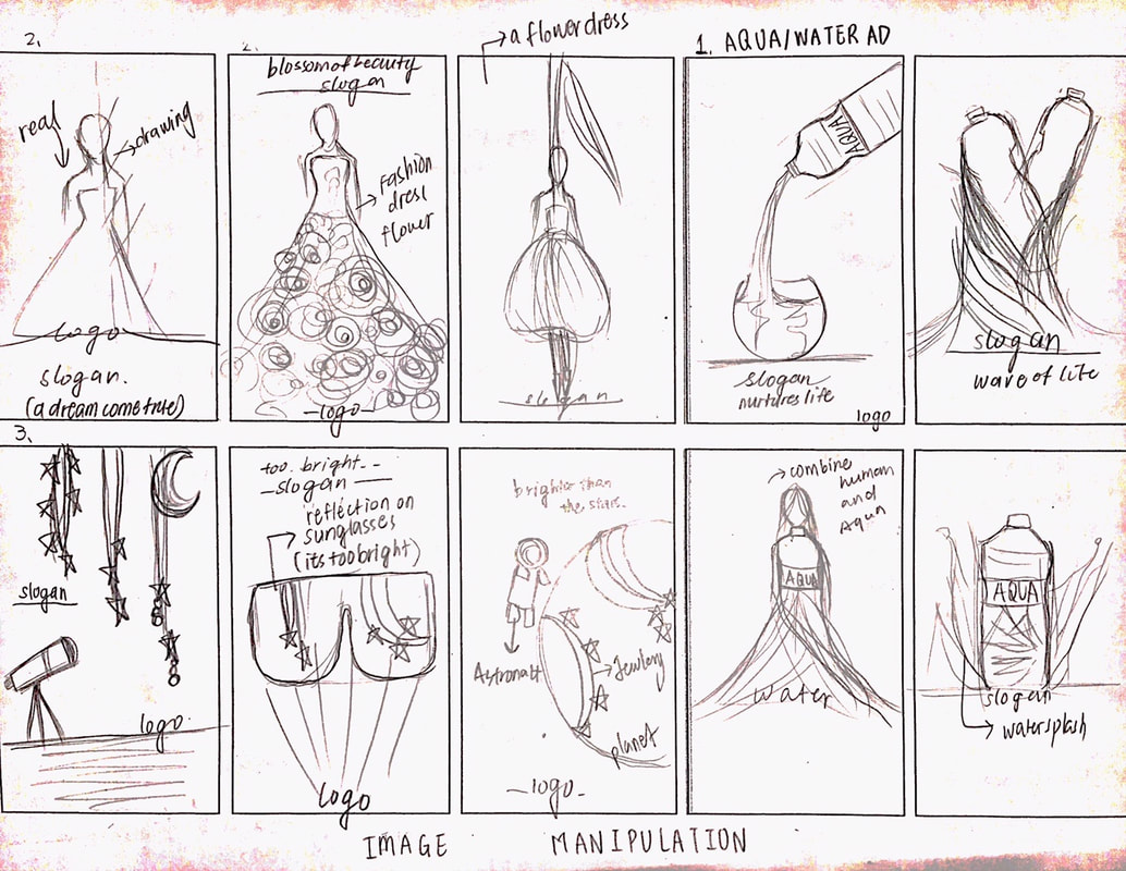
12. surreal advertising
research
|
|
|
moodboard/ references
|
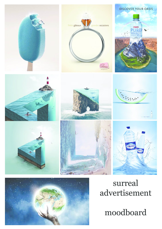
|
research on techniques and methods: surrealism
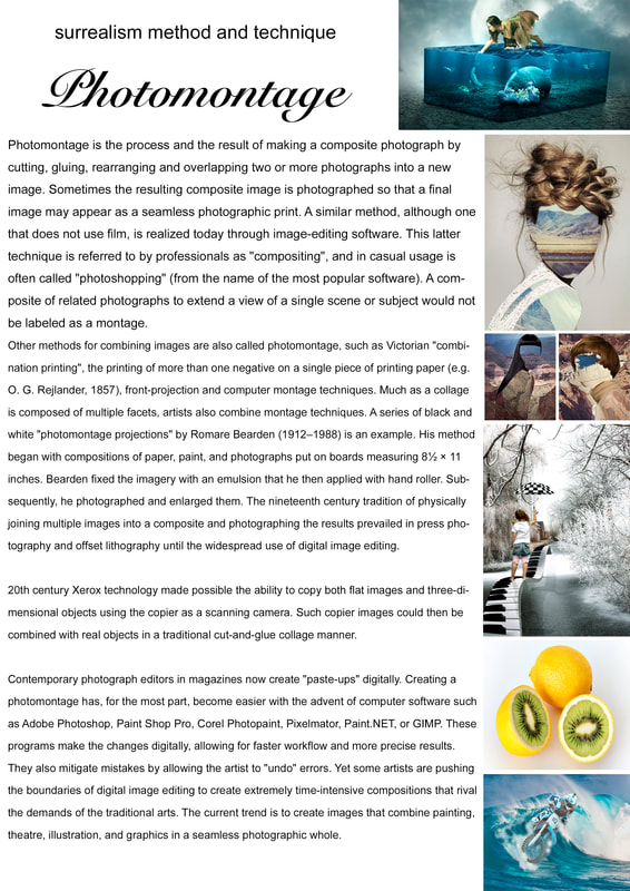
|
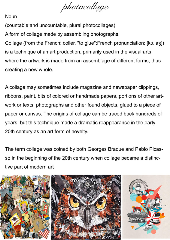
|
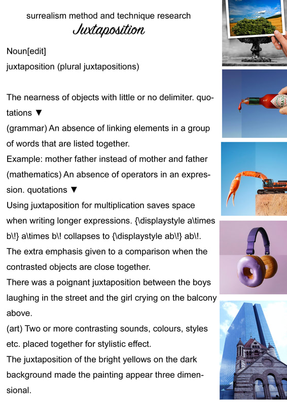
|
mindmap & sketch
|
|
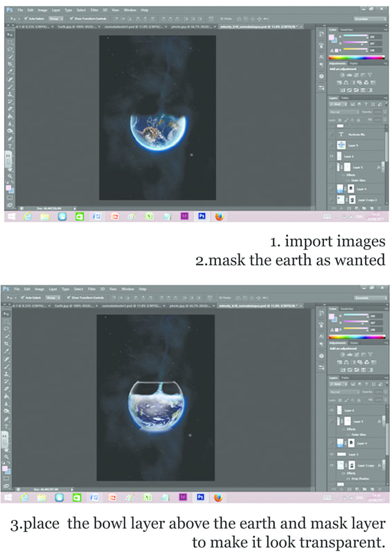
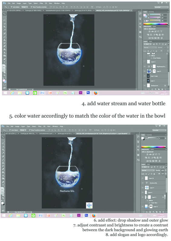
digital process
tool: adobe photoshop
|
|
images used
|
|
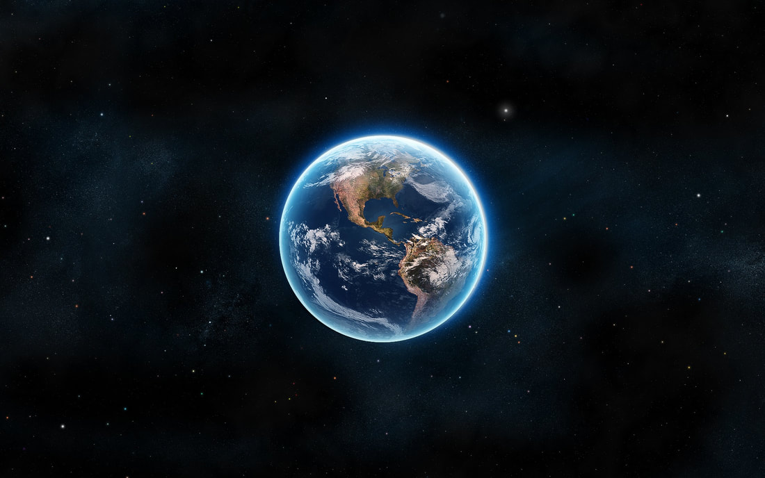
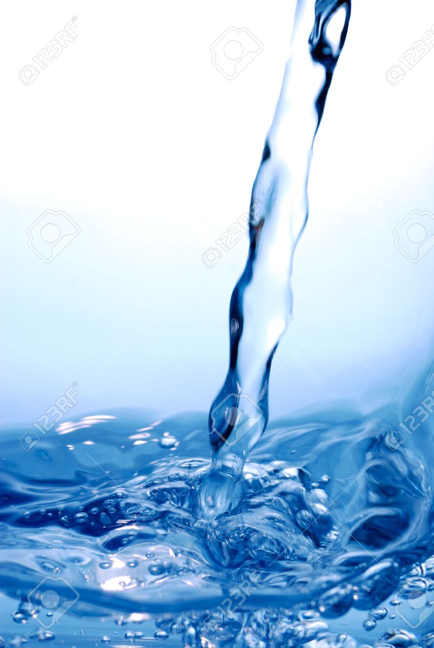
|
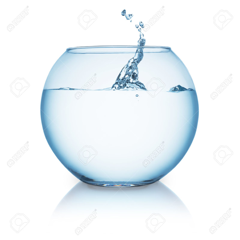
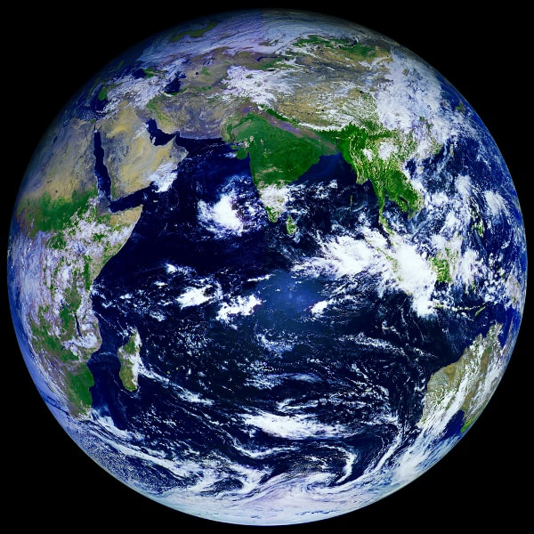
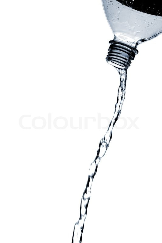
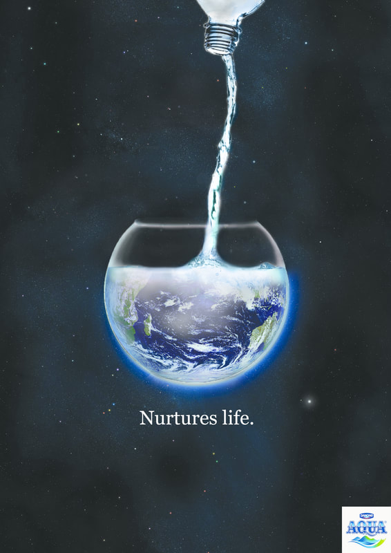
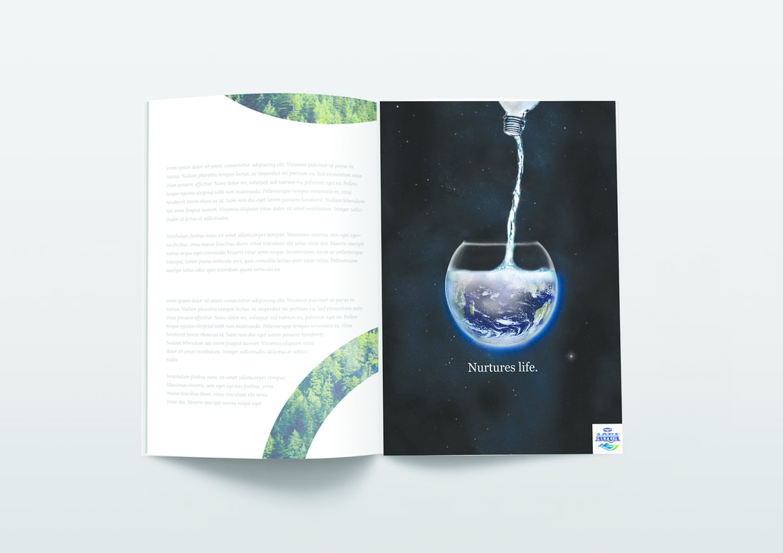
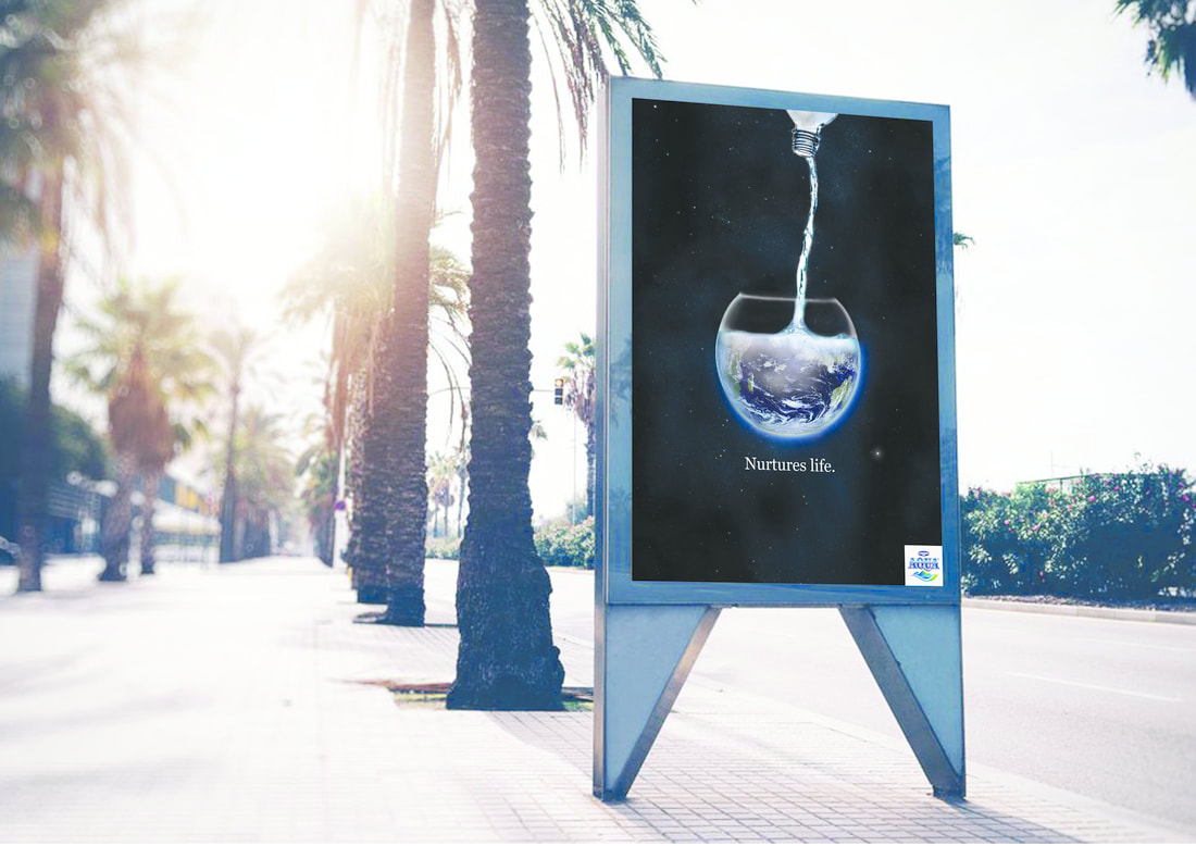
final outcome: aqua water ad
Aqua Water AD design explanation:
Aqua Water may seem like a very basic thing that always appears in our life. However, it is very important to us. Without water, there will be no life. Water is very source of life, it also nourished and nurtures life. It cares and encourages growth for earth's living things. Thus by using this dramatic surreal image of a water streaming down into a bowl , filling up an earth, to show the importance and essential of water. In the poster the main focal point is the earth being filled up by water , show how our home the blue planet is made of water thus showing how water nurtures and supports life. The dark blue universe background and the glowing blue earth & water stream shows contrast , thus making the earth and water pops and glowing. The slogan of the aqua water is "nurture life" , simple yet very crucial and in fact very glorious. The slogan is emphasized by being white to be contrast with the black background. The logo of the aqua water is shown at the corner.
Through this ad , i want to promote the glorious aqua water that is so important to everyone everywhere yet sometimes people take it for granted. By showing them a bigger picture of how water basically fills up and supports us and our home- earth, to evoke deeper thoughts into not just buying water but to cherish water resources.
magazine and billboard mockup
|
|
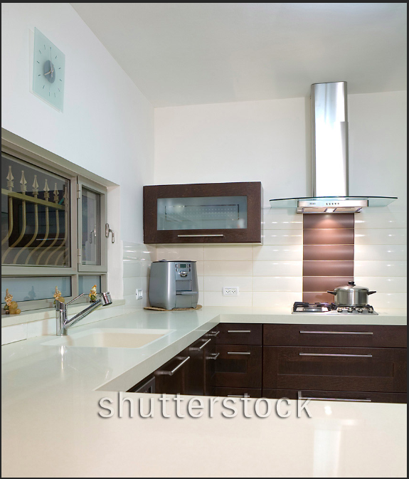
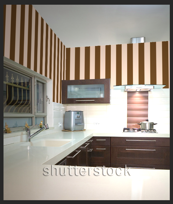
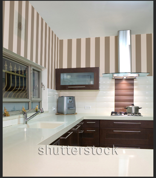
13.vanising point exercise
|
|
|
tool: adobe photoshop
STEPS:
STEPS:
- import photo of kitchen
- use tool "vanishing point" in filter adjust perspective of the two walls
- select and copy pattern image
- paste on the 'vanishing point' filter and adjust to the wall
- add render lighting, in point to create lighting effect
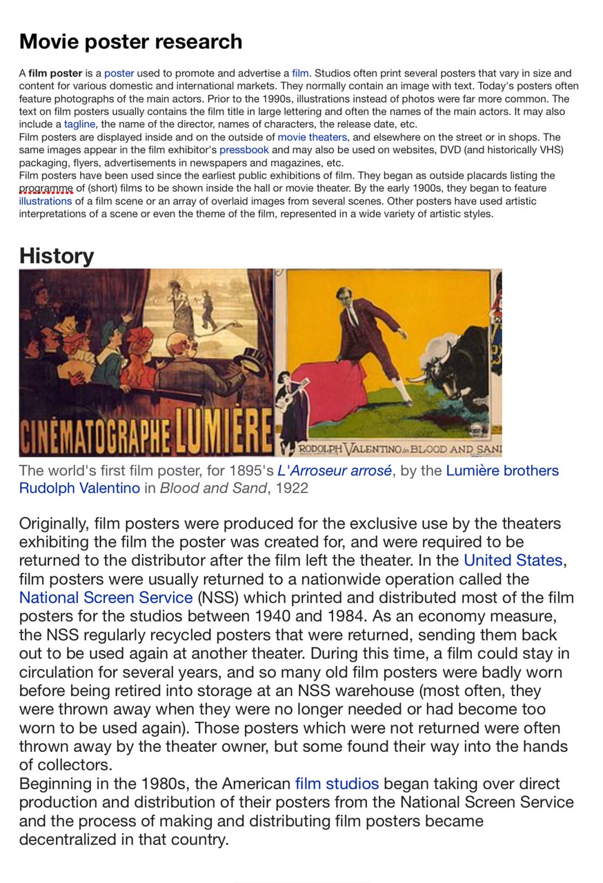
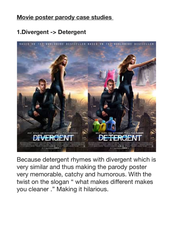
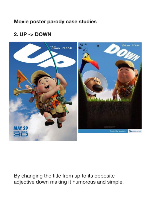
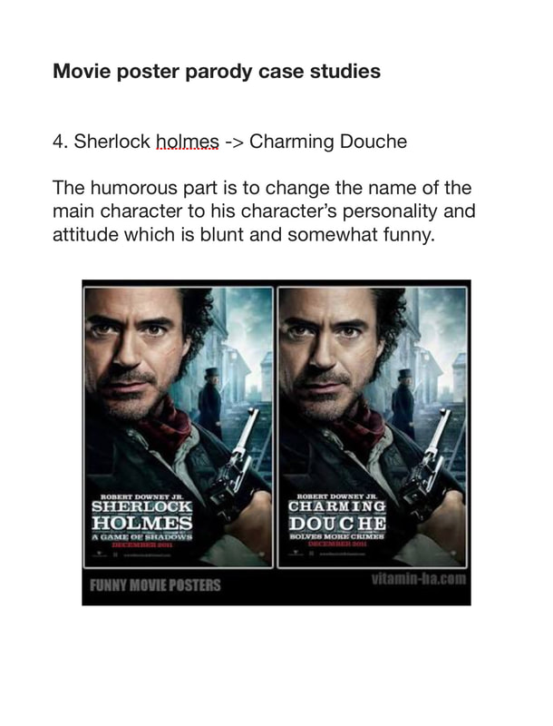
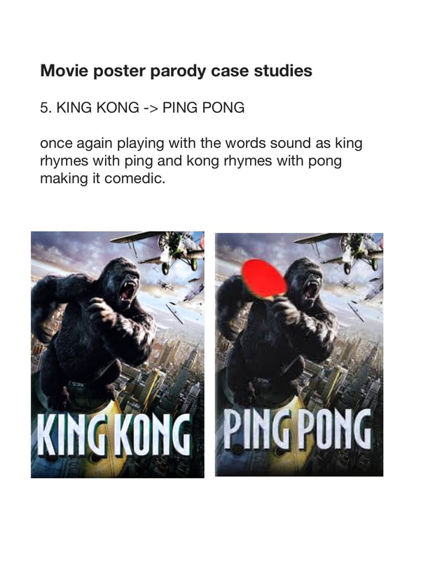
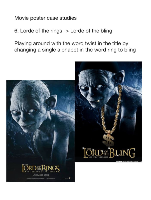
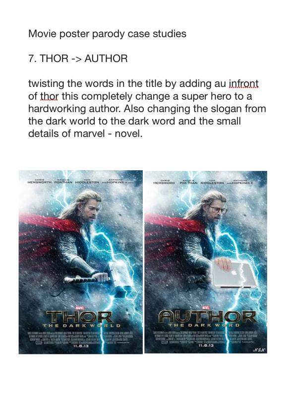
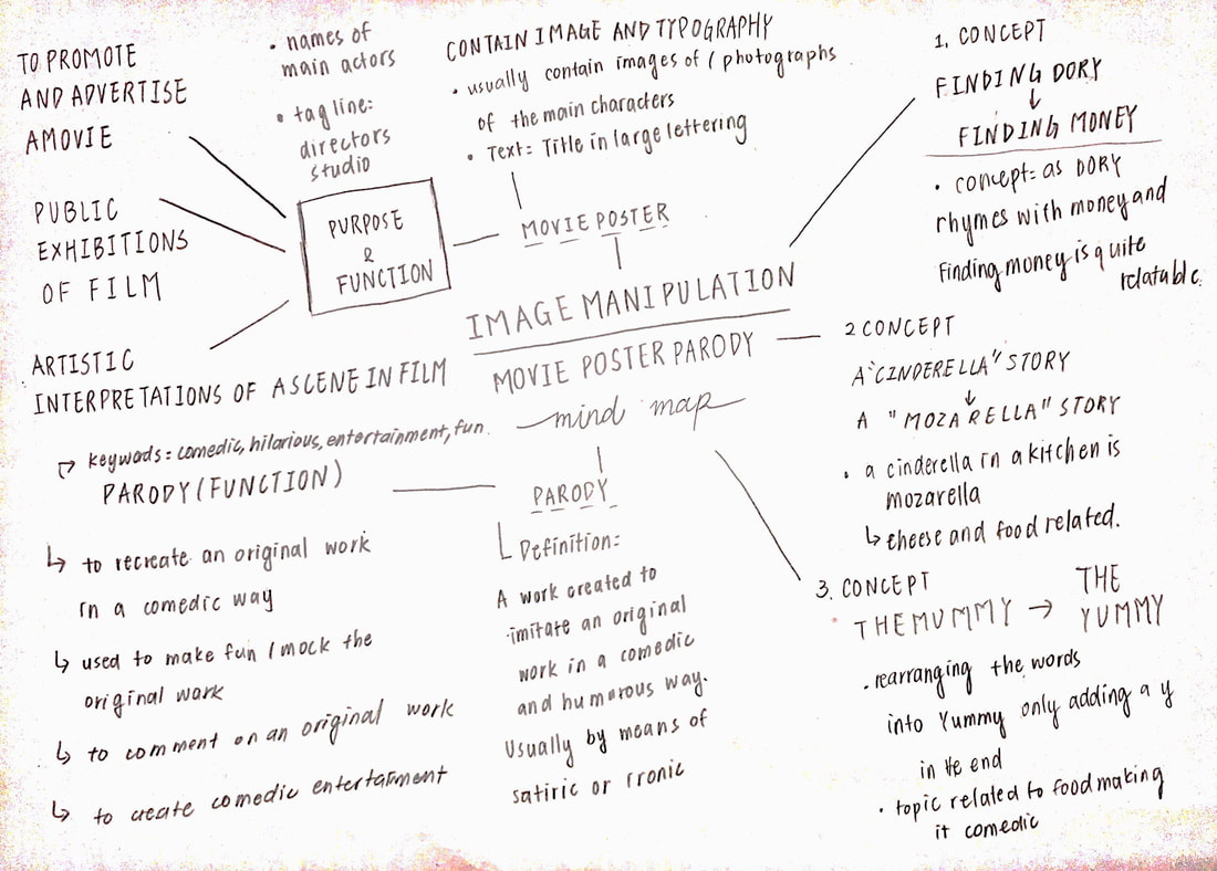
14.movie poster parody
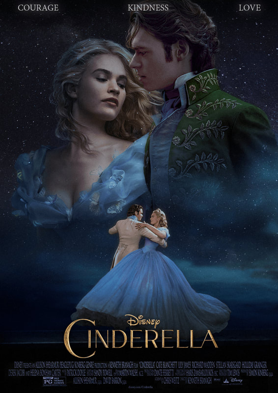
workflow1- movie poster research + movie poster parody case studies
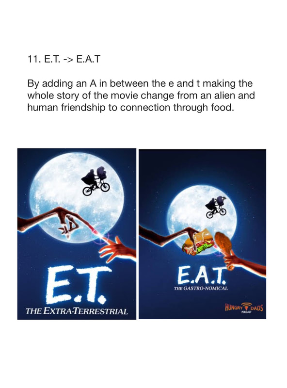
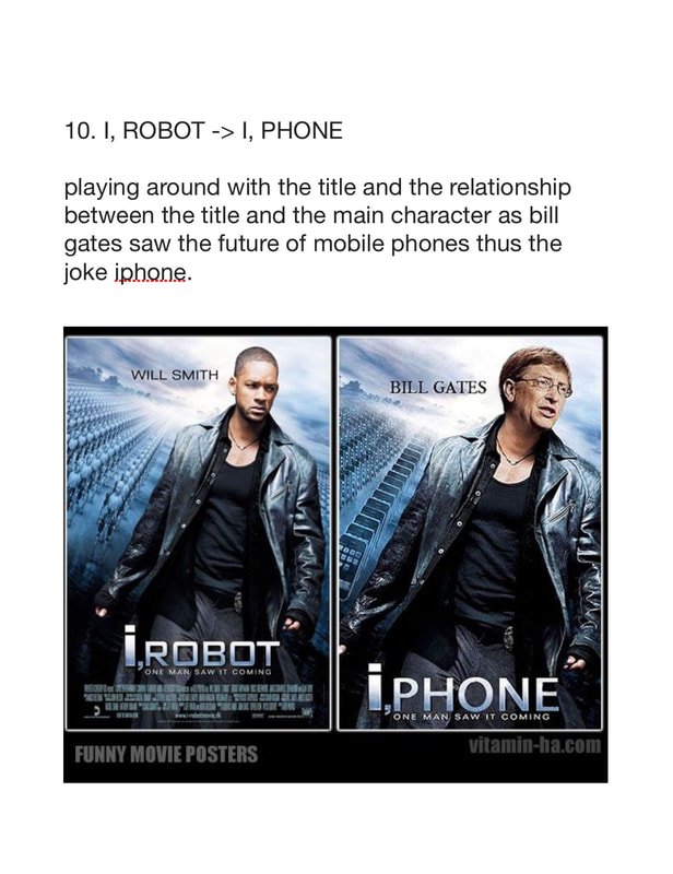
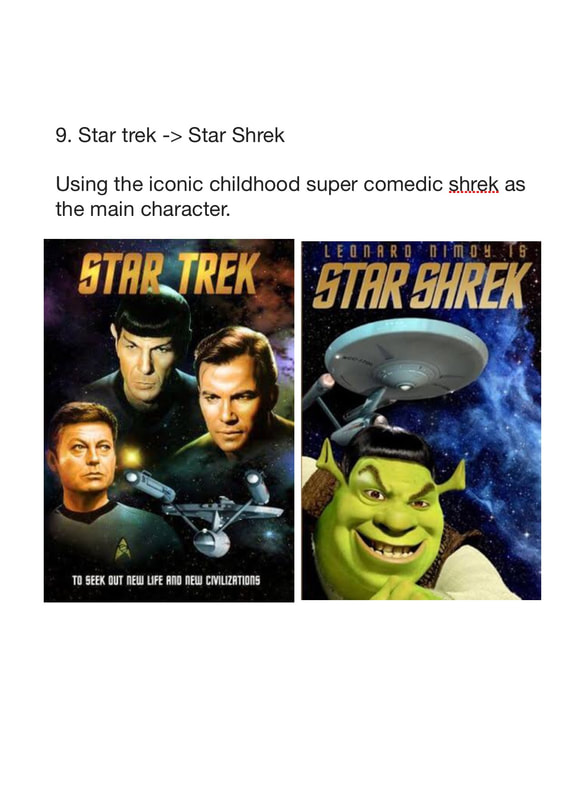
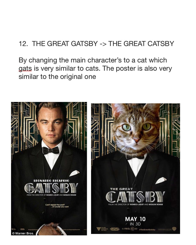
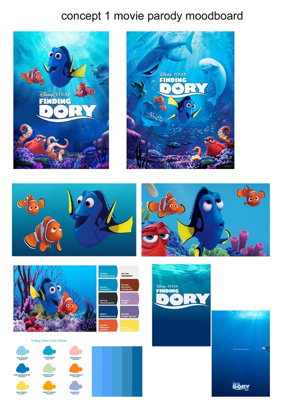
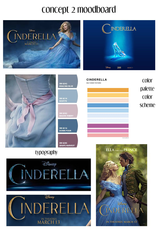
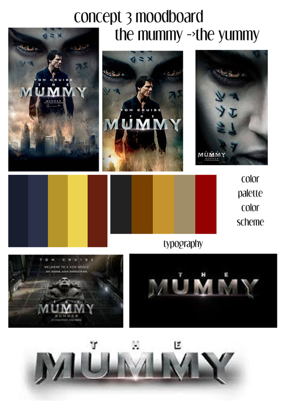
WORKFLOW2-moodboard
|
|
|
moodboards include poster reference and inspiration, the type face of the movie , the characters of the movie, and the color scheme of the movie poster and movie.
WORKFLOW2-mindmap and sketch
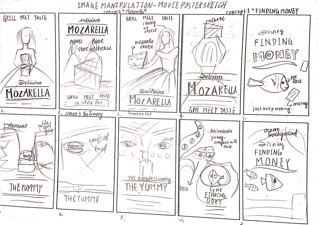
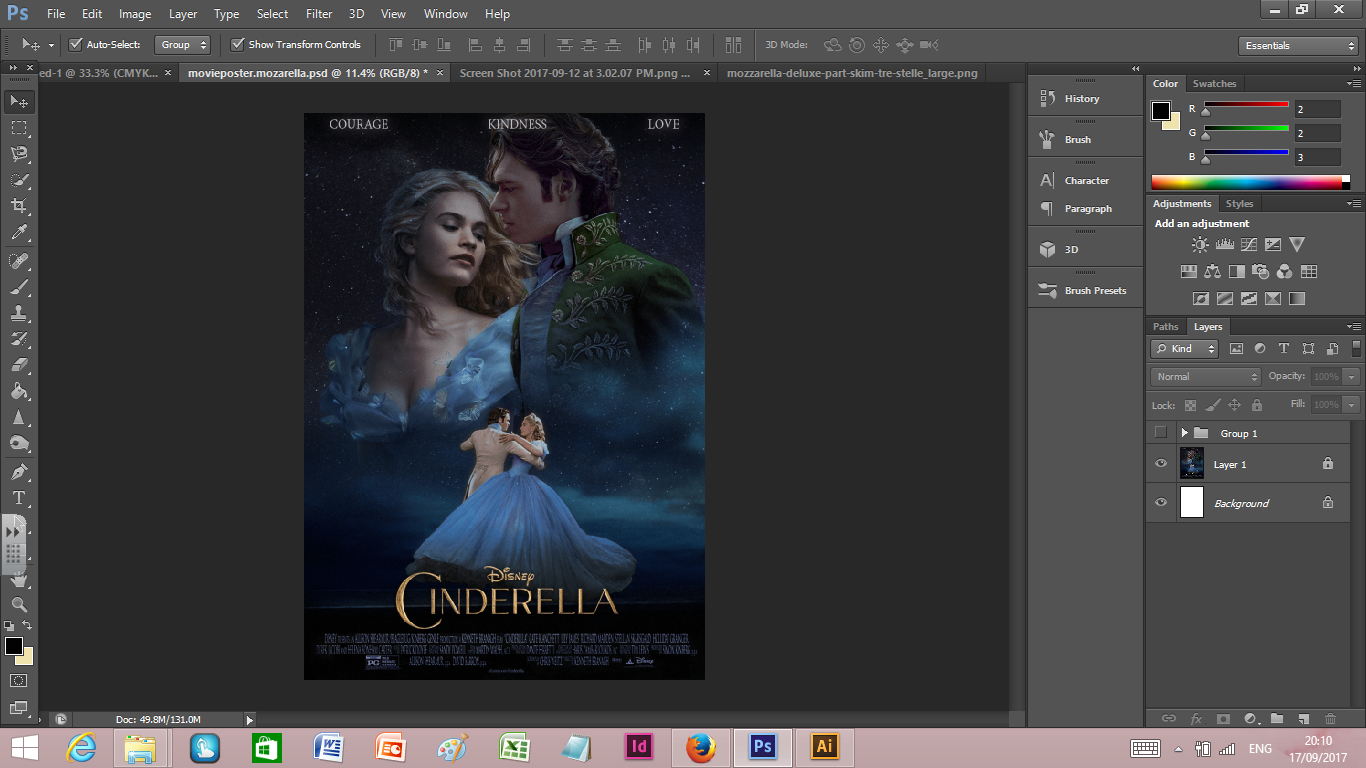
concepts explanation and swot analysis. the concepts i have came up with are 1. finding dory to finding money, trying to show the relatable topic that can make it hilarious and funny, however the weakness and threat of the concept is the characters are animated thus it would be hard to put real face on it it would be awkward.
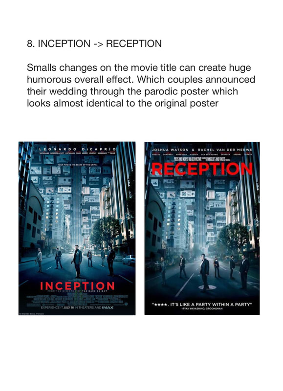
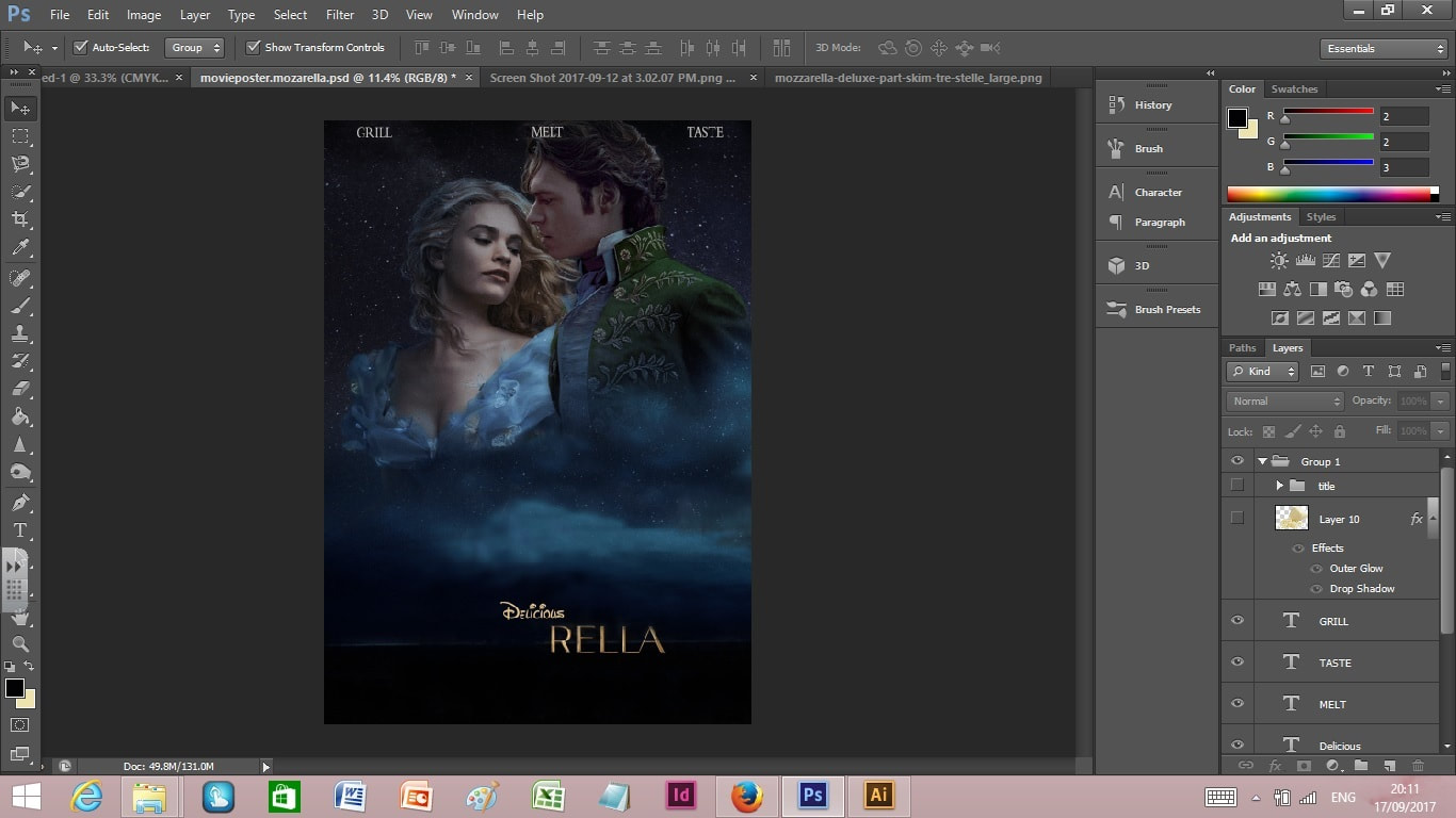
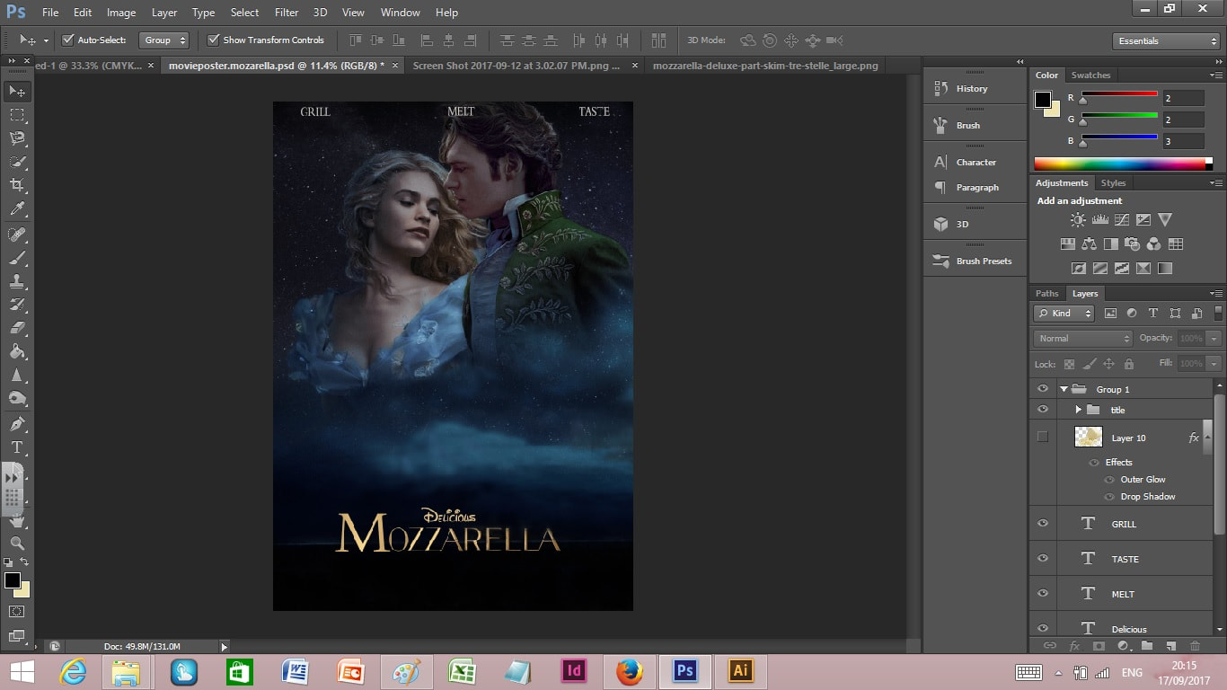
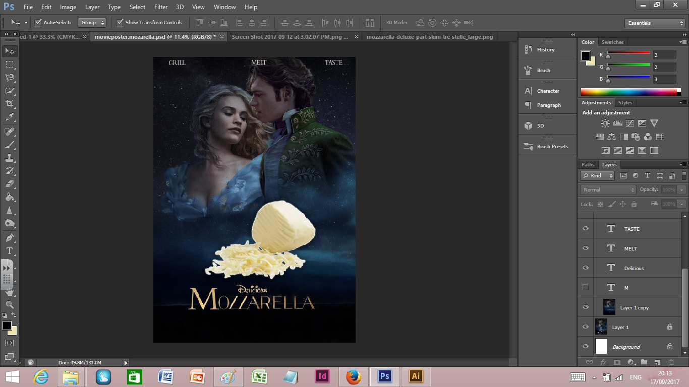
2. concept Cinderella to Mozzarella, thiis concept's strength is it rhymes with the original title which makes it catchy and easy to remember and the food topic is something hilarious and easy to related, the opportunity is that the disney can be changed to delicious and the subtitle or slogan 'love, kindness, courage' can be changed to 'grill melt taste' which makes it even more hilarious with the play and twist of words. the expressions on the character can also be parodic and hilarious. the weakness and thread iss that the only poster available online the resolution is not exactly perfectly hd making it a problem when printing, however i tried to minimize it by retyping all the credits and words so that it would be hd. this concept is chosen for the final as it hasthe most parodic and catchy approach.
3. the mummy to the yummy, this approach's strength is the parodic vibe of the food related topic. however, the original pposter color scheme and tone is very dark and glomy thus not so suitable for food related stuff, as the threat and weankess is it might not work well and not look appetizing, thus not chosen
PICTURES USED

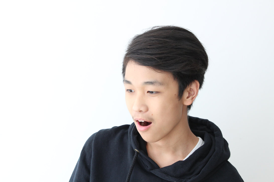
photoshoot taken in school using canon DSLR camera with model: myself and stefan whom is our classmate
WORKFLOW3-digital process
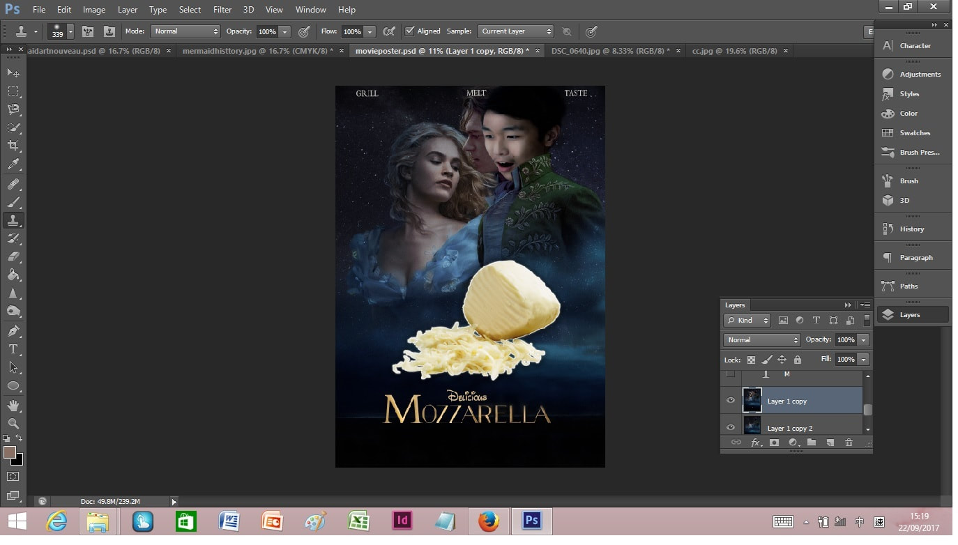
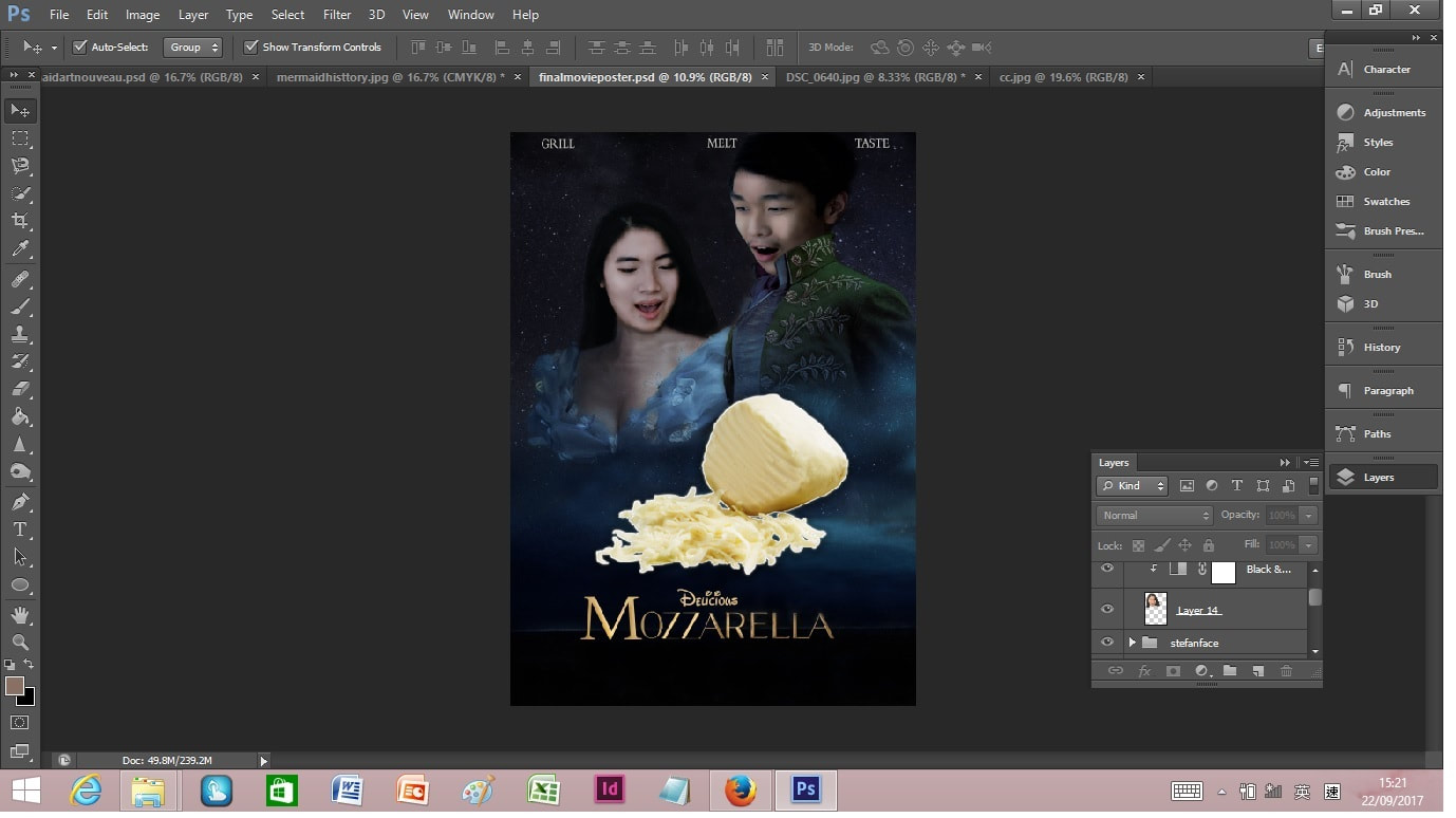
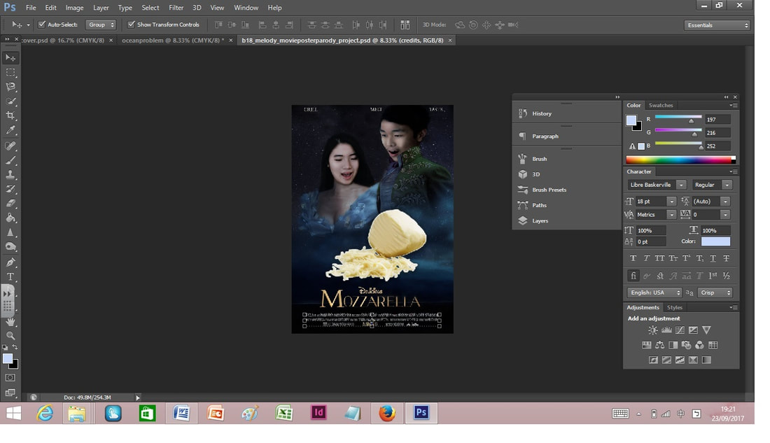
FINAL MOVIE POSTER
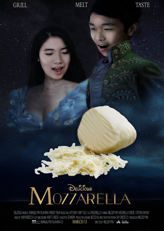
Image manipulation final movie poster parody
For the final assignment i have decided to make the parody of the movie Cinderella into Mozzarella. Since mozzarella rhymes with cinderella thus the title is very catchy and easy to remember also making it funny. It is hilarious because a story so magical and romantic can turn into something so simple yet beautiful and loved by everyone which is mozzarella. Since as i know so far everyone loves cheese thus the mozzarella joke is relevant and humorous. Furthermore the twist and play of words between disney to delicious and the slogan " love, kindness, courage" to " grill, melt, taste" also makes the poster funnier. Another parodic element is the facial expressions of the models which include myself. The credits are also changed to make the poster more hilarious such as " dram fairytale film to kitchen fairy tale". Lastly, throughout the whole process i was able to use the techniques i learnt in photoshop such as using dodge and burn tool , adjusting layers, masking, clown tool and more. Thus it was a great experience.
For the final assignment i have decided to make the parody of the movie Cinderella into Mozzarella. Since mozzarella rhymes with cinderella thus the title is very catchy and easy to remember also making it funny. It is hilarious because a story so magical and romantic can turn into something so simple yet beautiful and loved by everyone which is mozzarella. Since as i know so far everyone loves cheese thus the mozzarella joke is relevant and humorous. Furthermore the twist and play of words between disney to delicious and the slogan " love, kindness, courage" to " grill, melt, taste" also makes the poster funnier. Another parodic element is the facial expressions of the models which include myself. The credits are also changed to make the poster more hilarious such as " dram fairytale film to kitchen fairy tale". Lastly, throughout the whole process i was able to use the techniques i learnt in photoshop such as using dodge and burn tool , adjusting layers, masking, clown tool and more. Thus it was a great experience.
