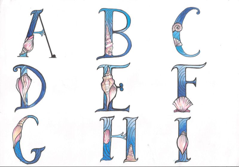
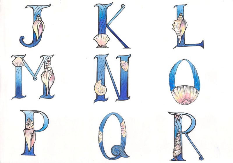
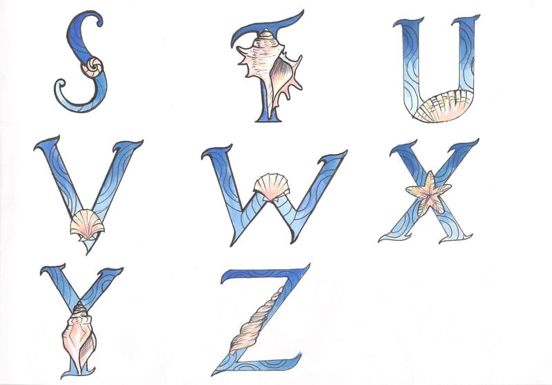
1. Design typeface based on favourite music genre
research, ,mindmap, doodle, moodboards.


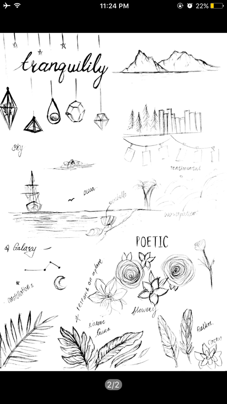


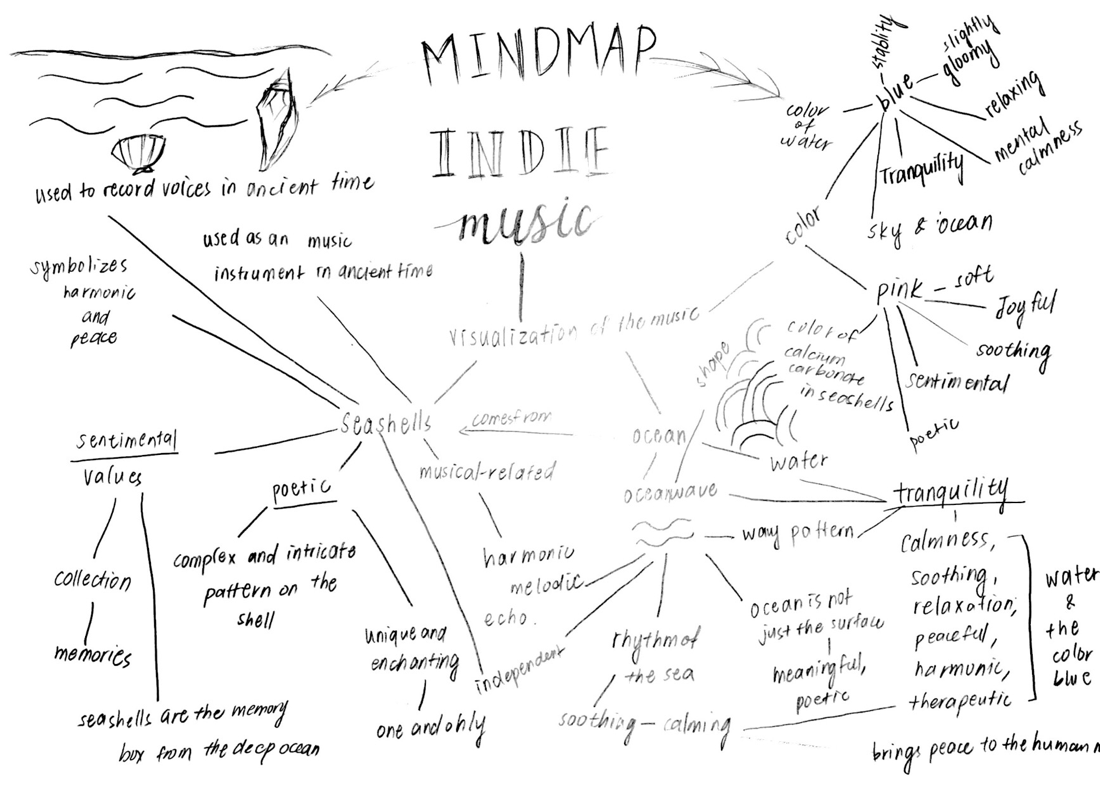

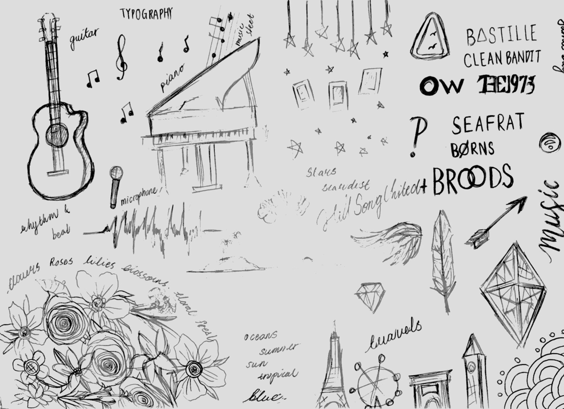
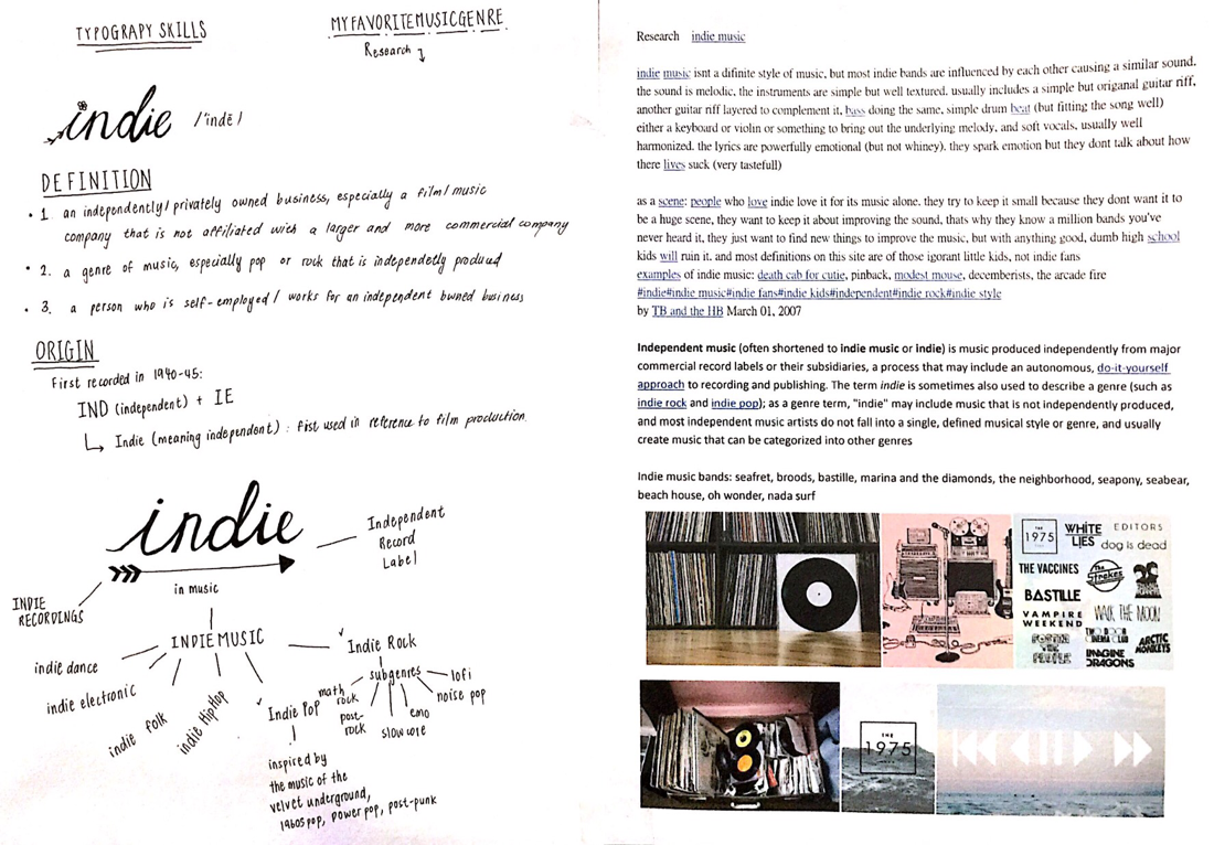
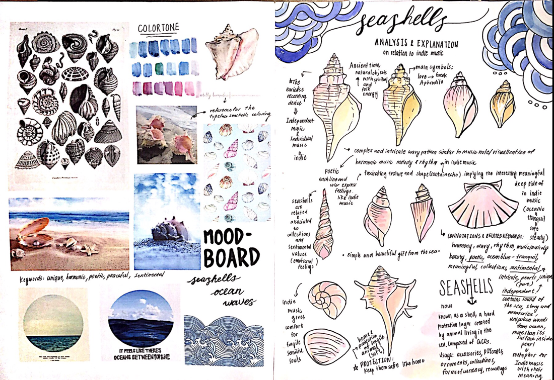


typeface design
|
|
|
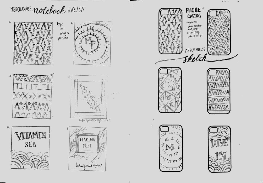
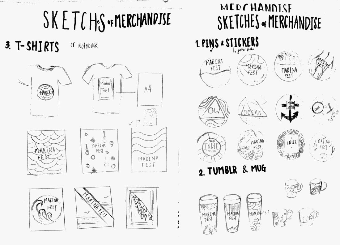
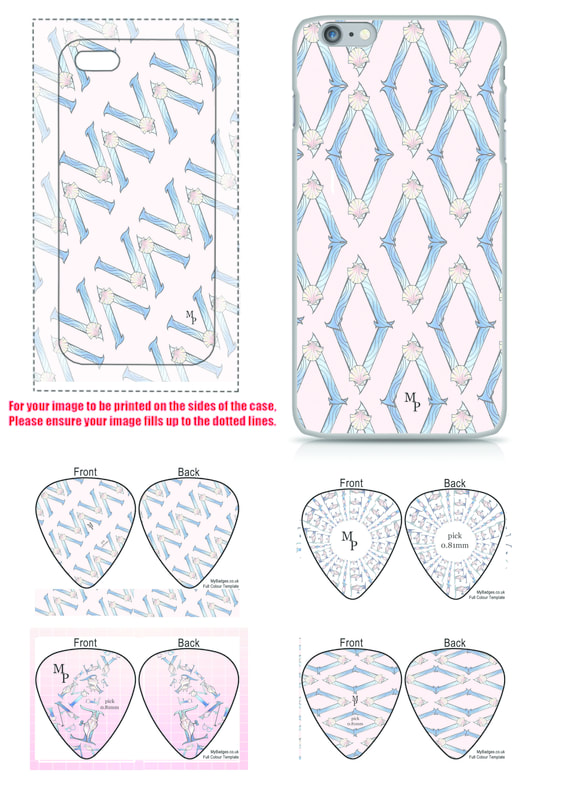
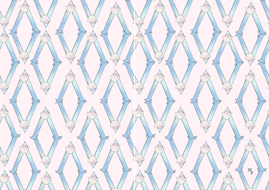
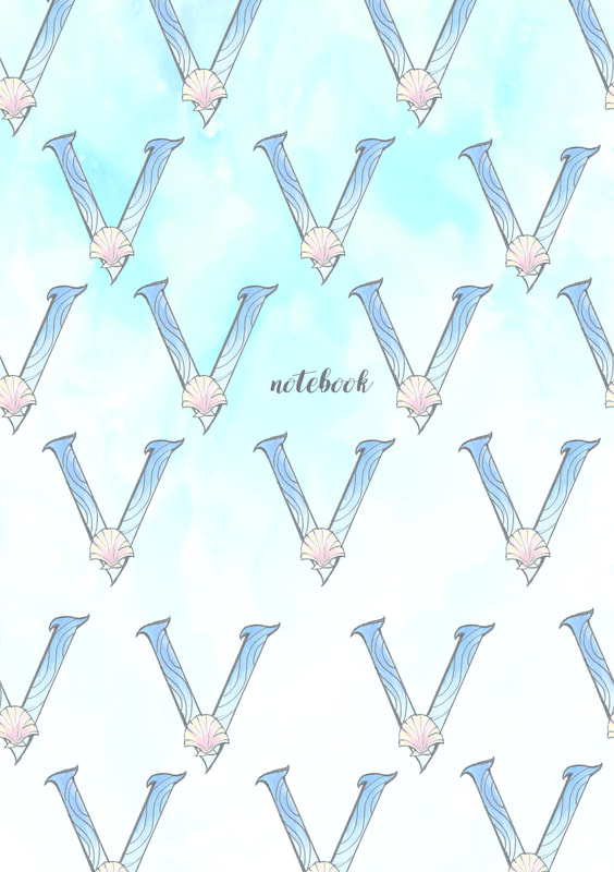
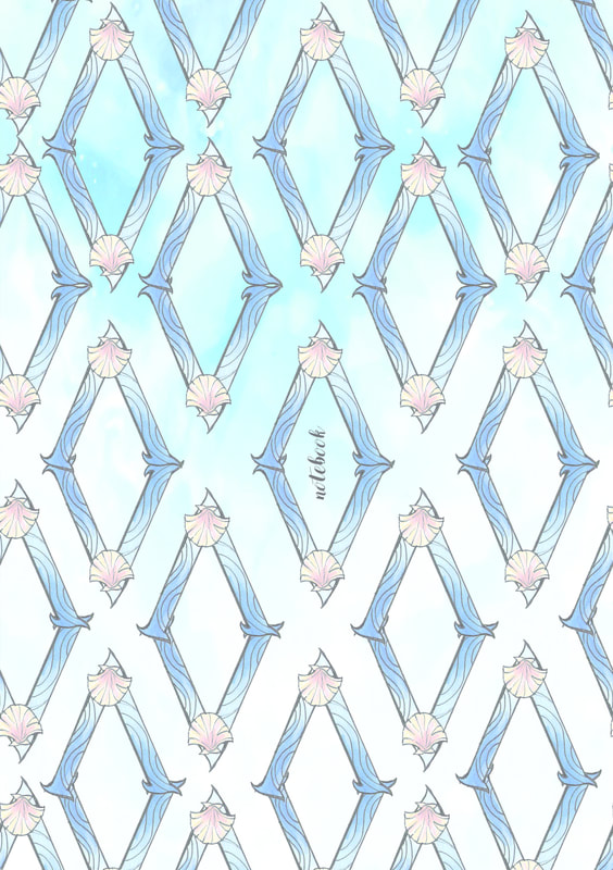
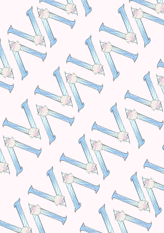
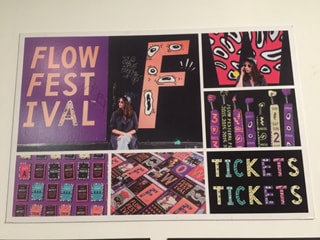
Merchandise
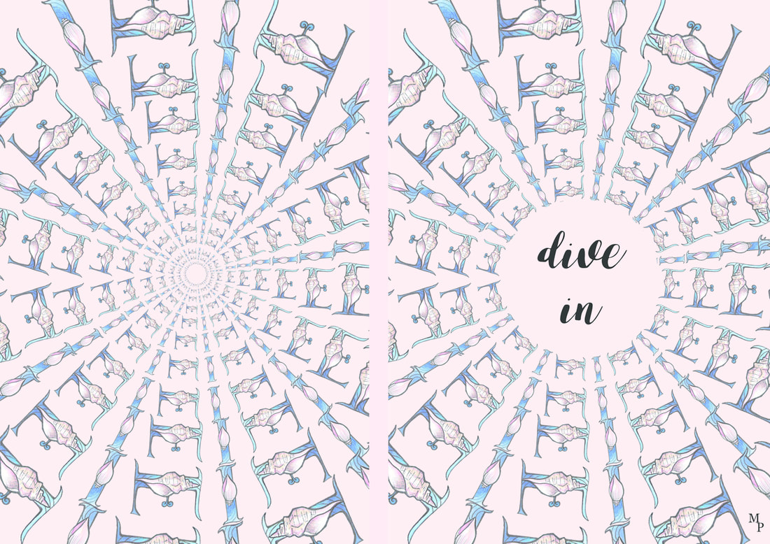
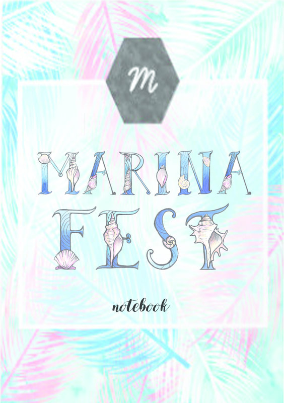
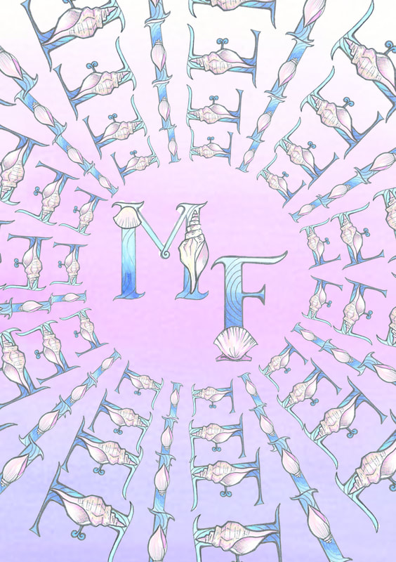
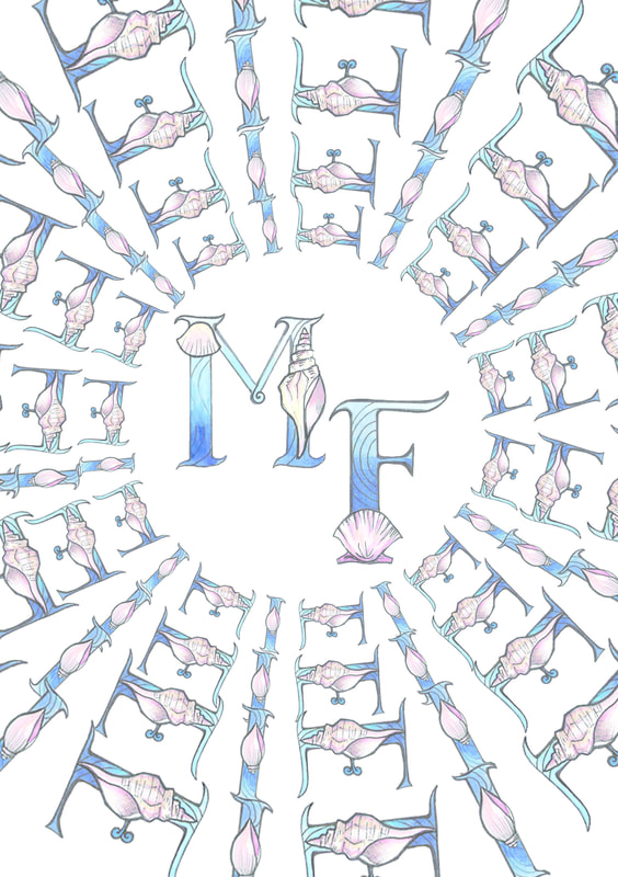
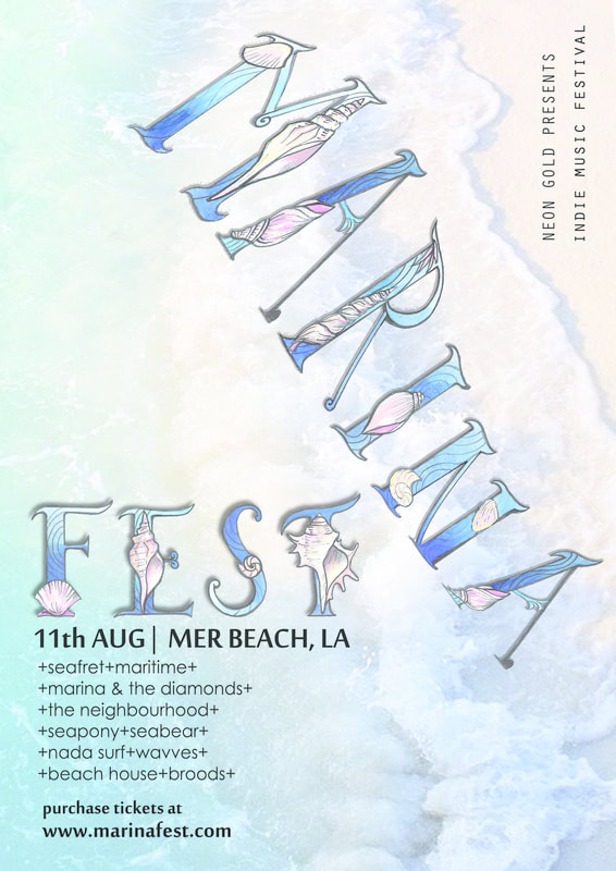
marina fest (indie music festival) poster trials and experimentations
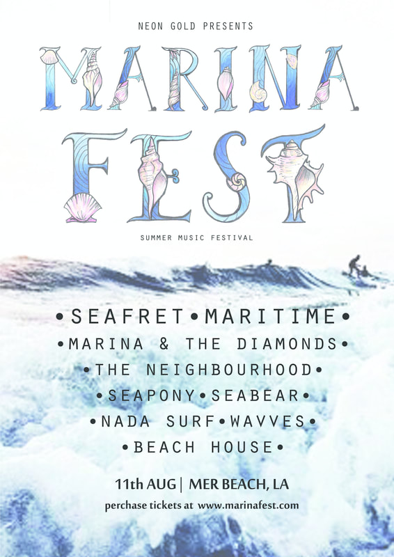
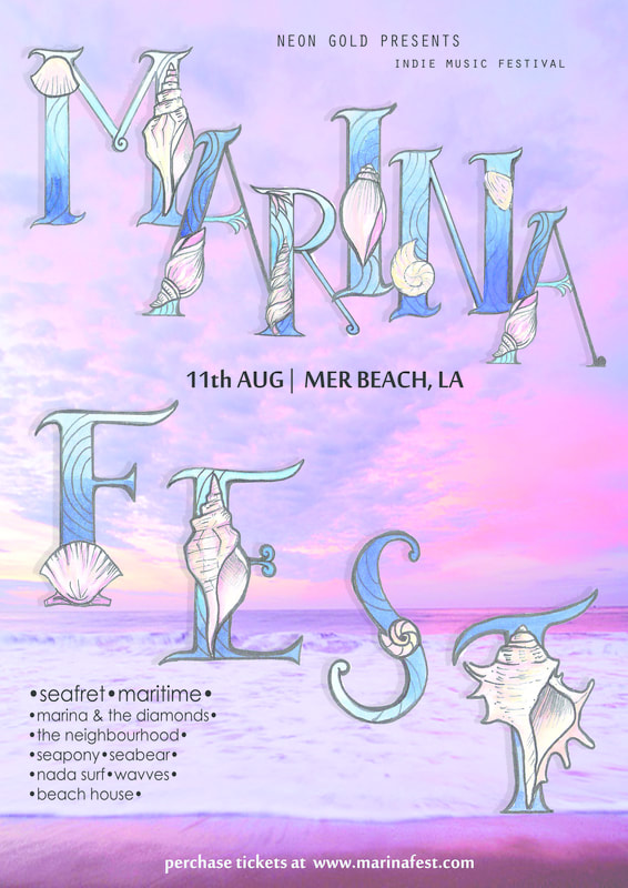
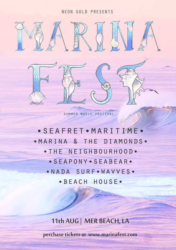
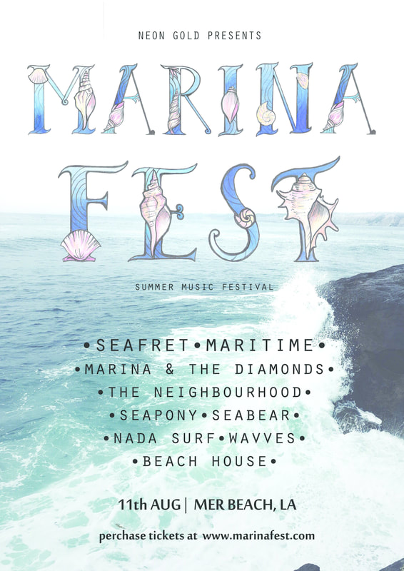
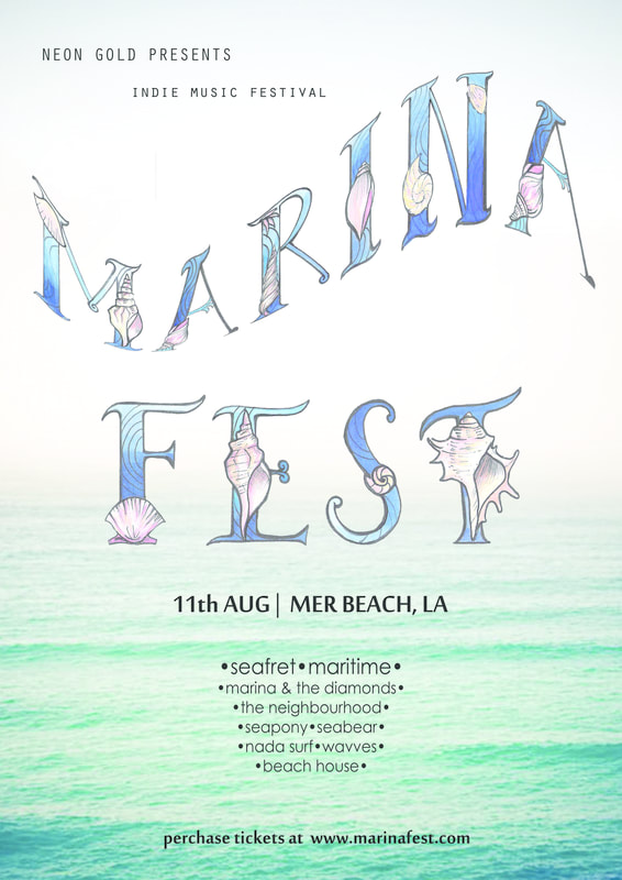
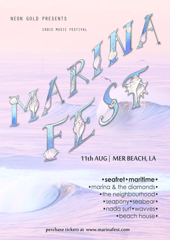
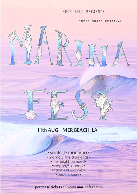
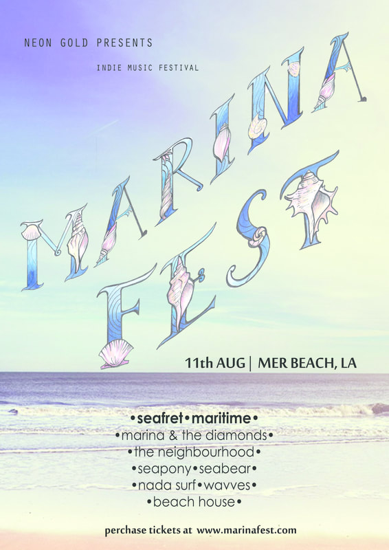
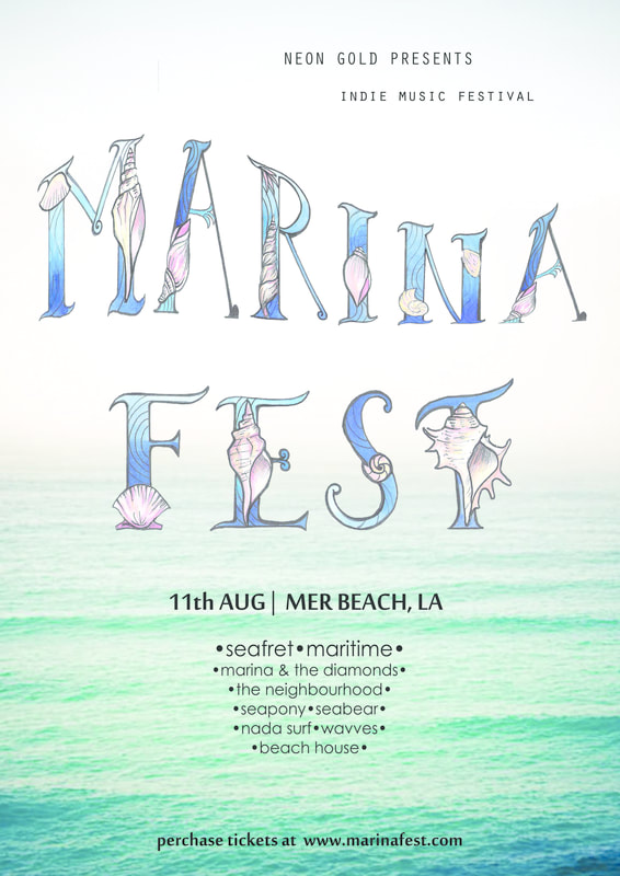
final poster .
2. typographic skills exercise 2
research: typography
按此處以編輯.
按此處以編輯.
|
|
“Illustrious” Origins
Writing is one of the most fundamental forms of communication, and it traces its roots back to hieroglyphs or pictograms. Used by ancient civilizations of the world to represent ideas, these images soon evolved into alphabets and phonographic writing, which led to the development of various typographic systems.
Typography has an “illustrious” history and is obviously a crucial aspect of graphic design. Sure enough, typeface designers need to have a thorough understanding of typography—especially its evolution over the centuries—in order to incorporate or revive older or even extinct typefaces, depending upon their requirements, and give the letters a modern touch.
Ancient Era – Saying it with PicturesAncient cave paintings that date back to 20,000 B.C. are perhaps the very first recorded written communication. However, formal writing is said to have been developed by the Sumerians at around 3,500 B.C.
As civilizations advanced, the need to communicate complex concepts grew—hence the development of Egyptian hieroglyphics. By 3100 B.C., the Egyptians began incorporating symbols or ideograms into their art, architecture and writings. Also, by 1600 B.C. Phoenicians developed phonograms, or symbols used to represent spoken words. At present, we have a number of phonograms laced in the English alphabet such as % to represent “percentage” and # to represent “number” and so on and so forth.
It is Phoenicians who are credited with creating the very first alphabet and around 1000 B.C.—the same alphabet was used by the Greeks. In fact, the word Alphabet is a combination of the first two Greek letters, Alpha and Beta.
The Romans, after several years, used this Greek Alphabet and on the basis of the same, styled the Uppercase Alphabet, which is still used today. They also refined the art of handwriting and fashioned a number of different styles of lettering. Additionally, they also introduced different scripts – formal and informal for official and unofficial writings respectively.
The Middle Ages – Handwritten and Well-Illustrated ManuscriptsThe Middle Ages were all about hand-written and well-illustrated manuscripts. It led to the evolution of a wide range of writing styles. Unicals and half unicals were prominent features, with rounded, elaborate lettering. The art of Calligraphy along with page layout and lettering forged new ground. Calligraphy masters travelled across the known world to share their knowledge with the educated elite.
The Book of Kells, c. AD 800, is lettered in a script known as “insular majuscule,” a variety of uncial script that originated in Ireland. (Image source)
Gutenberg and Modern TypographyAs we all learned in history class, the development of moveable type and the printing press in the 15th century by Johannes Gutenberg was a turning point for the modern world—and, of course, modern typography. During this time, both practical and decorative typefaces appeared en masse, along with a lighter, more ordered page layout with subtle illustrations.
By the Industrial Revolution typography was all about communicating with the masses. Through signs, posters, newspapers, periodicals and advertisements, typefaces became larger and catchier, with bolder lettering and shading—as well as experimental serif and sans serif typefaces. Ornamental typography was another major highlight in this era. In the 1800’s, medieval art and hand crafted individual art has become commonplace, and international artistic styles developed considerably.
Shifting to the PresentGraphic designers these days have the luxury of endless tools and technology to create a wide range of typographic styles and even entire families of font families and typefaces. Armed with the knowledge of typographic history, graphic designers can expand their horizons and enhance their skills to produce a much more refined body of work.
Understanding the various visual communication principles in typography since the beginning of time can help designers determine which elements have more or less remained the same and which ones have evolved with time—as well as the factors that contributed to their success or failure.
From ancient typographic styles to classic movable type, the history of typography can help designers develop a more informed and cohesive style that builds on the past. There is so much to learn from the past, and so much inspiration to be discovered.
History also allows designers to learn from the past mistakes, understand common threads, reinvent classic letterforms and develop innovative typographic styles, which they can proudly add to an existing portfolio or body of work.
In ConclusionThe practically-endless body of work that represents typography makes it impossible for graphic designers nowadays to become familiar with each and every typeface design that exists. However, it is important that to be well-versed in typographic styles, iconic typefaces from the past, and the origins of common typefaces. It’s not just about theoretical knowledge, either; a strong foundational understanding of typographic history helps designers understand and meet the needs of their clients more effectively.
source: http://www.printmag.com/typography/evolution-typography-history/
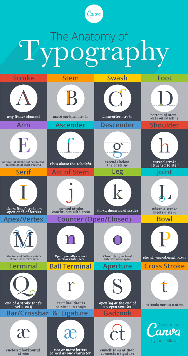
2.type terminology
https://designschool.canva.com/blog/typography-terms/
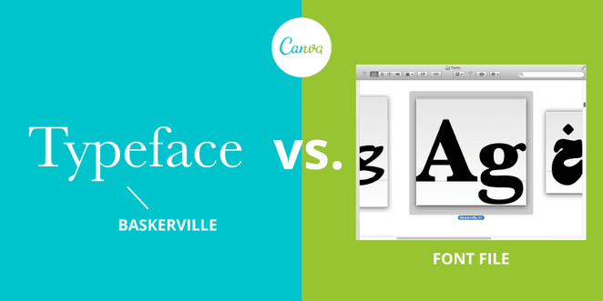
01.typeface/font:
A collection of letters, numbers, punctuation, and other symbols used to set text (or related) matter. Although font and typeface are often used interchangeably, font refers to the physical embodiment (whether it’s a case of metal pieces or a computer file) while typeface refers to the design (the way it looks). A font is what you use, and a typeface is what you see.
02. Character:
An individual symbol of the full character set that makes up a typeface; may take the form of a letter, number, punctuation mark, etc.
03. Serif:
A short line or stroke attached to or extending from the open ends of a letterform; also refers to the general category of typefaces that have been designed with this feature.
04. Sans-Serif / Sans:
Literally “without line”; the general category of typefaces (or an individual typeface) designed without serifs.
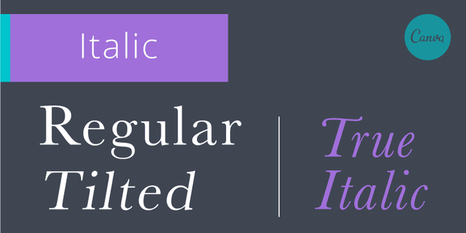
05. Italic:
A slanted version of a typeface (slants from left to right); a true italic is uniquely designed, more than a tilted version of the upright (a.k.a. “roman”) typeface.
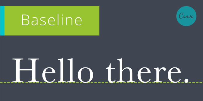
06. Baseline:
The imaginary line on which most letters and other characters sit.
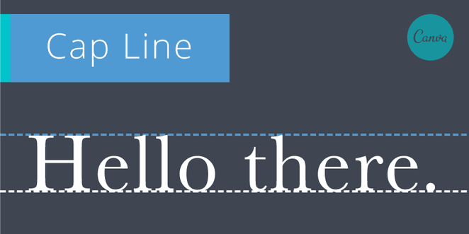
07. Cap Line:
The imaginary line that marks the upper boundary of capital letters and some lowercase letters’ ascenders (see Ascender definition in the next section).
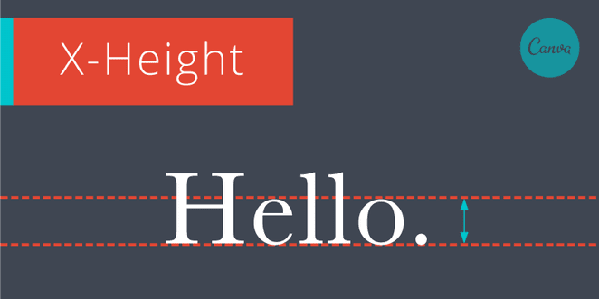
08. X-Height:
The height of a typeface’s lowercase letters (disregarding ascenders and descenders).
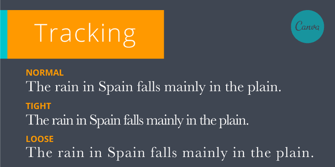
09. Tracking / Letter-Spacing:
The uniform amount of spacing between characters in a complete section of text (sentence, line, paragraph, page, etc.).
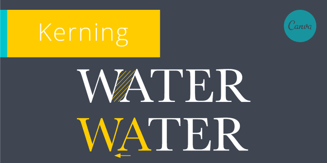
10. Kerning:
The horizontal spacing between two consecutive characters; adjusting the kerning creates the appearance of uniformity and reduces gaps of white space between certain letter combinations.
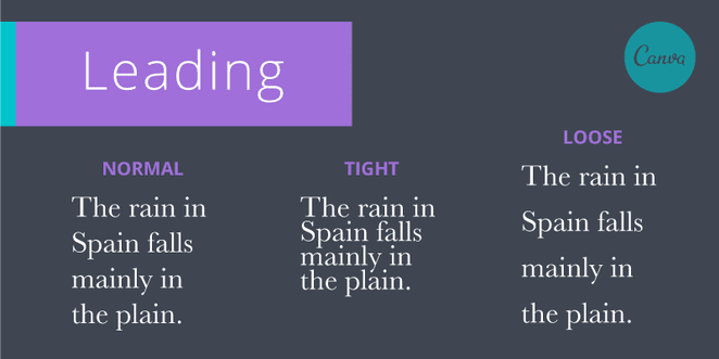
11. Leading / Line-Spacing:
The vertical spacing between lines of text (from baseline to baseline).
https://designschool.canva.com/blog/typography-terms/
01.typeface/font:
A collection of letters, numbers, punctuation, and other symbols used to set text (or related) matter. Although font and typeface are often used interchangeably, font refers to the physical embodiment (whether it’s a case of metal pieces or a computer file) while typeface refers to the design (the way it looks). A font is what you use, and a typeface is what you see.
02. Character:
An individual symbol of the full character set that makes up a typeface; may take the form of a letter, number, punctuation mark, etc.
03. Serif:
A short line or stroke attached to or extending from the open ends of a letterform; also refers to the general category of typefaces that have been designed with this feature.
04. Sans-Serif / Sans:
Literally “without line”; the general category of typefaces (or an individual typeface) designed without serifs.
05. Italic:
A slanted version of a typeface (slants from left to right); a true italic is uniquely designed, more than a tilted version of the upright (a.k.a. “roman”) typeface.
06. Baseline:
The imaginary line on which most letters and other characters sit.
07. Cap Line:
The imaginary line that marks the upper boundary of capital letters and some lowercase letters’ ascenders (see Ascender definition in the next section).
08. X-Height:
The height of a typeface’s lowercase letters (disregarding ascenders and descenders).
09. Tracking / Letter-Spacing:
The uniform amount of spacing between characters in a complete section of text (sentence, line, paragraph, page, etc.).
10. Kerning:
The horizontal spacing between two consecutive characters; adjusting the kerning creates the appearance of uniformity and reduces gaps of white space between certain letter combinations.
11. Leading / Line-Spacing:
The vertical spacing between lines of text (from baseline to baseline).
3. digital type
A Brief History of Digital Type
With the advent of desktop publishing, type design and manufacturing entered a new era. The “analog” letterforms of metal and photo type were converted to a variety of digital formats. The first generation of technology resulted in “bitmap” fonts – comparable to superimposing a sheet of graph paper over a drawn letter and coloring in the boxes (pixels) that fell within the outline of that letter. Bitmapped fonts had the advantage that they could be carefully edited for quality and readability. They also had, however, the disadvantage of requiring a separate font for each size and resolution, thereby taking up a relatively large amount of memory.
The next, and current, generation of digital font technology provides for “scalable” outline fonts. They are smaller in memory size and faster to process. Analog drawings of letters are plotted with a mouse or stylus to create an outline representation (made up of curves and straight lines). These digitized outlines are made into a font that is installed in a computer operating system.
An application program (such as Microsoft Word or Quark Xpress) will scale the outline font to the requested size (like 12 point) and resolution (a 72 dot per inch [dpi] screen or 600 dpi laser printer, for instance). The outline is then “scan converted” or “rasterized”, which turns on pixels that lie within the area of the scaled outline. The resulting image is then sent to a screen or printer.
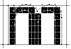
The resulting bitmaps at small sizes and resolutions (particularly video display screens) may be of poor quality, due to there being fewer pixels with which to render the fine detail of a letterform. Font technologies in use today (primarily PostScript, True Type, Microtype) have strategies for improving the quality for greater readability. Variously called “hints”, “instructions” or “intelligence”, the intent is to identify key features of the members of the font and ensure they behave consistently when displayed. For example, the widths of the 3 stems of a lower case “m” need to be the same number of pixels to be properly readable at small sizes. Hints improve the consistency of letterform shapes and their alignment when rasterized.
A Brief History of Digital Type
With the advent of desktop publishing, type design and manufacturing entered a new era. The “analog” letterforms of metal and photo type were converted to a variety of digital formats. The first generation of technology resulted in “bitmap” fonts – comparable to superimposing a sheet of graph paper over a drawn letter and coloring in the boxes (pixels) that fell within the outline of that letter. Bitmapped fonts had the advantage that they could be carefully edited for quality and readability. They also had, however, the disadvantage of requiring a separate font for each size and resolution, thereby taking up a relatively large amount of memory.
The next, and current, generation of digital font technology provides for “scalable” outline fonts. They are smaller in memory size and faster to process. Analog drawings of letters are plotted with a mouse or stylus to create an outline representation (made up of curves and straight lines). These digitized outlines are made into a font that is installed in a computer operating system.
An application program (such as Microsoft Word or Quark Xpress) will scale the outline font to the requested size (like 12 point) and resolution (a 72 dot per inch [dpi] screen or 600 dpi laser printer, for instance). The outline is then “scan converted” or “rasterized”, which turns on pixels that lie within the area of the scaled outline. The resulting image is then sent to a screen or printer.
The resulting bitmaps at small sizes and resolutions (particularly video display screens) may be of poor quality, due to there being fewer pixels with which to render the fine detail of a letterform. Font technologies in use today (primarily PostScript, True Type, Microtype) have strategies for improving the quality for greater readability. Variously called “hints”, “instructions” or “intelligence”, the intent is to identify key features of the members of the font and ensure they behave consistently when displayed. For example, the widths of the 3 stems of a lower case “m” need to be the same number of pixels to be properly readable at small sizes. Hints improve the consistency of letterform shapes and their alignment when rasterized.
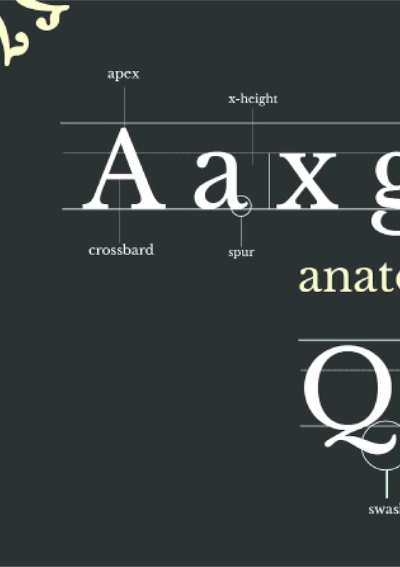
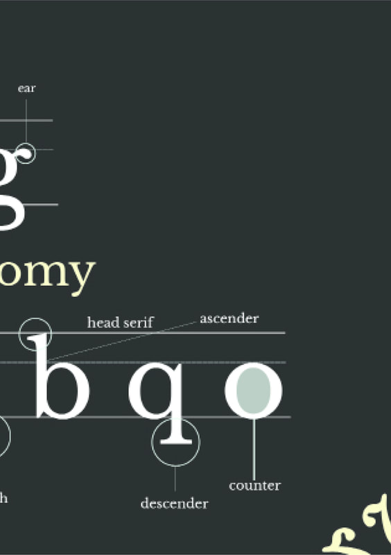
4. anatomy of type
5. type families
|
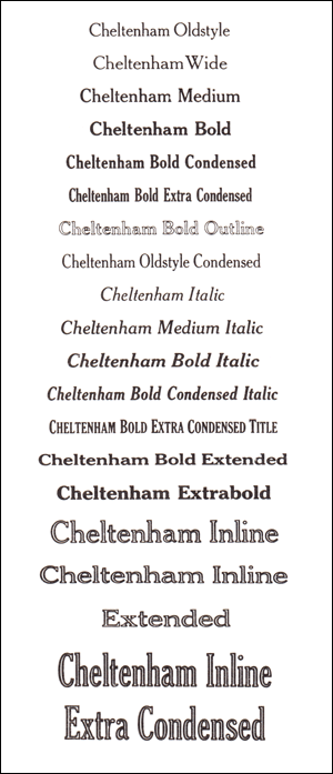
Modern Type Families-
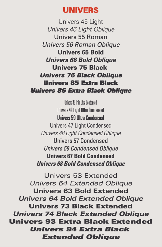
When typefaces were first invented, the notion of having a family of type hadn’t occurred to anyone. All fonts were simply roman designs. In the early 16th century, cursive – or italic (named after Italy, where the idea was popularized) – type was introduced. There were still no typeface families; romans were one style of type and italics were another – much like serif and sans serif.In the late 1700s, foundries began to release fonts in families – pairing roman and italic designs that matched each other in style. Later the concept of typeface weights and proportions was added to the typeface family mix. In the 20th century, type families were enlarged even further with the introduction of different designs such as condensed, expanded and outlined.The person generally credited with conceiving the modern idea of a typeface family is Morris Fuller Benton, director of typeface development for American Type Founders in the late 19th and early 20th centuries. Benton’s premise was that typefaces within a family would share the basic characteristics of the parent design, but with individual variances. The Cheltenham, Century, Cloister, and Stymie typeface families are just a few of the designs developed under Benton’s watchful eye.Benton’s original vision has been expanded several times over the decades; type families have become larger, more diverse and better thought-out. Planning by the Numbers- In 1957, the Swiss type designer Adrian Frutiger designed a new kind of type family. Because he felt that the traditional system of providing names – “bold,” “semi-bold,” “semi-bold condensed” and so on – was confusing and outdated, he proposed a logical, systematic numbering scheme. In Frutiger’s system, each typeface was given a two-digit suffix. The first digit classified the alphabet weight, with 3 indicating the lightest weight in the family and 9 the boldest. The second digit identified the typeface proportion, with higher numbers for condensed designs and lower numbers for expanded designs. In addition, if the second number was odd, the typeface was a roman design; if it was even, the typeface was italic. Thus Univers 39 is a very light condensed roman, while Univers 56 is a medium-weight italic of normal proportions. Neue Helvetica and Serifa are two other type families that use this numbering system. |
|
|
Extended Type Families-
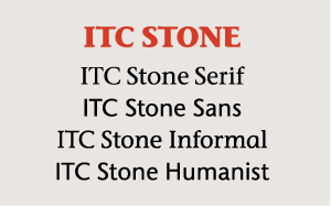
Some typeface families are made up of two or more sub-families. ITC Stone is a good example. Its sub-groups consist of Serif, Sans, Humanistic and Informal. Each design has roman and italic versions in three weights for a total of 24 individual typefaces. The four designs share the same cap height, lowercase x-height, stem weight and general proportions. Each typeface, however, is designed to stand on its own as a useful, distinctive communication tool. Thesis and ITC Legacy are two other popular typeface families that are made up of sub-families. |
|
|
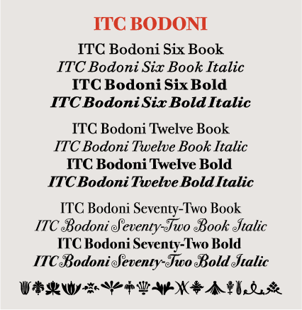
Size-specific Families- Another kind of type family has different designs for use at different sizes. ITC Bodoni is such a family. It’s comprised of three size-sensitive variants, named Six, Twelve, and Seventy-Two. These were designed to emulate the differences in the progressively-sized metal punches that Giambattista Bodoni created for his original fonts. The numerical designation indicates the optimum point size at which each design should be set – but, as with most typographic decisions, there are no hard and fast rules. FB Californian and ITC Founders Caslon are two newer size-specific typeface families. https://www.fonts.com/content/learning/fontology/level-1/type-families/about-typeface-families |
|
6. what is grid?
noun: grid; plural noun: grids
- 1.
a framework of spaced bars that are parallel to or cross each other; a grating.
"the metal grids had been pulled across the foyer"
synonym:grating, mesh, grille, gauze, lattice
"a metal grid" - 2.
a network of lines that cross each other to form a series of squares or rectangles.
"a grid of tree-lined streets"
7. top 10 typefaces
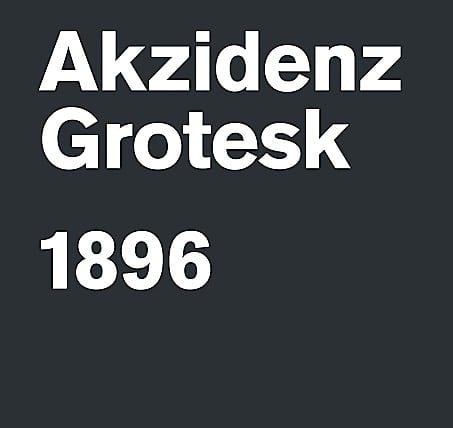
1.Akzidenz-Grotesk
Probably the best typeface ever designed. First released by the Berthold Type Foundry in 1896 in Germany, its popularity increased after it was developed in the 1950s under the direction of Günter Gerhard Lange with a wider range of weights and variants. Akzidenz influenced a whole range of other fonts including the infamous Max Miedinger’s Helvetica and Adrian Frutiger’s Univers – though neither of these has the detail and elegance of Akzidenz. Its strength derives from its neutrality and the fact that it doesn’t overdominate when used, allowing the designer more freedom and versatility
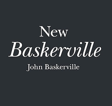
2.New Baskerville
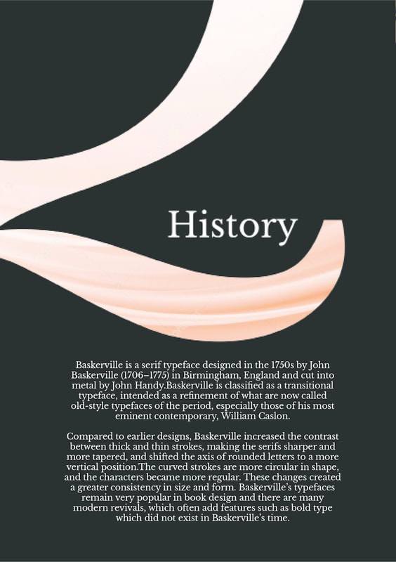
Probably the best serif typeface ever designed. Not showy but full of confidence, Baskerville is known as a transitional serif typeface and was originally designed in 1757 by John Baskerville (1706–1775) in Birmingham. A transitional typeface is positioned between the old-style typefaces of William Caslon, and the modern styles of Bodoni and Didot. Since then many versions have been produced by various type foundries including this popular New Baskerville version. What really makes it work is the way the roman and italic versions are successful whether used together or individually
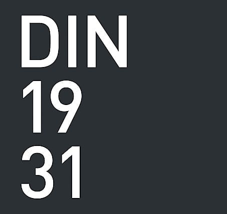
3.DIN 1451
Designed in 1931 for the German standards body DIN – Deutsches Institut für Normung (German Institute for Standardisation) – it looks and behaves as if it had been produced today. It extols all of the principles of the Bauhaus and has not dated in any way. It has two strong characteristics – first, it is a condensed font, meaning on a very simplistic level that it creates a strong mass when used as text and therefore the type can become more of a shape. Second, it has a quietly beautiful rounded detail, which makes it feel like it was designed for the age of computers, but still retains a gentleness
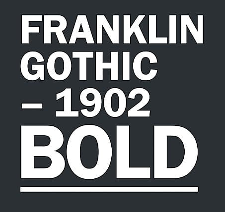
4.Franklin Gothic
Produced by the American type designer Morris Fuller Benton (1872–1948) in 1902, it reflects everything that America was aspiring to and would become – confident, bold and expressive. It’s American through and through. The bold version I think is best: its blackness is just so powerful. Franklin Gothic has more character than other realist sans serif fonts. I’ve always believed Franklin Gothic works best next to a more subtle, sensitive font. The best example was seen in the groundbreaking work by the American-based French designer Fabien Baron for Vogue Italia in the late 1980s
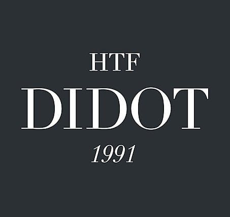
5.HTF Didot
This is a revival font. I could have chosen Bodoni, which I also love, but Didot gets the nod over its Italian sibling. However, it’s this particular cut by the type designers Jonathan Hoefler and Toby Frere-Jones that I think is something near to perfection. It was created for the Harper’s Bazaar magazine in the 1980s for the aforementioned Fabien Baron. It just feels like a fashion font – effortlessly beautiful but honed and crafted. But beware – it is tricky to use as it’s so delicate. It needs to be handled with care as the characters have extremes of thicks and hairline thins. It’s simply beautiful
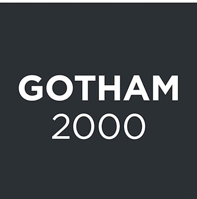
6.Gotham
Released in 2000 by Hoefler and Frere-Jones, this clean, modern sans serif typeface has become possibly the most popular font for designers over the last 13 years. It is rumoured to be Obama’s favourite typeface but I’m not sure whether this is just an urban myth; it was, however, specifically used by the Obama campaign during the 2008 election. Originally commissioned by GQ magazine, it is very much an American font in that its design was inspired by the lettering found on the architecture of New York City
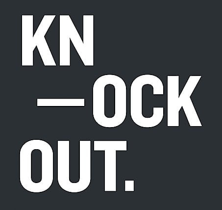
7.Knockout
Knockout gets my vote almost just for its name. All the variants are based on different boxing weights. It is another design from the Hoefler and Frere-Jones type foundry, consisting of a family of 32 different sans serif weights. Knockout’s nine-width, four-weight family offers a range of options that cannot be achieved with even the best modern sans serifs. Most fonts begin their life with maybe just a regular, bold and italic version. If a design is successful then more weights are added as required over the years. Knockout was created as a family from the outset and therefore has achieved instant integration and balance
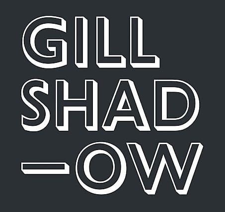
8.Gill Shadow
Eric Gill designed this quintessentially English font in 1928, produced by the Monotype Corporation. The typeface was inspired by Edward Johnston’s Johnston typeface which was designed for the London Underground. Gill had worked with Johnston and this was his attempt to make the most legible sans serif font. Unlike other more functional sans serifs, Gill was imbued with distinctive characteristics – look at the cap “R”, for instance. Used extensively by many, including the BBC – Gill also made sculptures for the facade of Broadcasting House in London. The variant Gill Shadow stands out as one of the font’s most gloriously idiosyncratic expressions
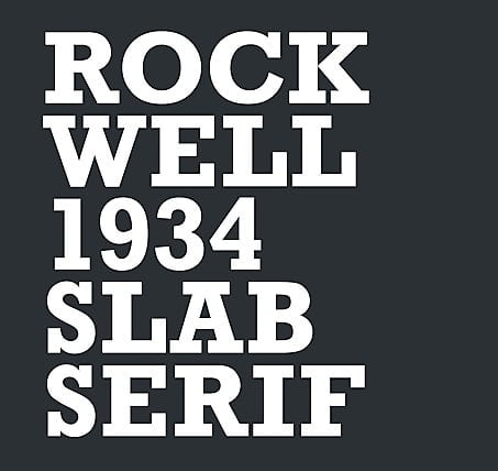
9.Rockwell
Rockwell is an instantly recognisable slab serif font where the serifs are similar in weight to the horizontal strokes of the letters. Designed by the Monotype foundry’s inhouse design department in 1934, its distinctiveness originates from its geometric form. Although primarily used as a display font, it is the type of font that adds personality to any piece of design. Most typefaces need to be respected and work with your design; however Rockwell is robust enough for you to do things to it. You can pull it apart and clash it together. It has such a great sculptural form but somehow retains its quality
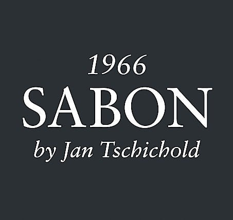
10.Sabon
Jan Tschichold was a pioneer of modern graphic design. Swiss by birth, Tschichold was active in possibly the most influential period in graphic design history. Between 1947 and 1949 he worked in England where he oversaw the redesign of hundreds of paperbacks for Penguin Books. Most graphic designers do not make good type designers; Tschichold is an exception. He designed several fonts but it’s his 1966 old-style Sabon serif for which he’s most widely known. Based on the typeface Garamond, its uniqueness is that the roman, italic and bold weights are all the same width when typeset
1.Akzidenz-Grotesk
Probably the best typeface ever designed. First released by the Berthold Type Foundry in 1896 in Germany, its popularity increased after it was developed in the 1950s under the direction of Günter Gerhard Lange with a wider range of weights and variants. Akzidenz influenced a whole range of other fonts including the infamous Max Miedinger’s Helvetica and Adrian Frutiger’s Univers – though neither of these has the detail and elegance of Akzidenz. Its strength derives from its neutrality and the fact that it doesn’t overdominate when used, allowing the designer more freedom and versatility
2.New Baskerville
Probably the best serif typeface ever designed. Not showy but full of confidence, Baskerville is known as a transitional serif typeface and was originally designed in 1757 by John Baskerville (1706–1775) in Birmingham. A transitional typeface is positioned between the old-style typefaces of William Caslon, and the modern styles of Bodoni and Didot. Since then many versions have been produced by various type foundries including this popular New Baskerville version. What really makes it work is the way the roman and italic versions are successful whether used together or individually
3.DIN 1451
Designed in 1931 for the German standards body DIN – Deutsches Institut für Normung (German Institute for Standardisation) – it looks and behaves as if it had been produced today. It extols all of the principles of the Bauhaus and has not dated in any way. It has two strong characteristics – first, it is a condensed font, meaning on a very simplistic level that it creates a strong mass when used as text and therefore the type can become more of a shape. Second, it has a quietly beautiful rounded detail, which makes it feel like it was designed for the age of computers, but still retains a gentleness
4.Franklin Gothic
Produced by the American type designer Morris Fuller Benton (1872–1948) in 1902, it reflects everything that America was aspiring to and would become – confident, bold and expressive. It’s American through and through. The bold version I think is best: its blackness is just so powerful. Franklin Gothic has more character than other realist sans serif fonts. I’ve always believed Franklin Gothic works best next to a more subtle, sensitive font. The best example was seen in the groundbreaking work by the American-based French designer Fabien Baron for Vogue Italia in the late 1980s
5.HTF Didot
This is a revival font. I could have chosen Bodoni, which I also love, but Didot gets the nod over its Italian sibling. However, it’s this particular cut by the type designers Jonathan Hoefler and Toby Frere-Jones that I think is something near to perfection. It was created for the Harper’s Bazaar magazine in the 1980s for the aforementioned Fabien Baron. It just feels like a fashion font – effortlessly beautiful but honed and crafted. But beware – it is tricky to use as it’s so delicate. It needs to be handled with care as the characters have extremes of thicks and hairline thins. It’s simply beautiful
6.Gotham
Released in 2000 by Hoefler and Frere-Jones, this clean, modern sans serif typeface has become possibly the most popular font for designers over the last 13 years. It is rumoured to be Obama’s favourite typeface but I’m not sure whether this is just an urban myth; it was, however, specifically used by the Obama campaign during the 2008 election. Originally commissioned by GQ magazine, it is very much an American font in that its design was inspired by the lettering found on the architecture of New York City
7.Knockout
Knockout gets my vote almost just for its name. All the variants are based on different boxing weights. It is another design from the Hoefler and Frere-Jones type foundry, consisting of a family of 32 different sans serif weights. Knockout’s nine-width, four-weight family offers a range of options that cannot be achieved with even the best modern sans serifs. Most fonts begin their life with maybe just a regular, bold and italic version. If a design is successful then more weights are added as required over the years. Knockout was created as a family from the outset and therefore has achieved instant integration and balance
8.Gill Shadow
Eric Gill designed this quintessentially English font in 1928, produced by the Monotype Corporation. The typeface was inspired by Edward Johnston’s Johnston typeface which was designed for the London Underground. Gill had worked with Johnston and this was his attempt to make the most legible sans serif font. Unlike other more functional sans serifs, Gill was imbued with distinctive characteristics – look at the cap “R”, for instance. Used extensively by many, including the BBC – Gill also made sculptures for the facade of Broadcasting House in London. The variant Gill Shadow stands out as one of the font’s most gloriously idiosyncratic expressions
9.Rockwell
Rockwell is an instantly recognisable slab serif font where the serifs are similar in weight to the horizontal strokes of the letters. Designed by the Monotype foundry’s inhouse design department in 1934, its distinctiveness originates from its geometric form. Although primarily used as a display font, it is the type of font that adds personality to any piece of design. Most typefaces need to be respected and work with your design; however Rockwell is robust enough for you to do things to it. You can pull it apart and clash it together. It has such a great sculptural form but somehow retains its quality
10.Sabon
Jan Tschichold was a pioneer of modern graphic design. Swiss by birth, Tschichold was active in possibly the most influential period in graphic design history. Between 1947 and 1949 he worked in England where he oversaw the redesign of hundreds of paperbacks for Penguin Books. Most graphic designers do not make good type designers; Tschichold is an exception. He designed several fonts but it’s his 1966 old-style Sabon serif for which he’s most widely known. Based on the typeface Garamond, its uniqueness is that the roman, italic and bold weights are all the same width when typeset
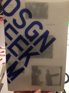
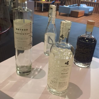
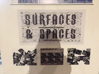
tdc exhibtion
task: find lots of inspirations in the min. of 10 artworks from your favorite artists/designers and analyze why.
Q&A
1. What is your first impression?
2. How does typography works in this exhibition?
3. What types of artwork that are displayed? *Look at the elements and principle of design.
4. Which artwork that has a strong meaning and message?
5. How are the layouts, colors, hierarchy works in the posters?
6. What inspired you through this exhibition?
7. What do you learn from this exhibition?
8. Who are your favorite designers? Why?
ANSWERS:
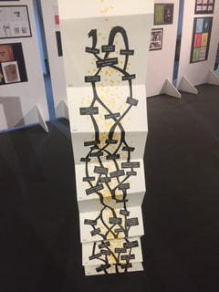
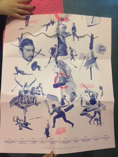
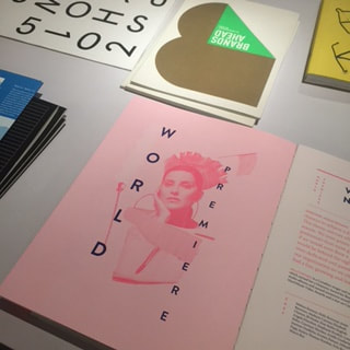
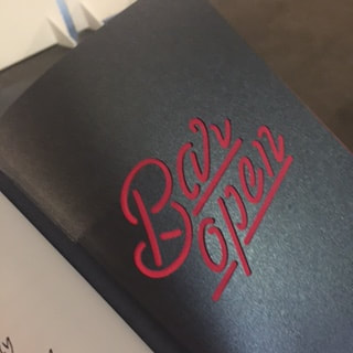
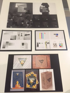
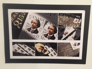
- What is your first impression? The exhibition is displayed a very creative way, hanging posters in an descending staircase motion showing direction, different shapes of tables displaying various artworks: brochures, books, magazines, postcards, posters etc. all of the artworks show unique typography element, the composition of the type, the chosen font their shapes and colors and the way they are displayed are all never seen before, thus makes it very interesting and special.
- How does typography works in this exhibition? typography plays a major role in the exhibition, it is used to inform audience with words and explanation, it is used for aesthetic and artistic value in posters, books, magazines, brochure etc it works to express concepts and ideas that typographer are trying to convey and deliver to the readers.As the exhibition is surrounded and occupied by thousands of typographic elements, the art of typography works powerfully in the exhibition, transferring audience to a world of typography.
- What types of artwork that are displayed? *Look at the elements and principle of design. There are various artworks displayed in the exhibition: poster, books, magazines, photographs, installations, manual embroidery art piece, painting, postcards, namecards, brochures etc. In which the principles and the elements of designed are applied. for instance the design elements which are the basic units of any visual design which form its structure and convey visual messages, defined the elements of design as Line, Direction, Shape, Size, Texture, Value, and Color are showed very clearly especially in the poster and book cover design. While the principles which are applied to the elements of design that bring them together into one design. How one applies these principles determines how successful a design may be, including: perspective, balance, hierarchy, proportion, scale, similarity and contrasts are shown in the layout and composition of art works.
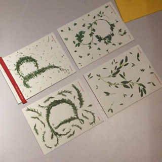
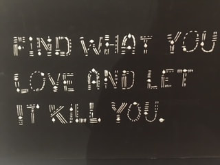
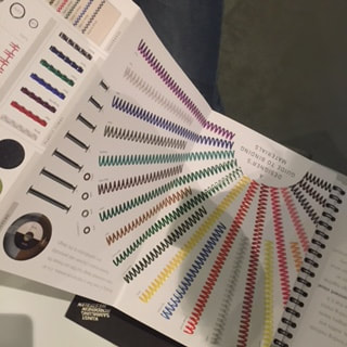
- Which artwork that has a strong meaning and message? 'Seasoning greetings, 2015' t artwork with natural thyme is very interesting and has a strong meaning of promoting natural therapeutic healing effect of certain thyme, by arranging them into typefaces showing authentic and earthy vibe, visually and sensually, the meaning behind the artwork is to show how small living thing like grass can have a great positive impact on human's health and how earth naturally gives us life and more healthy ingredients, it is a visually engaging typography work and it can connect and communicate with the audience by its interactive design.
- How are the layouts, colors, hierarchy works in the posters? The layouts are really creative and unique, as the posters have unusual compositions and arrangement between text and images. They also use enlarged or overlaying typography to create certain layout that are never seen before. The colors are quite various, as there are posters with monochromatic color scheme like black and white or blue and pink; really vibrant and colorful choices like neon colors or contrasting color palettes. Thus creating interesting visual effect, as monochromatic colors give out harmony and unity whereas contrasting colors gives a dynamic and spontaneous vibe. Hierarchy is also used in the poster design, by using contrast in scale , weight and shapes the designer make sure the most important information stands out and becomes and focal point in the artwork. The hierarchy also gives audience direction in where to start reading.
- What inspired you through this exhibition? The interesting and engaging display of different typography works really inspired me. how they are really unusual and special, it evokes my deeper thoughts into thinking different possibilities of using words to create art. within the exhibition i see potential in these seemingly strange yet effective composition, the reason why it can surprise audience is because one simple reason it is not seen before, humans are beings of creativity and the very true meaning of creativity is to innovate to create something new, and that is presented in the exhibition and strongly inspires me.
- What do you learn from this exhibition? I learned that there are millions of possibilities when it comes to design, different layout, composition, colors, lines, shapes etc. typography is crucial in design process , it is involved in almost every design, and it plays a very important role, not just the purpose of informing but also becoming a design itself. i learn to be more open to different art style and to be inspired by more artists and designers thus learning from them.
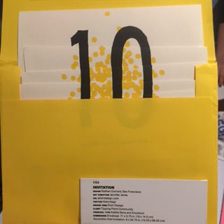
- Who are your favorite designers? Why? My favorite designers are: Nathan Durrant as his deisgn of the invitation for client tipping point community is very interesting as the layout and design is unusual and interactive. Another designer is David Byrne, as his use of colors are very appealing baby pink and navy blue, with his style of illustration and design layout. They both have unique design style and thus very inspiring and unforgettable.
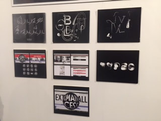
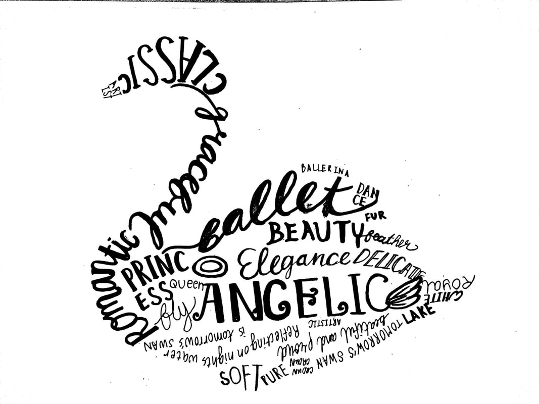
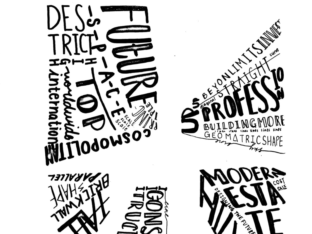
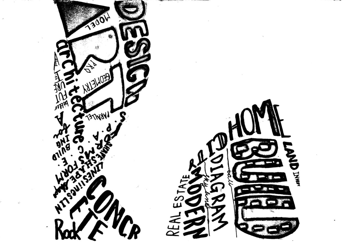
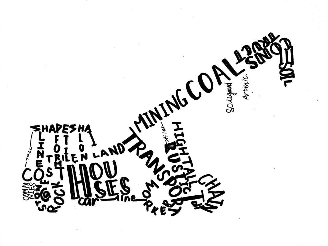
typogtaphy exercise2: task 1 tracing
|
|
|
|
|
- draw the image
- find text relates to image
- use black marker to write the typeface: italic, scripts,regular,bold
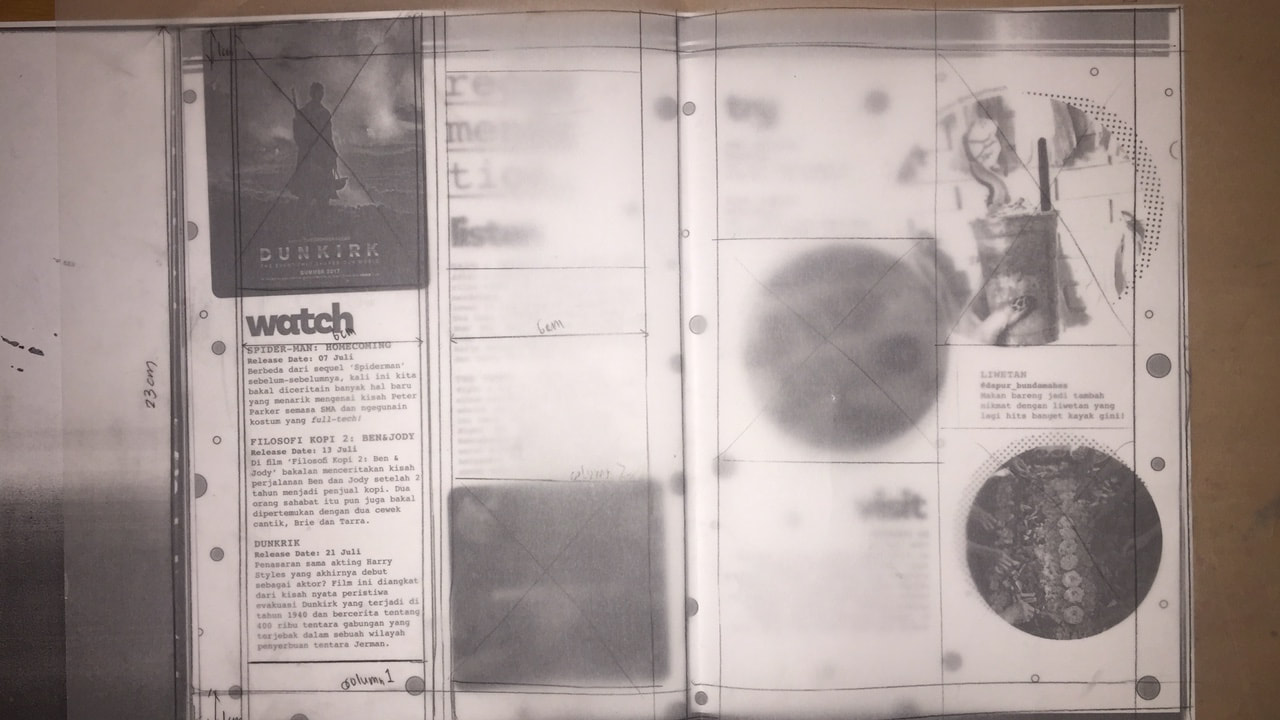
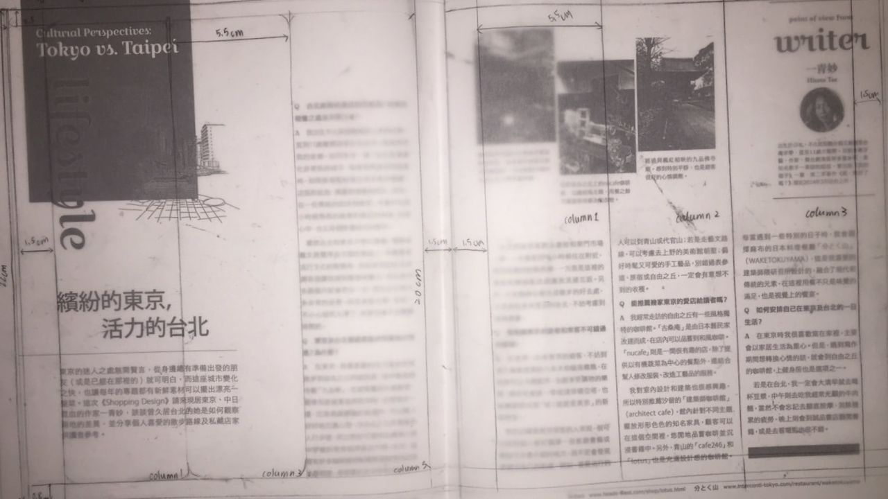
tyography exercise2: task2 grid
|
|
- choose one spread magazine
- draw grids with pencil in finding out how many columns, margins, gutter using transparent paper
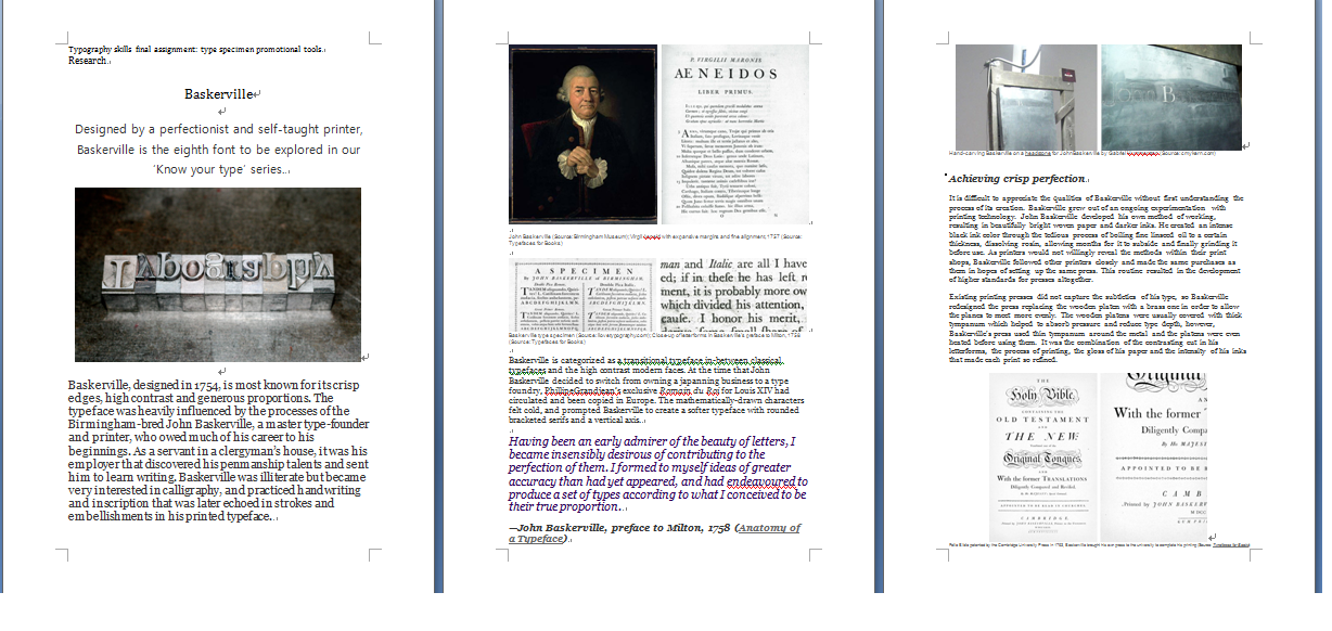
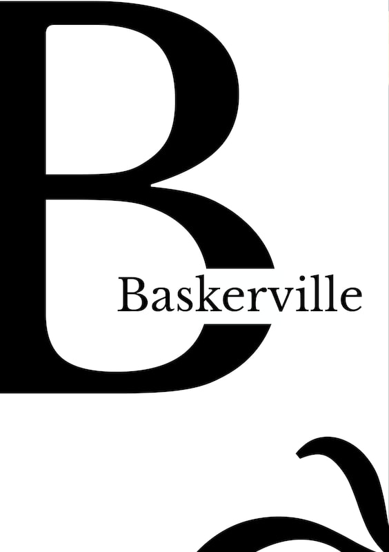
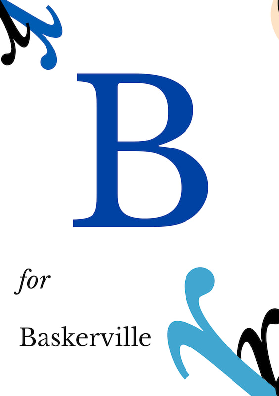
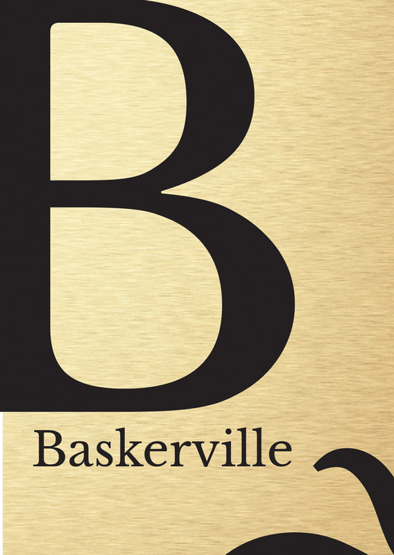
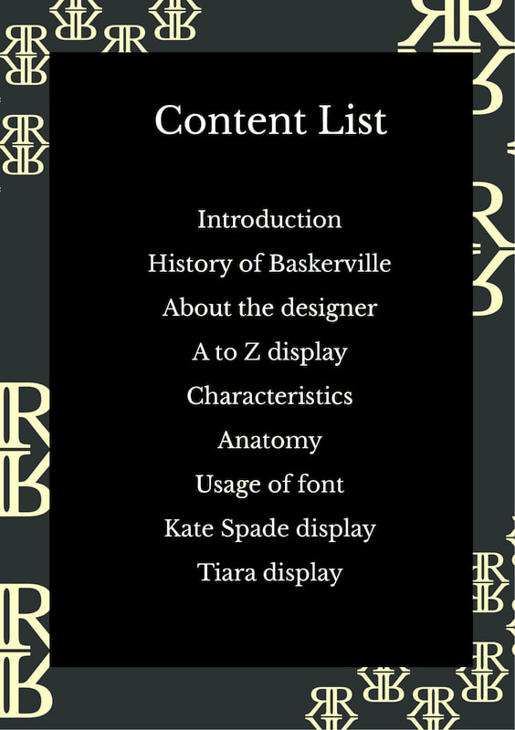
final assignment: type specimen promotional tool baskerville
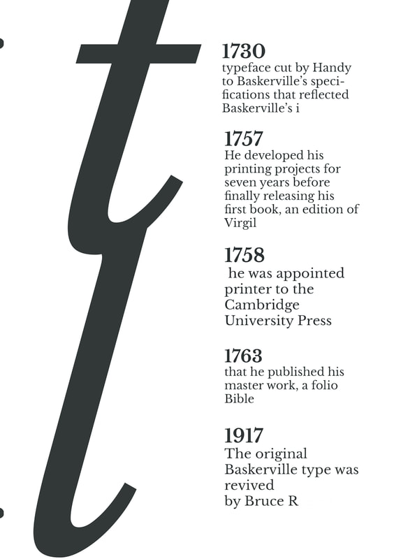
baskerville type research
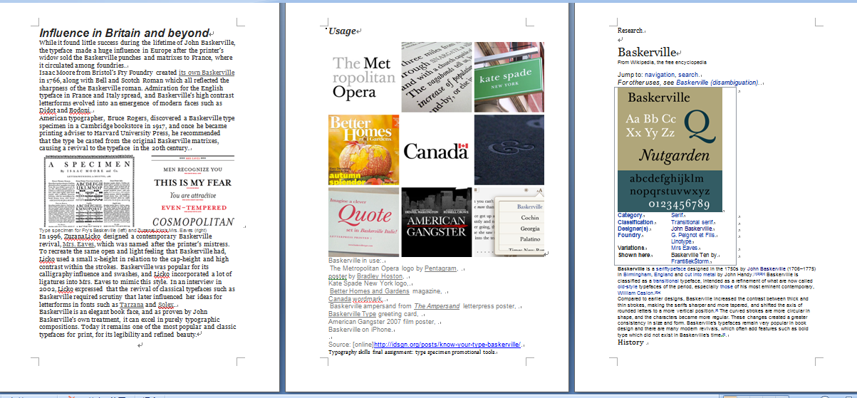
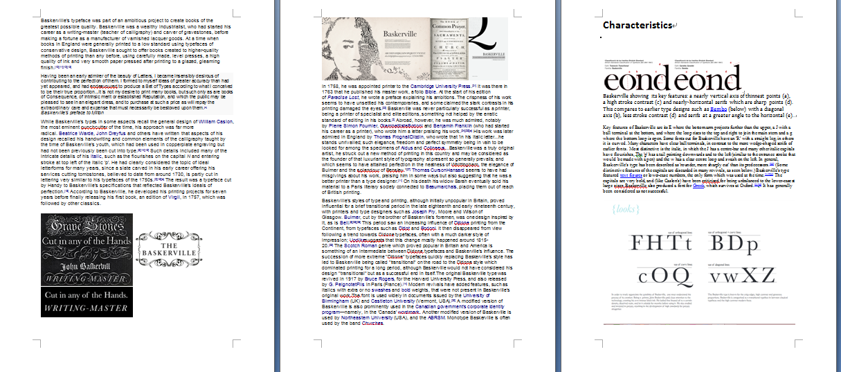
moodboard references and inspirations
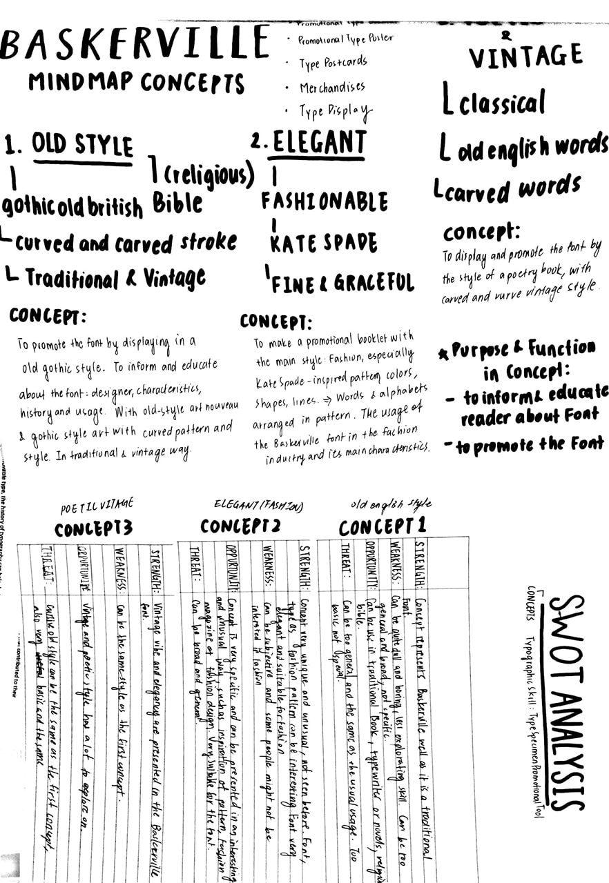
mindmap
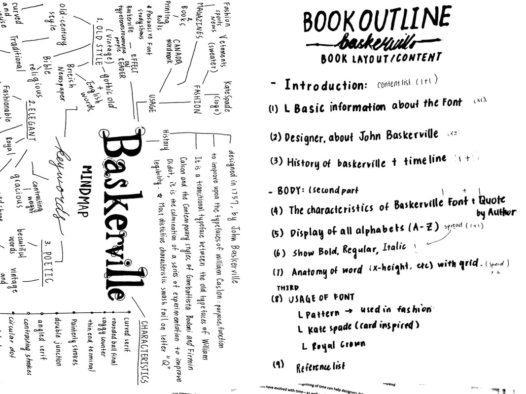
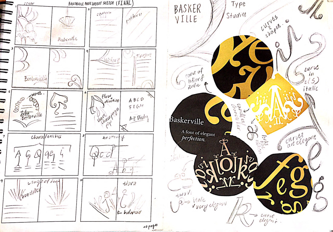
sketch
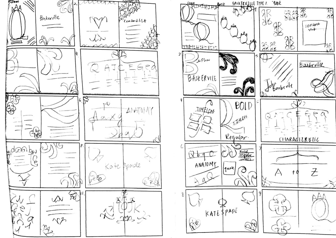
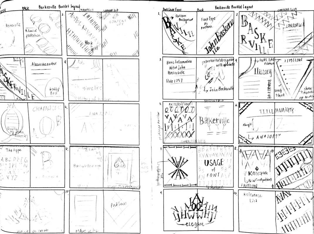
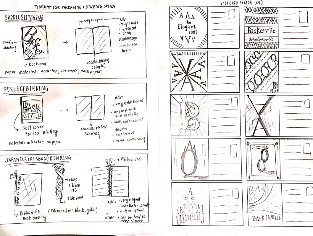
more sketches in visual diary, sketch of booklet layout, poster, postcard, merchandise
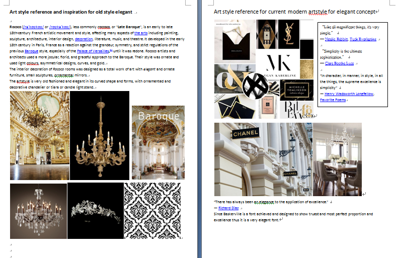
aetstyle reference for style and approaches
approach booklet1


approach booklet2

approach booklet 3


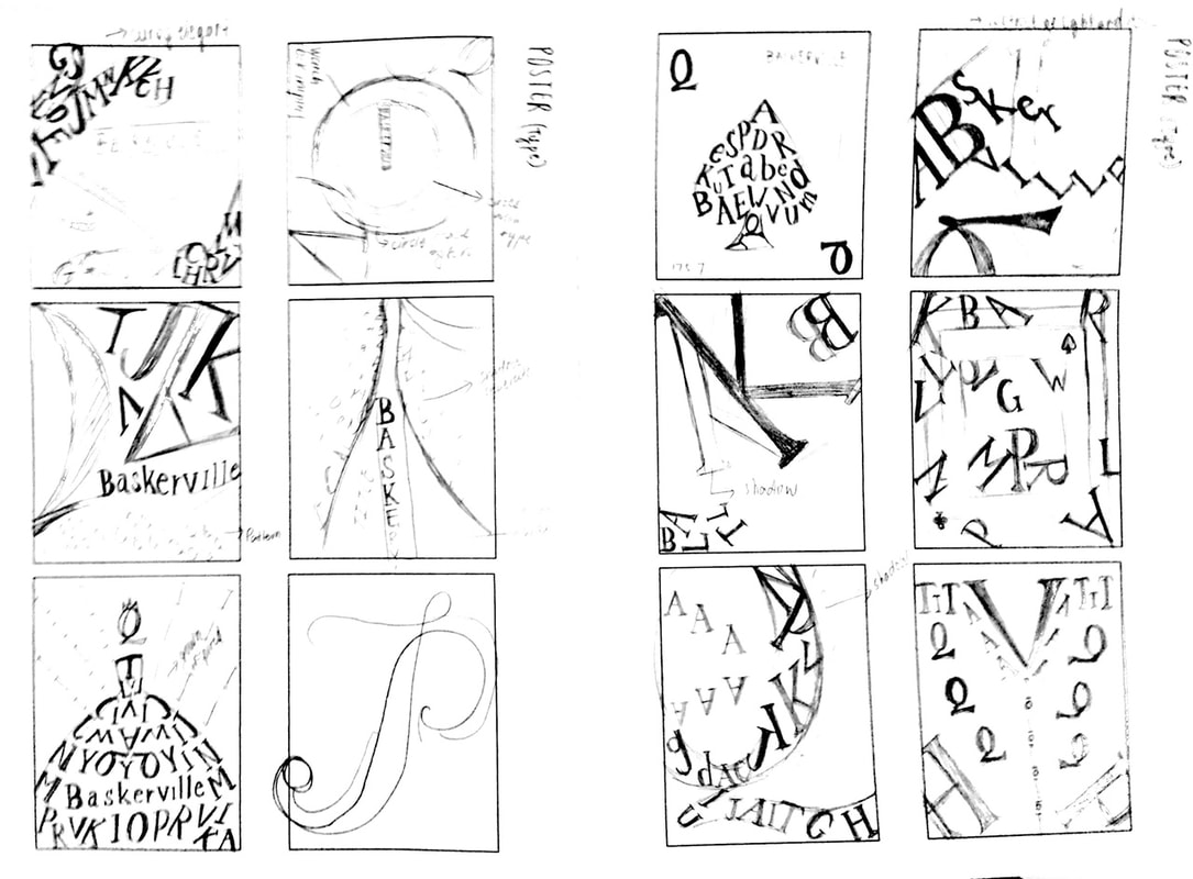
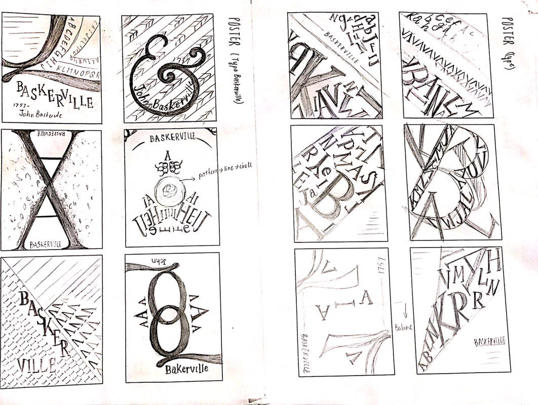
6 approaches of poster digital trials
|
|
postcard digital


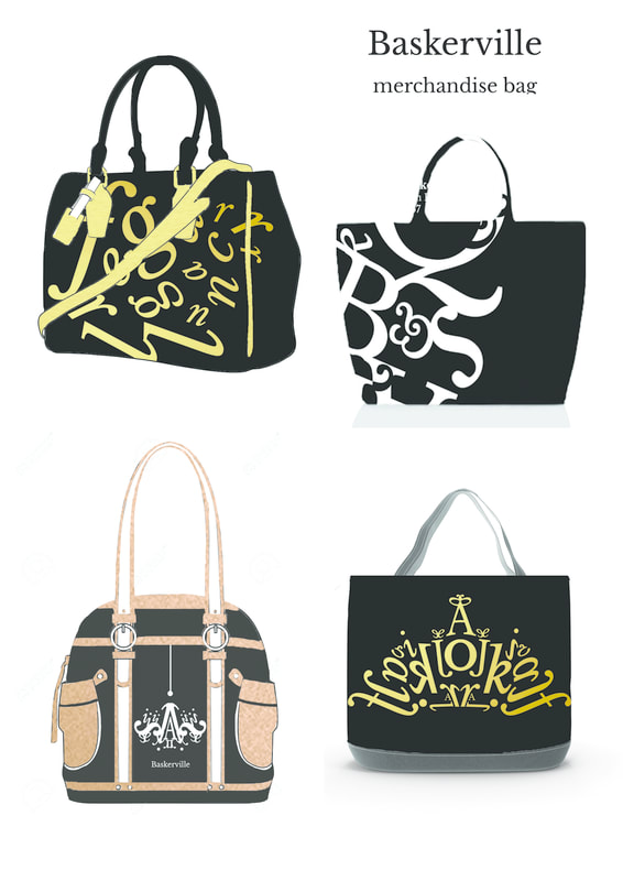
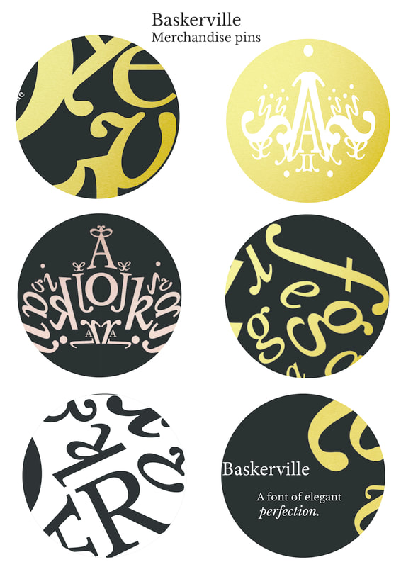
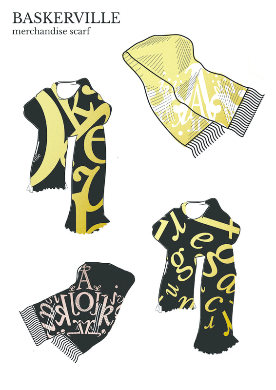
merchandise: bag, pins, scarf
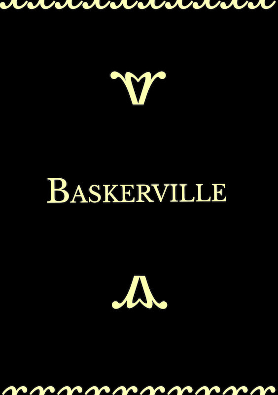
final outcome
booklet
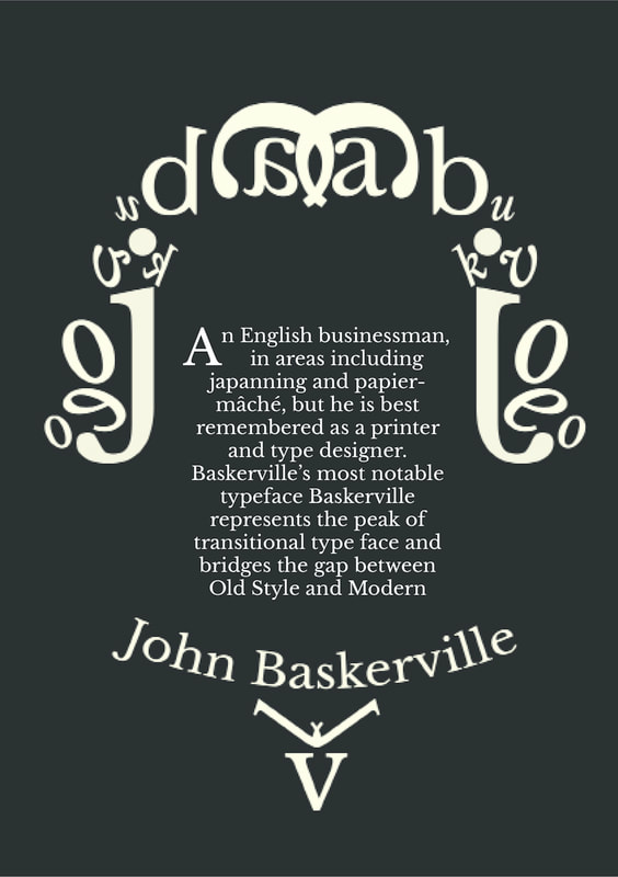
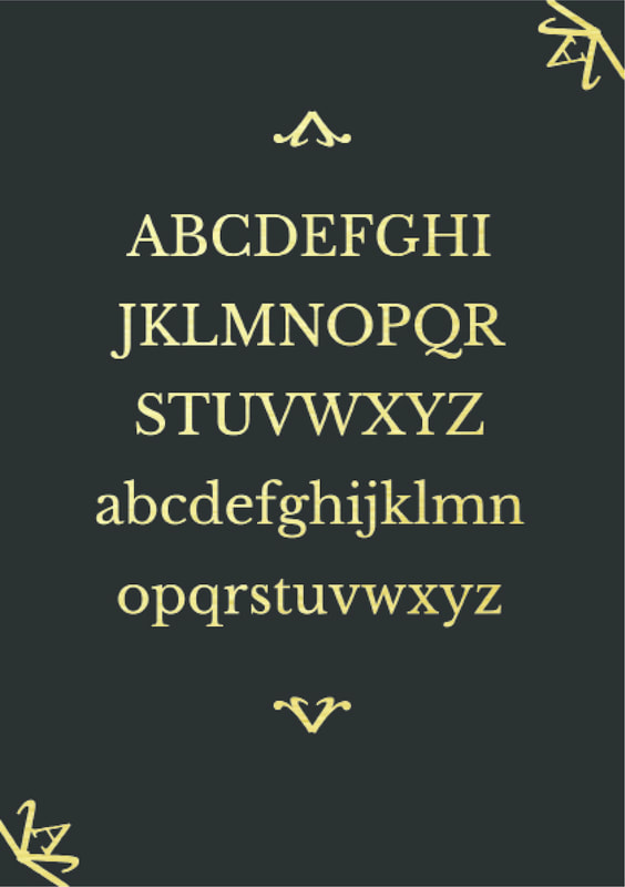
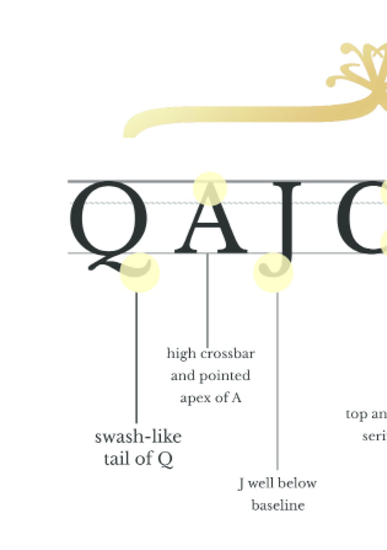
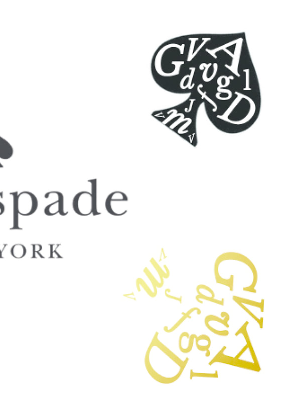
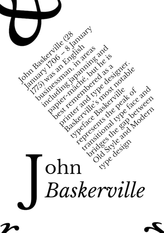
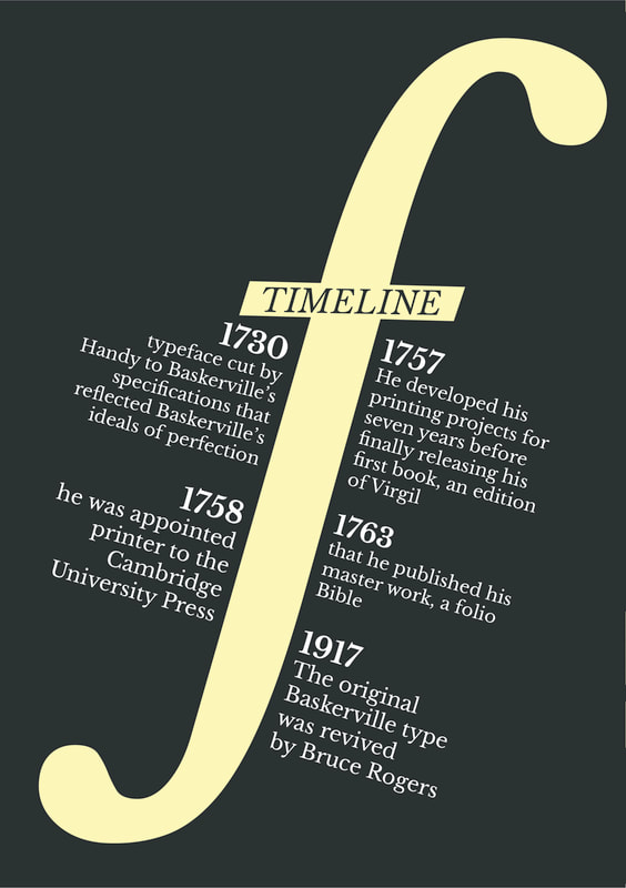
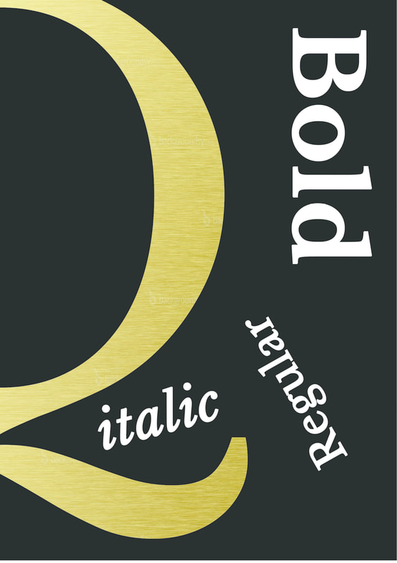
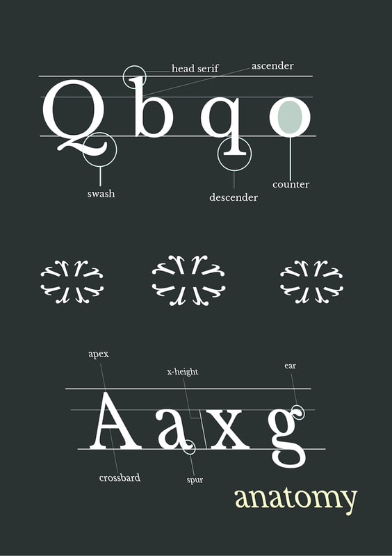
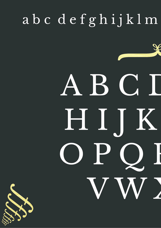
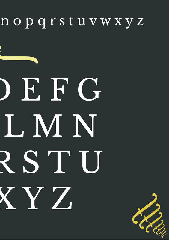
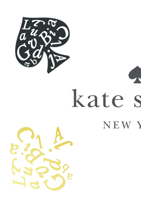
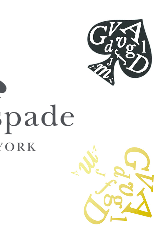
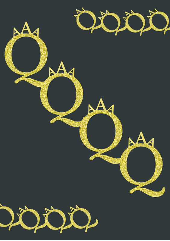
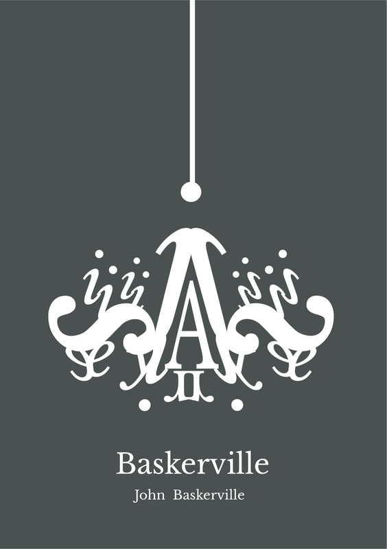
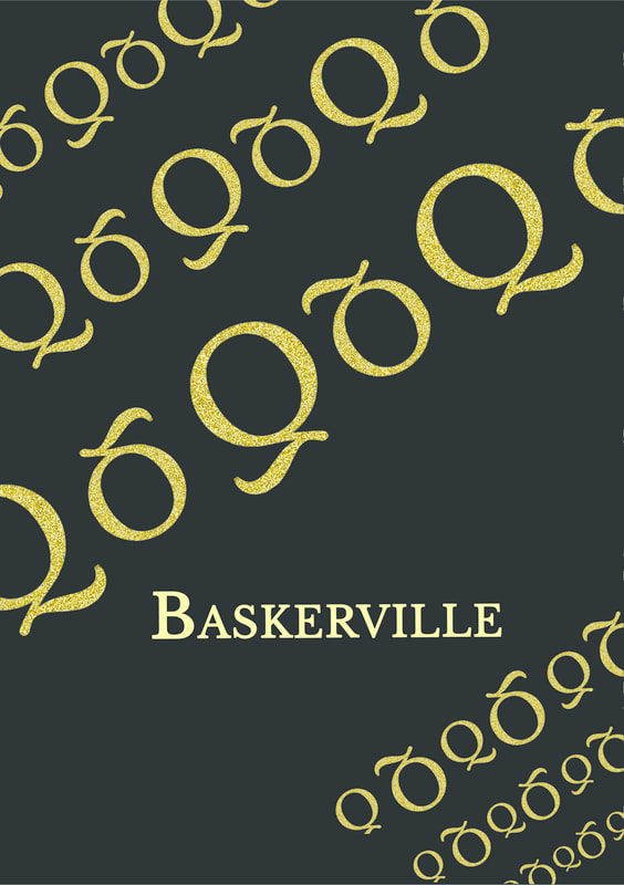
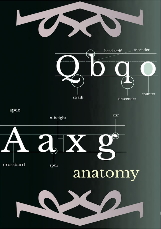
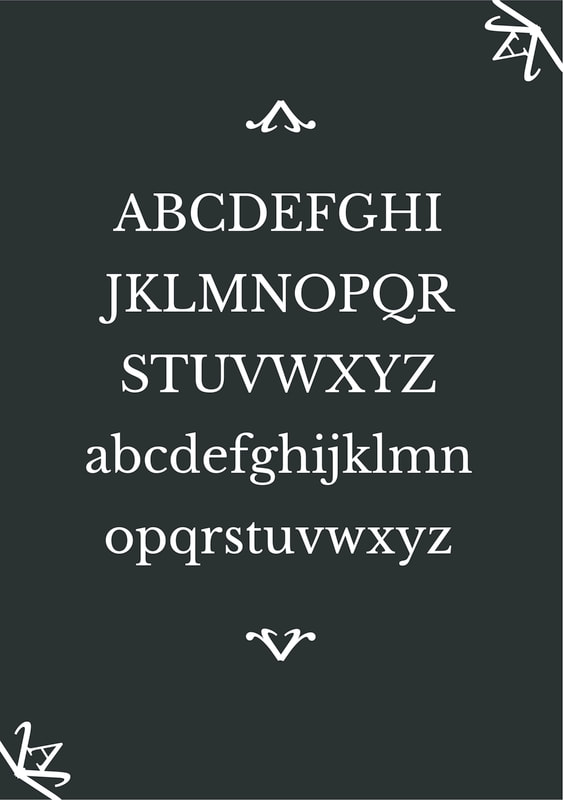
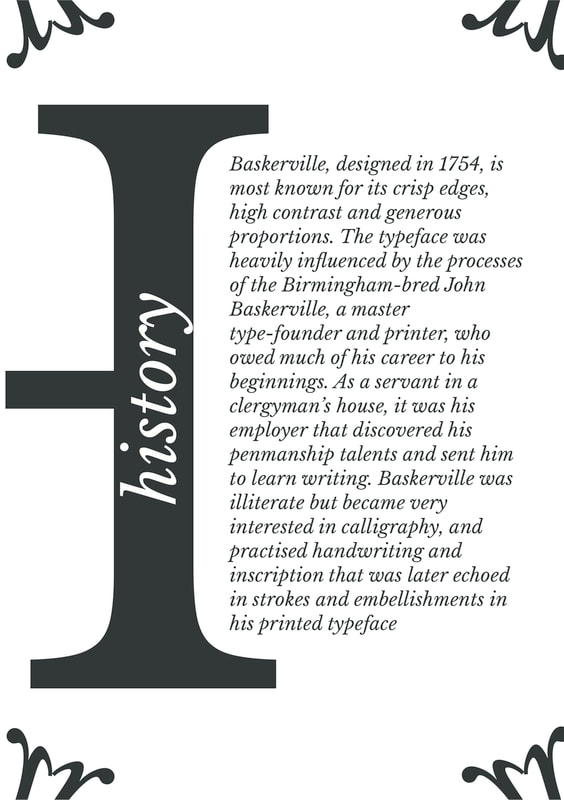
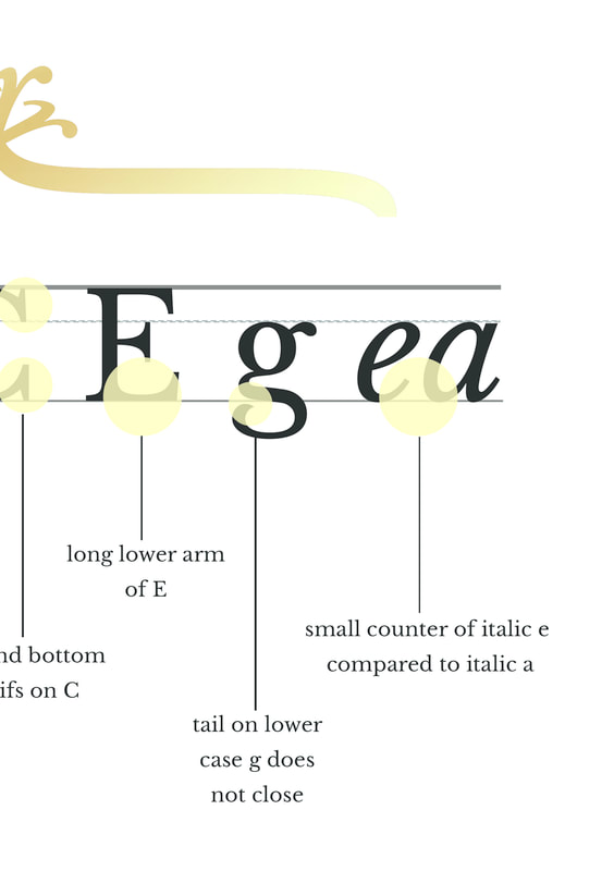
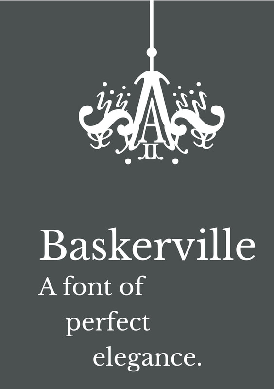
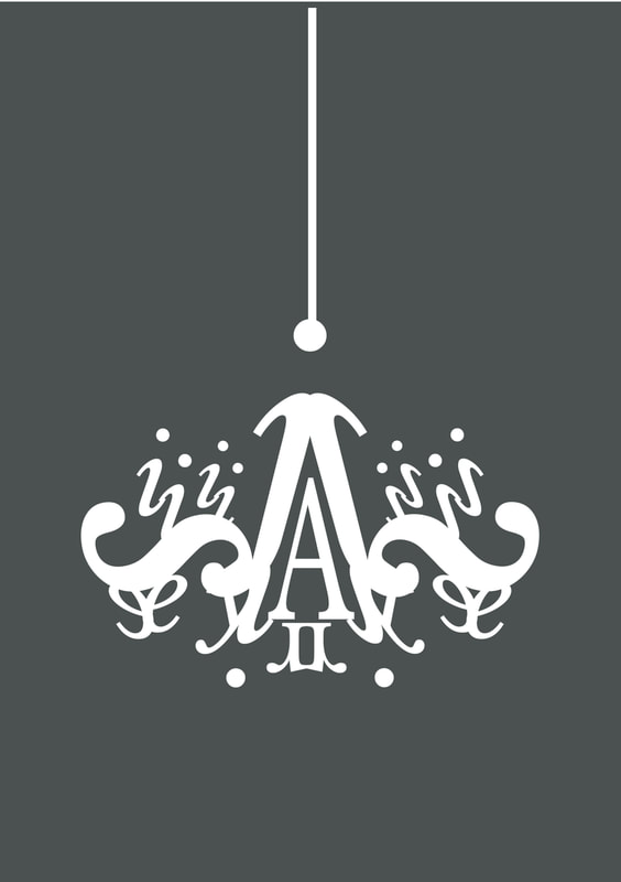
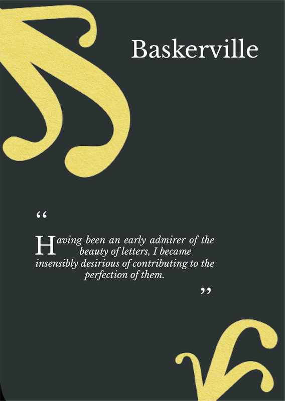
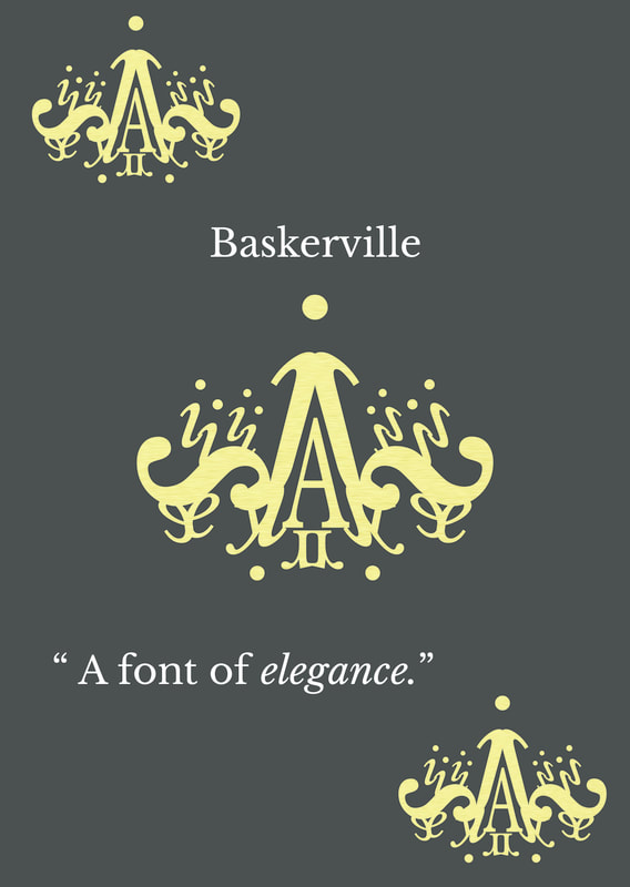
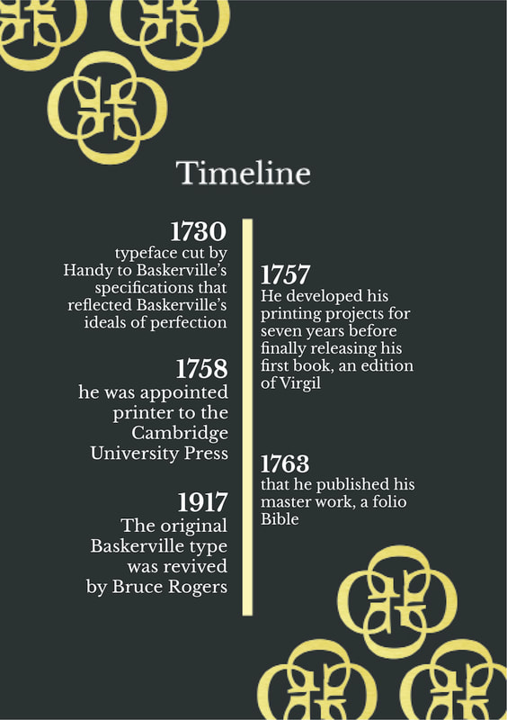
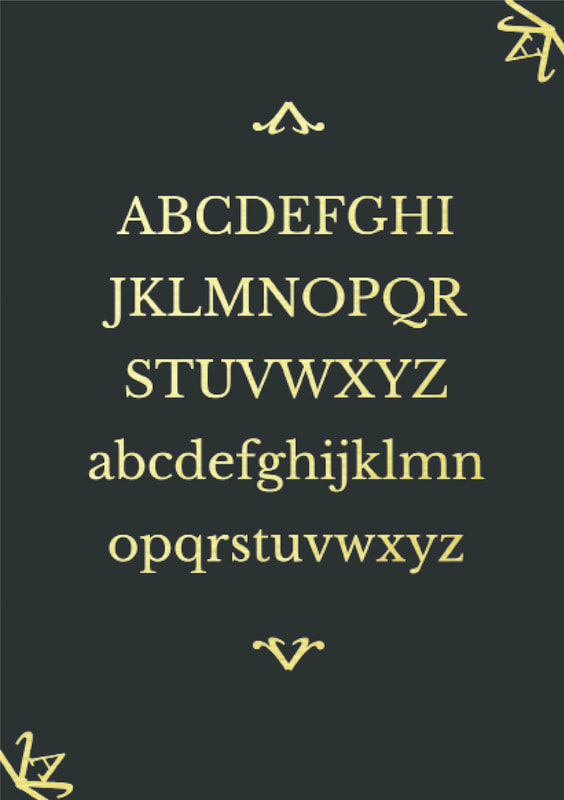
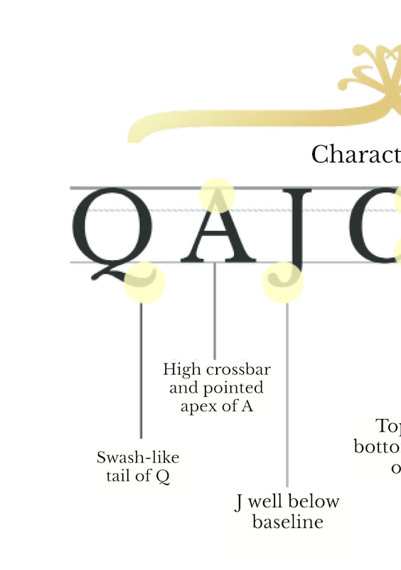
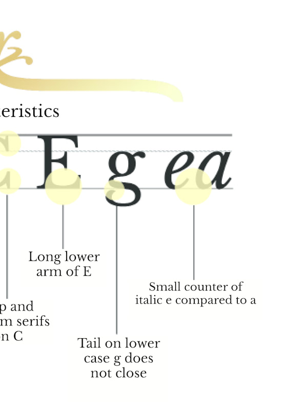
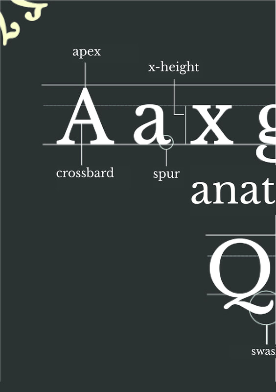
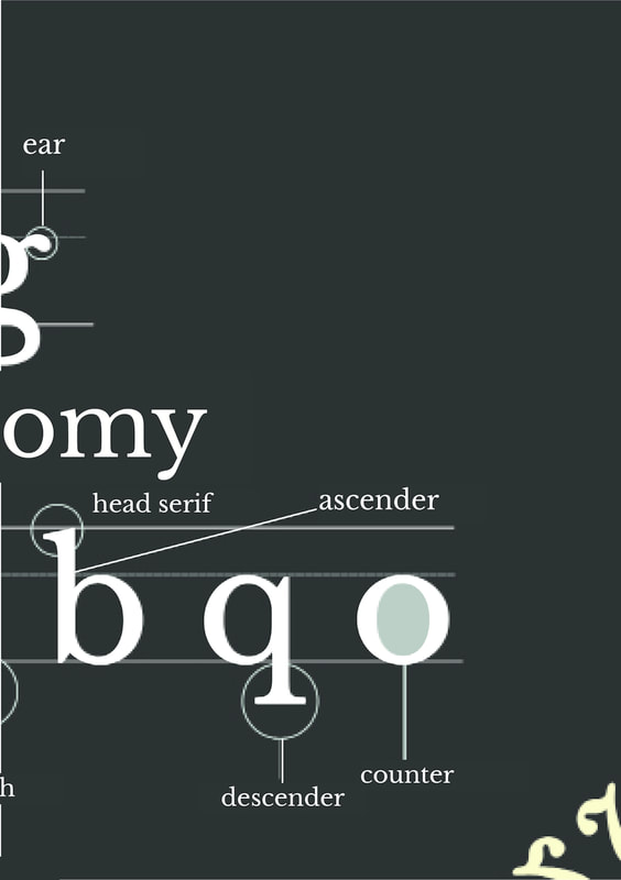
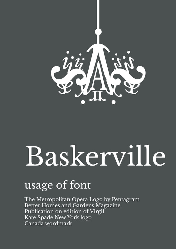
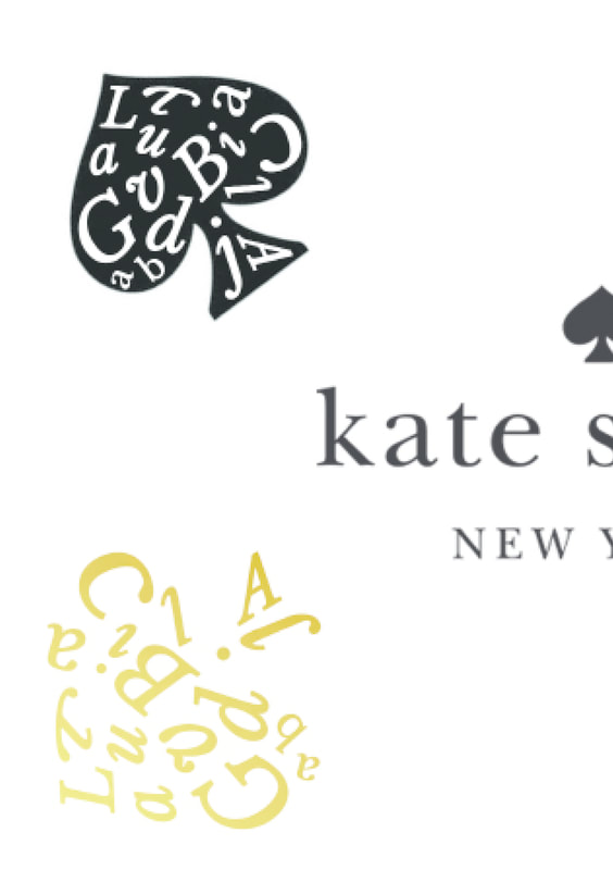
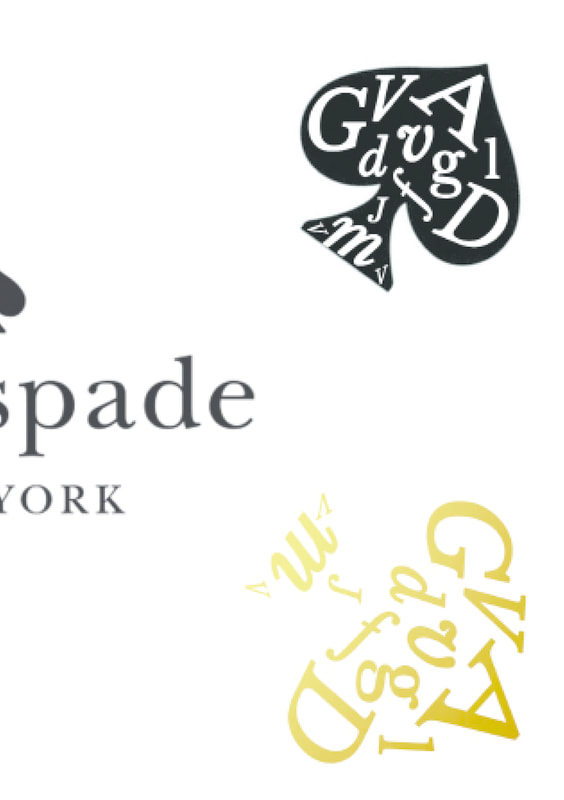
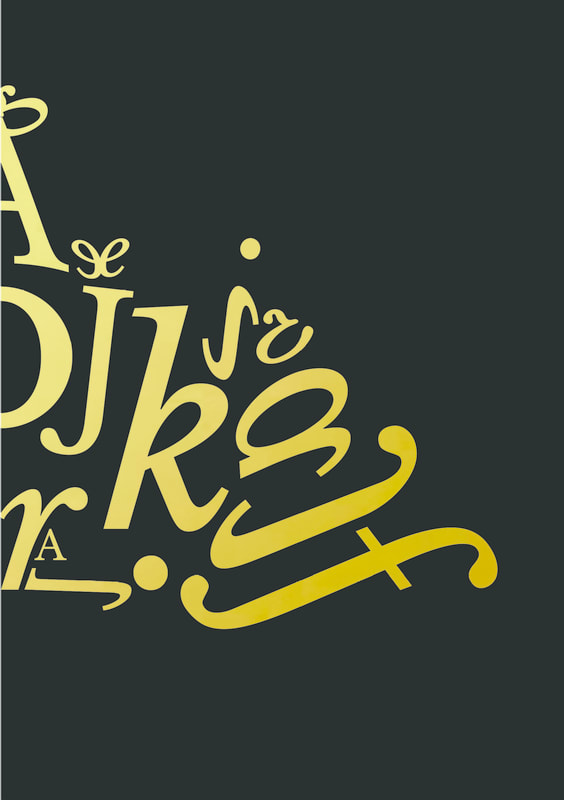
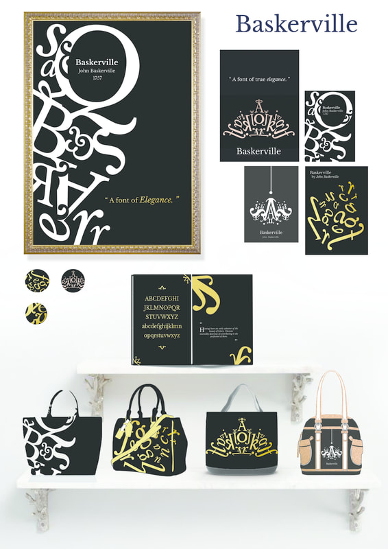
For the booklet i have made it informative and bold educating and showing information about the font including: about the font, its history with timeline, about john Baskerville, his quote and achievements, Baskerville characteristics and anatomy, baskerville in bold regular and italic, and A to Z display also the usage of font, especially in katespade and tiara and chandelier design to show elegance of the font. The booklet is simple and minimalistic with a hint of decorative curve shaped created from the font itself , for example the rounded serif of j is used to make curve pattern and the tail of q or the italics of the font to make the tiara and chandelier.


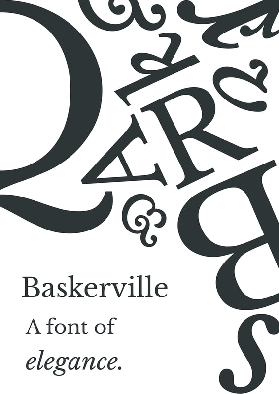
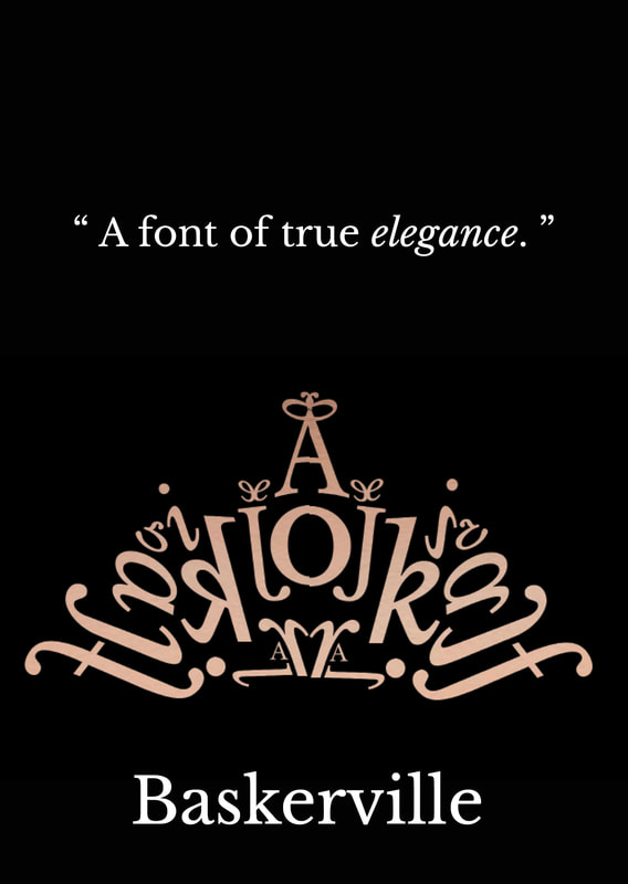
poster
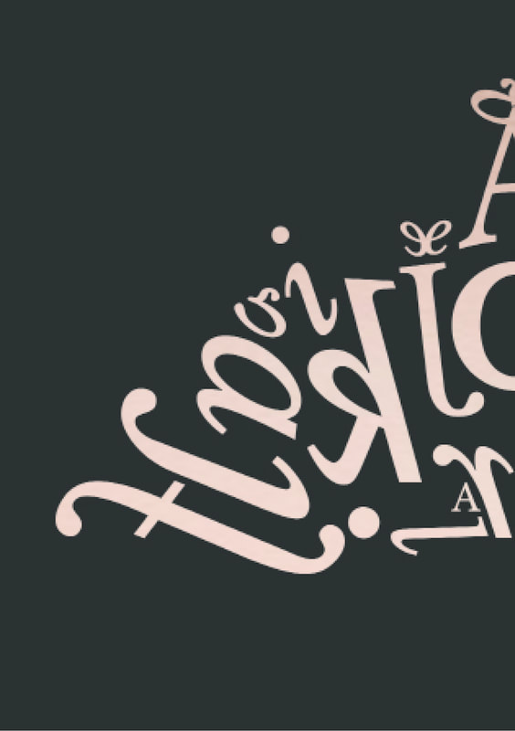
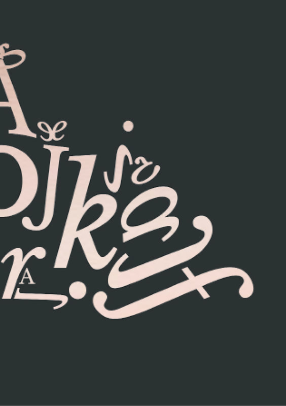
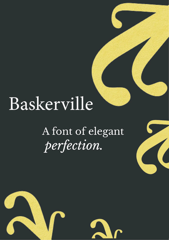
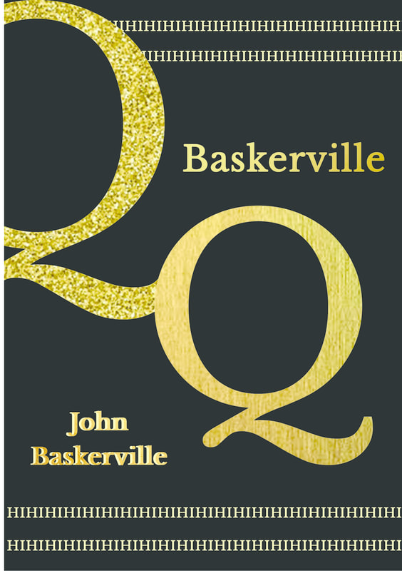
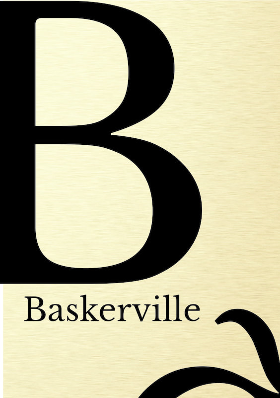
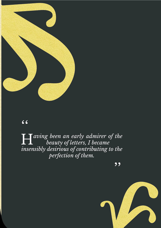
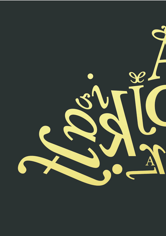
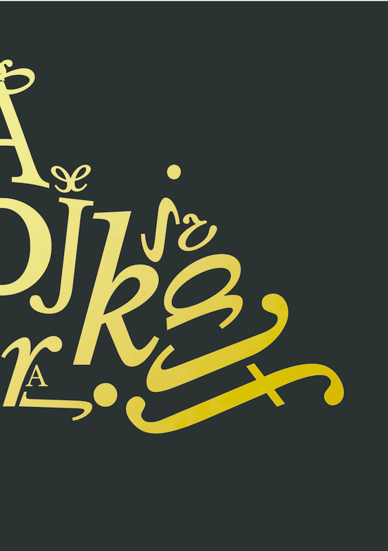
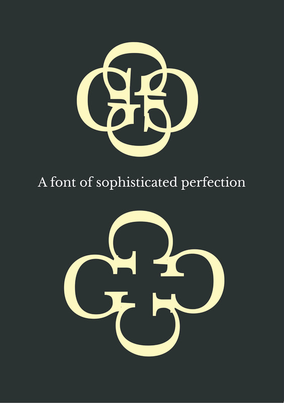
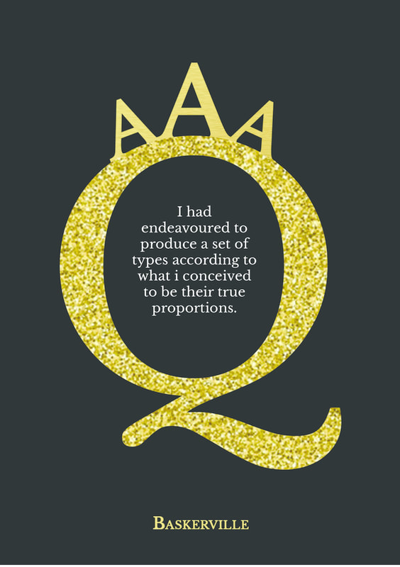
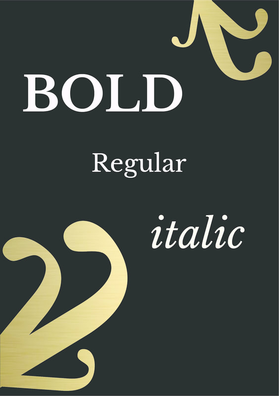
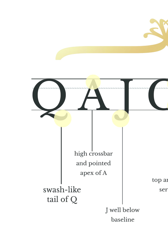
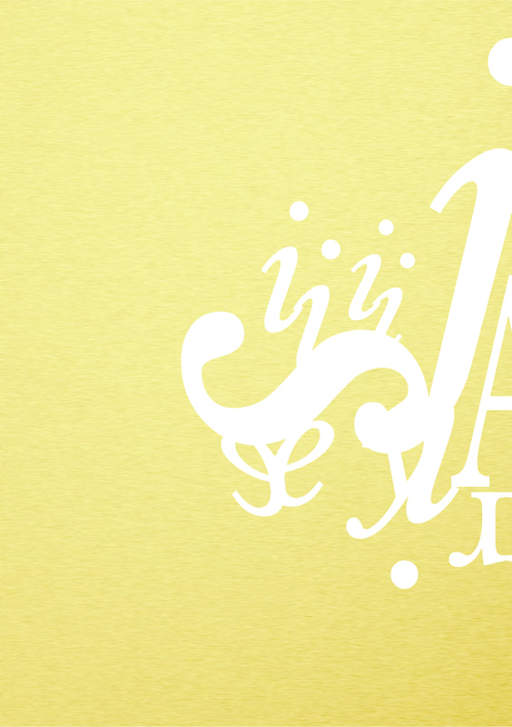
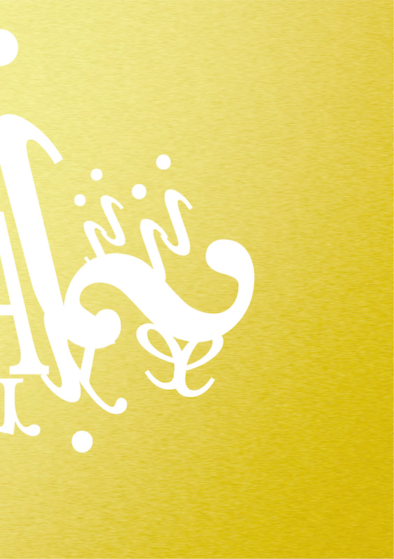
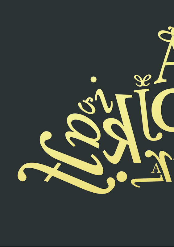
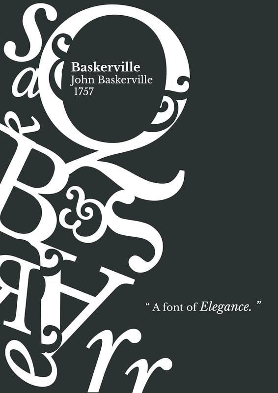
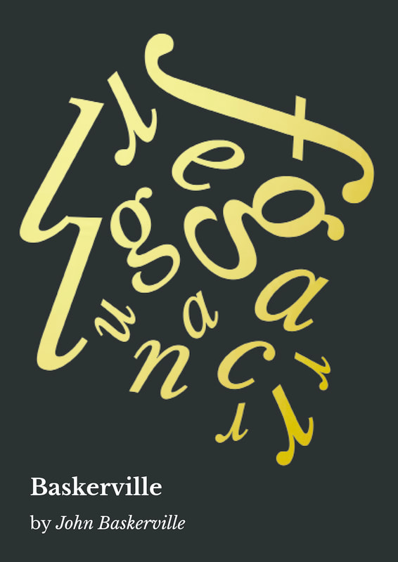
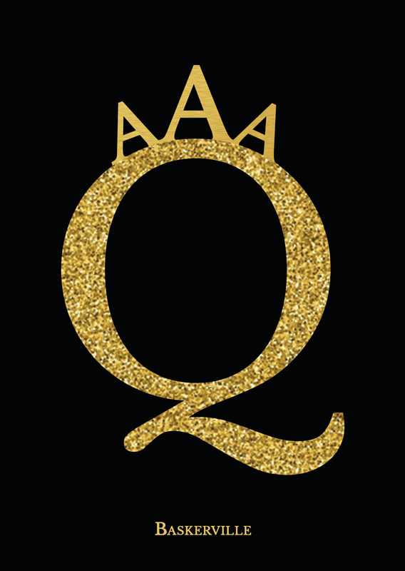
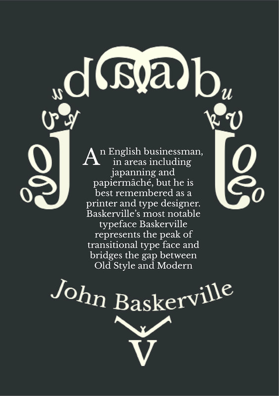
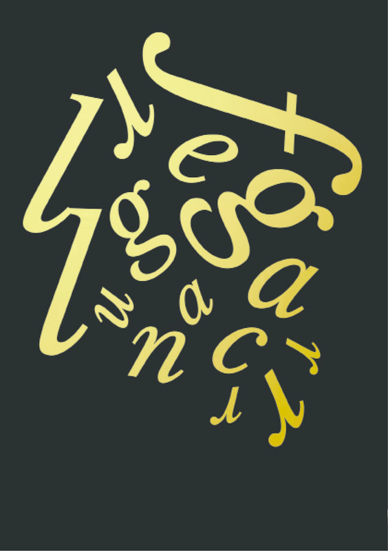
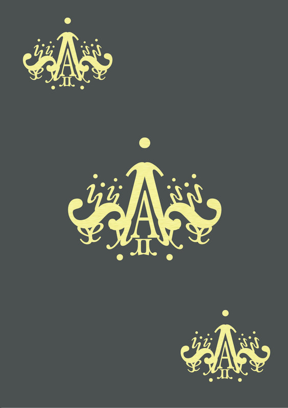
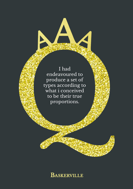
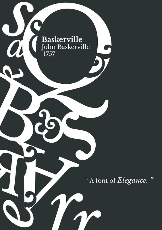
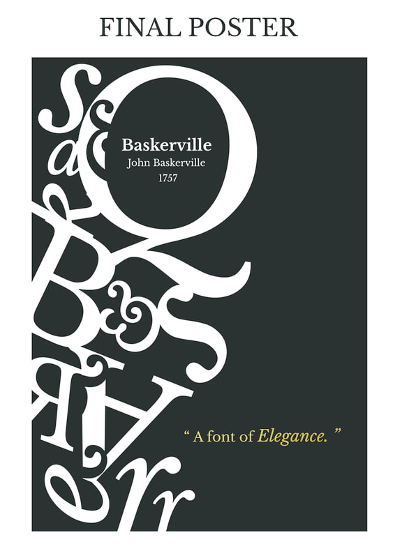
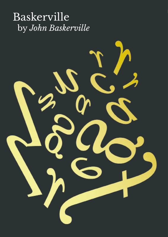
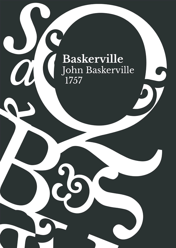
For the poster, the layout is to show contrast between the negative space and the decorative font arrangement, to show the combination and balance between the old elegant style which is decorative curve and the current elegant minimalistic style. All the words i have tried to show the flow and curve of each word using bold , regular, italics in different font size. The Q is the biggest and most prominent as it is the most iconic and representative alphabet in the Baskerville type with its Swash tail. In the middle of the circle/counter of Q is the title baskerville. Why did i put it there because the circular shape of it make it a perfect focal point for the whole poster, as psychologically people will read smthg in a circular frame like a camera lens focusing on an object. The layout of the type is also not like the usual central aligned so that it would be interesting and engaging and making people want to stare at the design for a longer time. The display of the font and layout is also made with a elegant theme on it, showcasing the most elegant side of baskerville. Especially the details of curve pattern of the italic & of baskerville, adding a classical sense. The slogan/ subtitle of "a font of true elegance" is in gold to emphasis and be in contrast. Overall, i tried to make the poster design as elegant yet still simple and easy to read as possible, thus delivering the idea of elegance and at the same time promoting the typeface Baskerville.
final postcard.
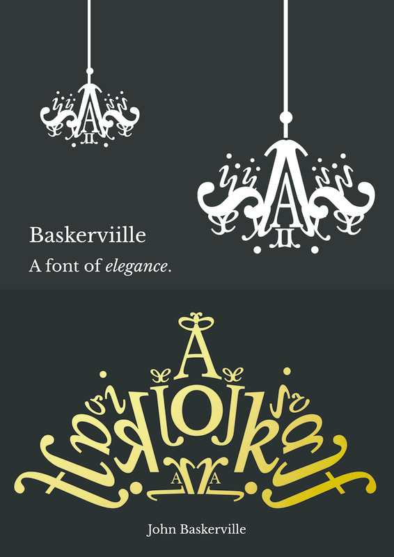
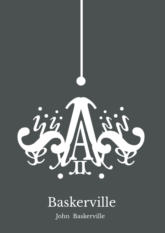
For the postcard design i had sketch it out the same as the poster design and also the booklet so that it will look cohesive and united, the design is to show elegant of baskerville by displaying them into champagne pop, chandelier, tiara and the original poster design. Thus showing elegance of bakserville and promoting the font.

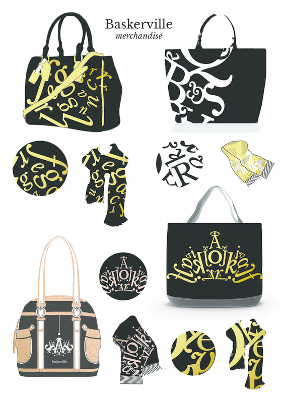
merchandise
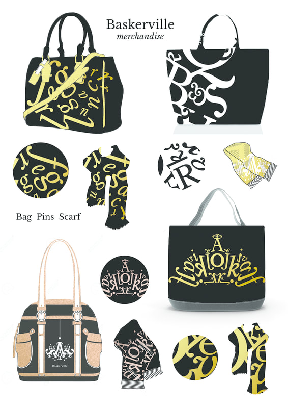
For the merchandise , i have decided to make bag , scarf and pins. As they are being used to show elegance and high- class sophisticated look. The curved patterns on the bag is inspired by elegant connotations: champagne, tiara, chandelier and curved shaped pattern. I had made the merchandise in a series so you can use the scarf matching with the bag and a pin to add as accessory.
final baskerville type exhibition
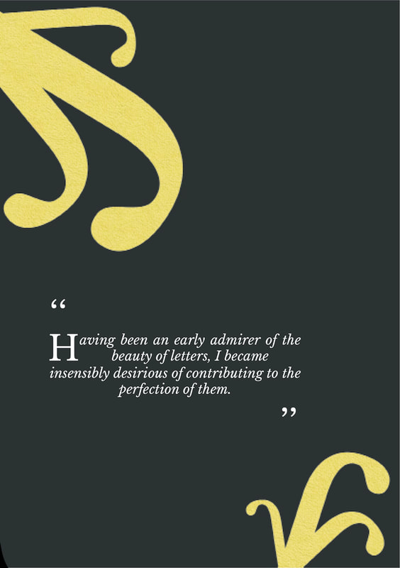
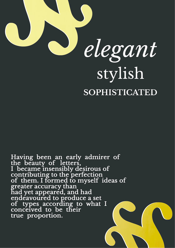
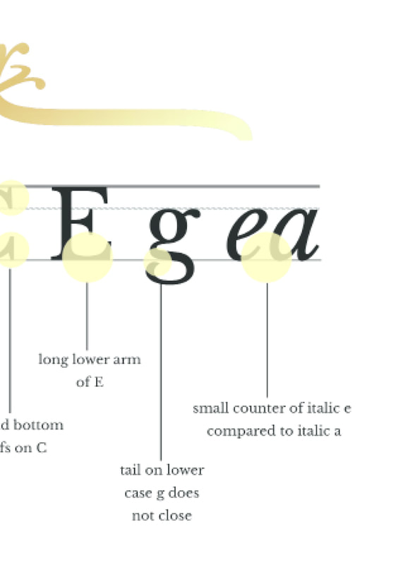
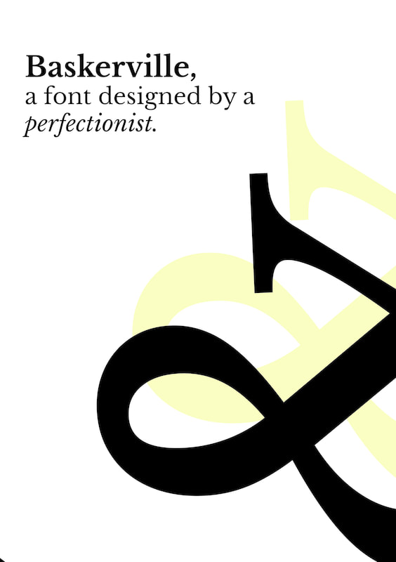
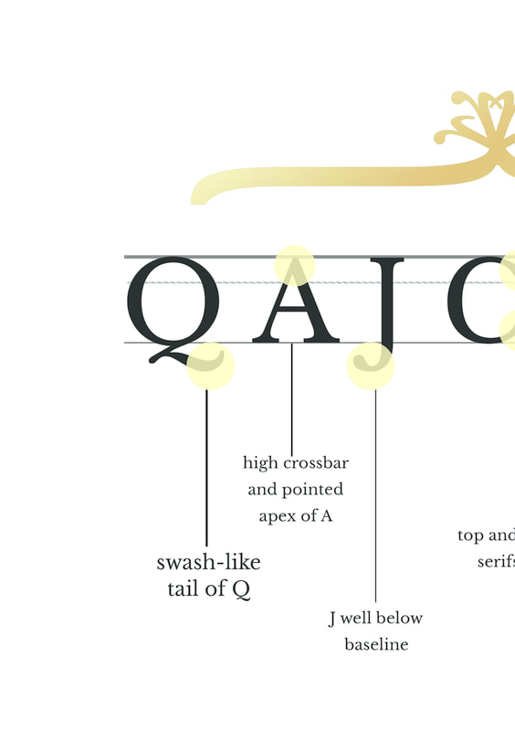
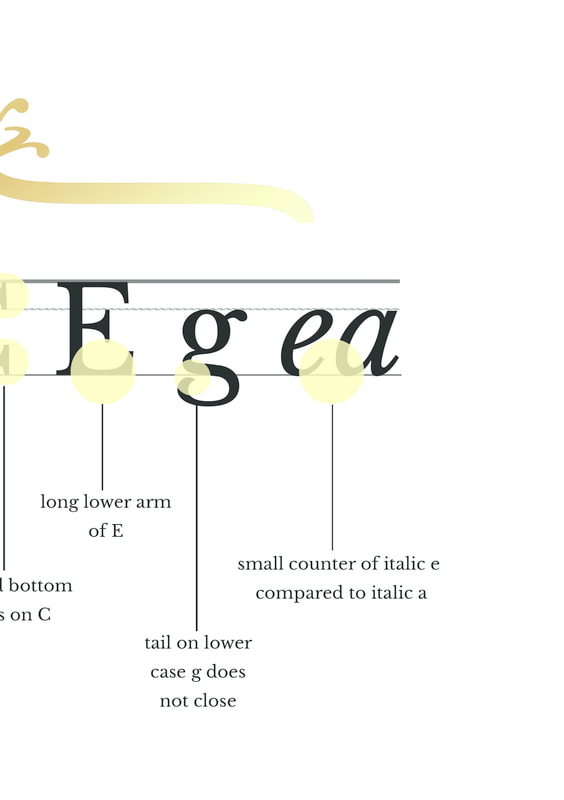
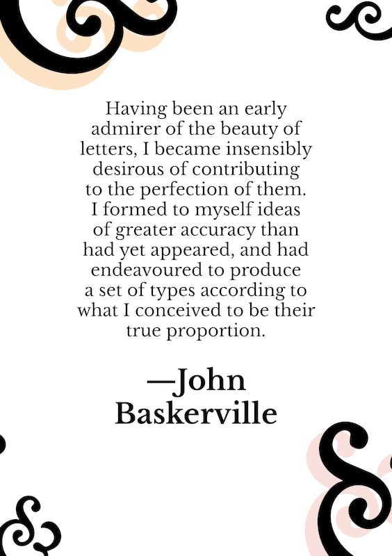
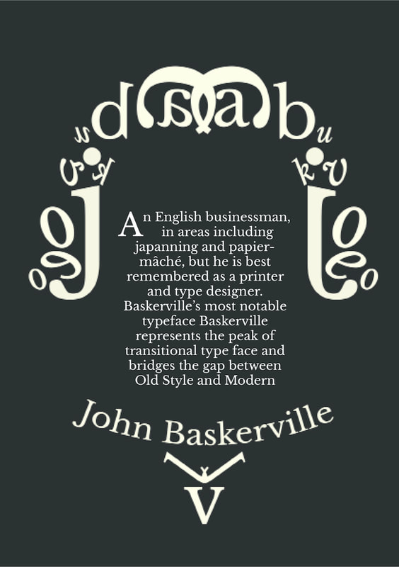
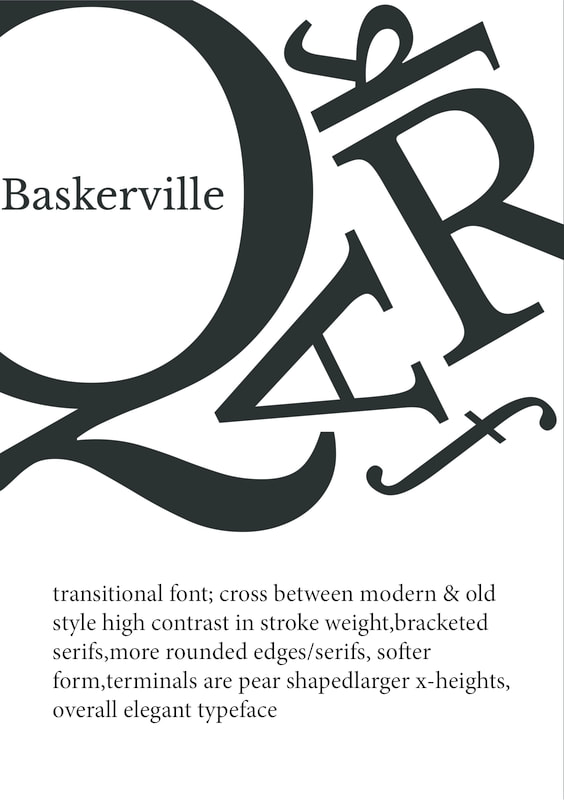
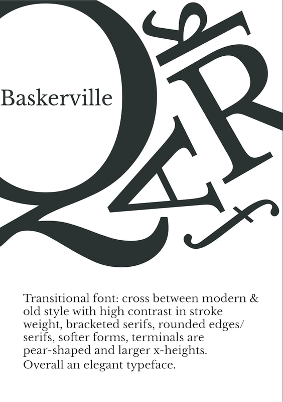
For the typographic skill final assignment, i have chosen the font Baskerville. As it is my favorite font because of its generous proportion , and elegant curve and swash stroke, with its classy look. baskerville is the font i would go for if i want a sophisticated and elegant looking type. After researching about the type, i found out that John Baskerville, the designer of the font, is actually a perfectionist and thus he wanted to find the most elegant and true proportion in font. After in depth research, I have then made mindmap and create three alternative concepts: classical, elegant and vintage/poetic. The final concept i have chosen is elegant for the reason of the type's graceful characteristics such as generous proportion , contrast in stroke, rounded serifs and curve-shaped tail and stroke. It is a transitional font which is in between the gap of modern and old style type, a type that is timeless, that it is used in both older days and current day.
As the word "elegant" means graceful, classy with a hint of being sophisticated and fashionable, thus i researched things and connotations relating to elegant. And found that elegant usually remind people of curve shape pattern, the color black & white & gold ( like the chanel and YSL logo) , the items chandelier , tiara, candlelight stand, flower, lace and champagne. In addition, elegant in the older century especially the great britain is shown perfectly by their royalty and their decorative ornaments. While nowadays elegant is shown by slightly simple yet classy-looking display. Thus i had put those elements in the booklet , balancing the decorative curve style of the old century elegance with the nowadays simple display of elegance, as it represents and shows that the font is in between the then and now style.
In conclusion,Baskerville is an overall elegant font with its perfectly achieved proportion and stroke. By showing the Baskerville type's characteristic through visuals and layouting on book, poster , postcard, i am convincing and showing the audience how great this Baskerville type is. The main purpose of the design is to promote the type and also to showcase the font's beauty , furthermore really appreciating the awe-inspiring typeface created by John Baskerville. It is truly amazing to see how they type is largely used nowadays , and i hope from my design i can let people see the beauty and elegant in the font Baskerville.
